Cryptocurrency industry and market. Creating a logo for an entity from the modern cryptocurrency industry is a special challenge.
In this article, we are analyzing the logo design solutions from the 48HoursLogo platform!
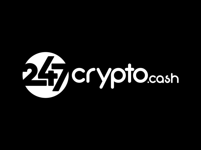
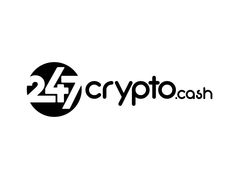
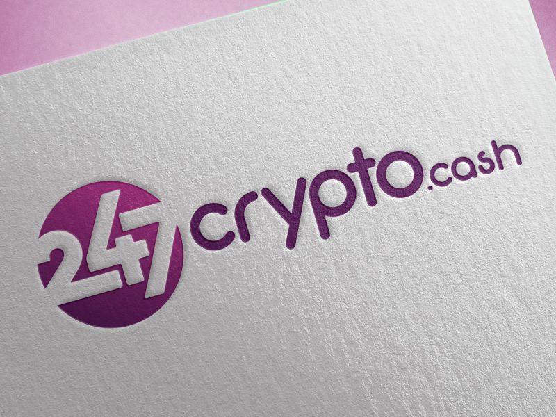
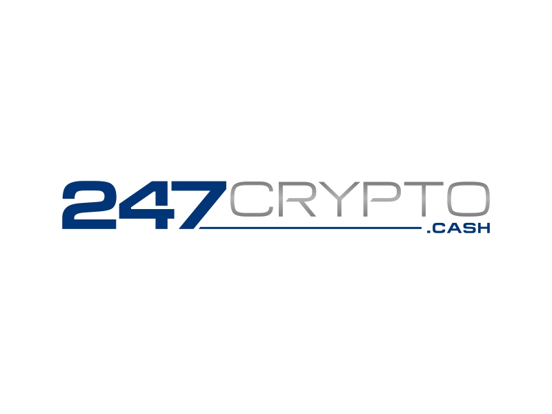
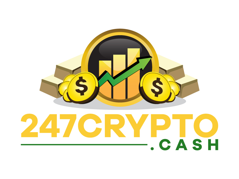
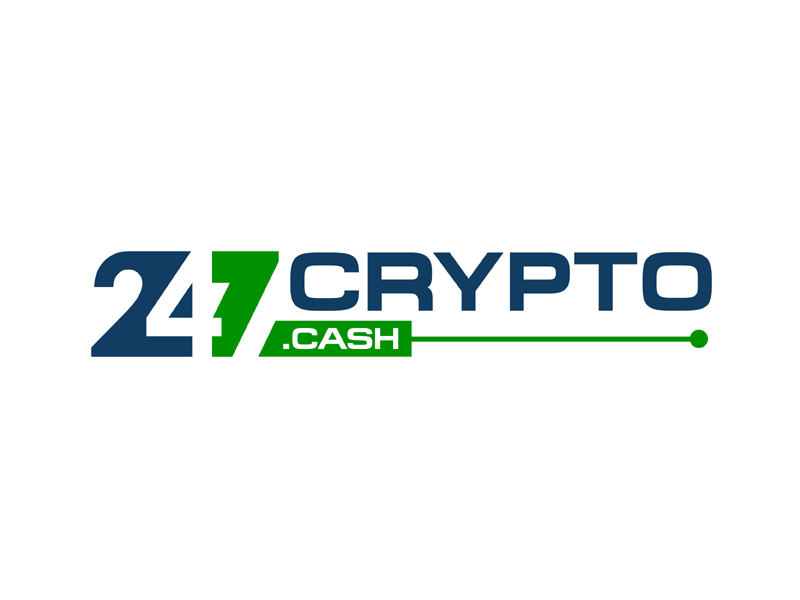
247crypto.cash Logo Design Contest

It is a platform about crypto and DeFi, and the client had very precise instructions on what kind of logo he wanted.
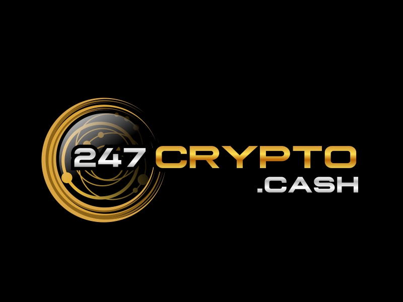
It was pointed out that part of the logo must be suitable for the favicon, as well as that the web logo should be on a white background, and the mobile logo on a black background. Such specific and clear instructions are of great importance for designers.
One of the things that the client also pointed out in his design brief is that the logo should be simple and memorable. Everyone strives for that, and 247crypto.cash has completely succeeded through the 48HoursLogo design crowdsourcing platform. Having 103 design solutions available, the client chose a winning solution that is exactly what is written in its design brief – the logo is simple and memorable.
Winning logo design solution
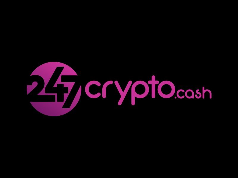
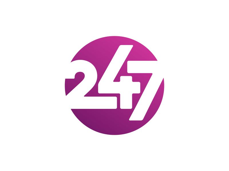
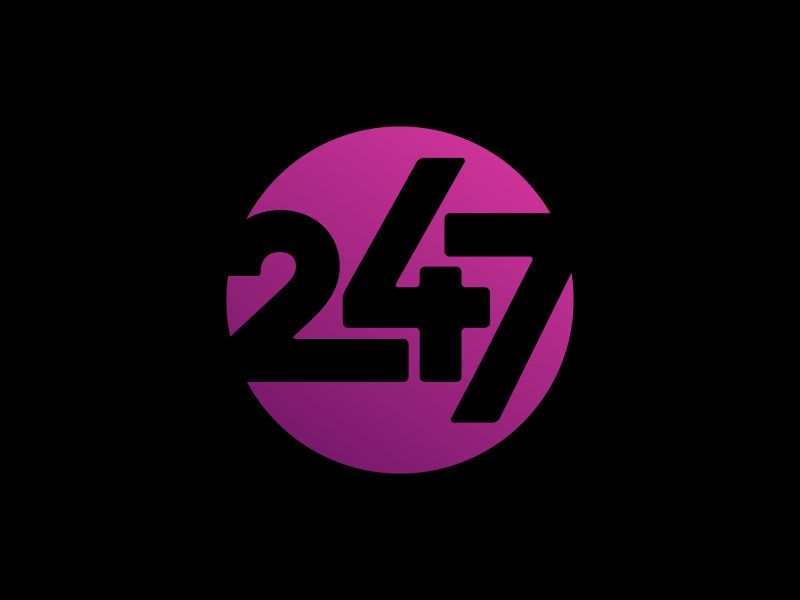
The winner of this contest was ekitessar
This logo has a very strong line of modernity, including the whole concept, colors, and font. In a sense, it is very sophisticated, yet simple and very applicable in various formats.
Purple color, often used in the field of banking and finance, is well placed here and blends into several shades, which further energizes this logo and makes it a communicating logo. The overflow of purple shades gives a special liveliness to this logo.
As for the elements, a simple circle was used with a small stylization of the “247” numbers, which gives uniqueness and what we call the “personality” of the logo.
The task of creating a special “icon” layout for this logo has been done in an extraordinary way. The icon layout of the logo is something that could be specially praised.
All in all, the goal of creating a logo that is simple and memorable has been achieved.
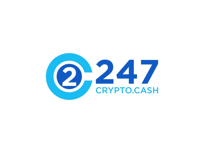
Some of the other solutions…
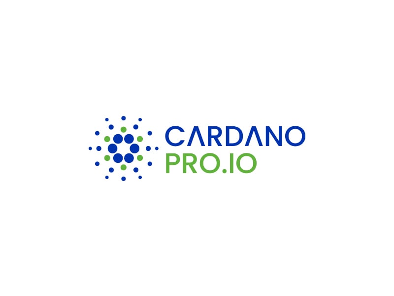
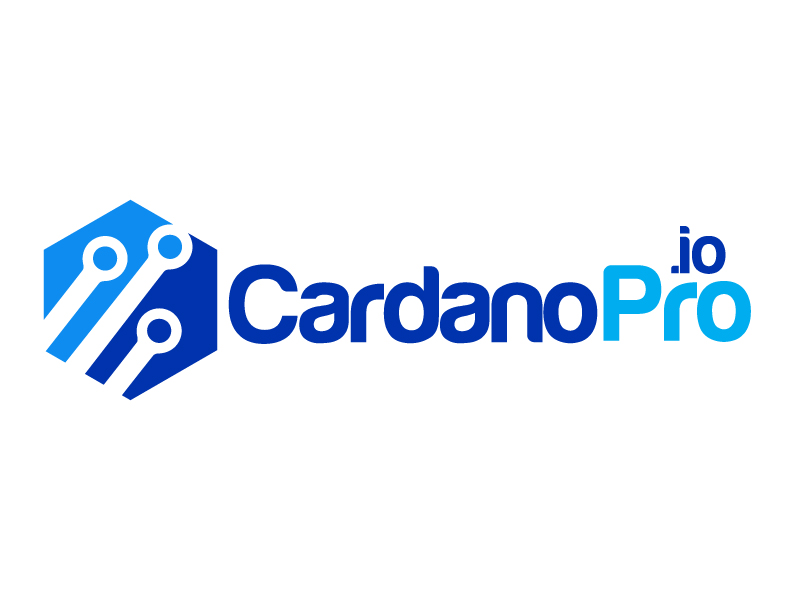
CardanoPro.io Logo Design Contest

CardanoPro.io is the cryptocurrency education and news website focused on the Cardano Blockchain.
The precise brief defines one of the colors to be blue # 0033ad, and the client also recommended the use of the Chivo font.
It was pointed out that the logo should look professional and trustworthy.
The client had as many as 259 creative solutions available through our platform.
Winning logo design solution
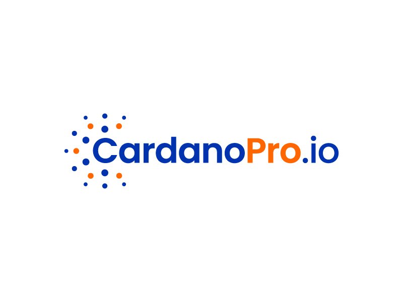
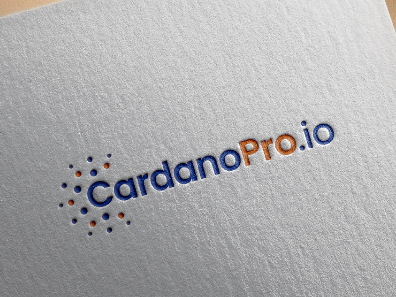
The designer that won this contest was akilis13
Following the instructions of the design brief, which required the use of a certain blue color, the designer made a very refreshing combination by adding orange.
Orange broke the monotony and added motivating refreshing energy to the whole logo while maintaining the seriousness that blue carries.
The geometric shape of the Cardano sign used also has a similar function. It gives movement and liveliness to the logo, but it is stable and adheres to the goal of achieving energy that instills trust, that is, it achieves the “trustworthy” element specified by the client in the design brief.
A very compact logo that has recognizability and attractive energy.
Some of the other solutions…
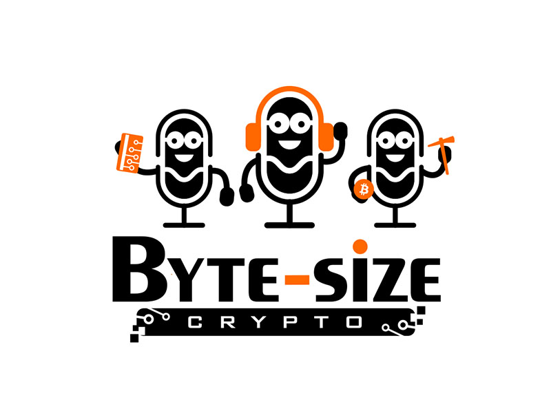
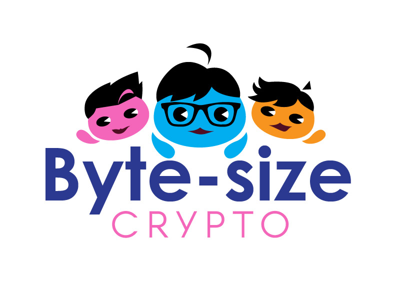
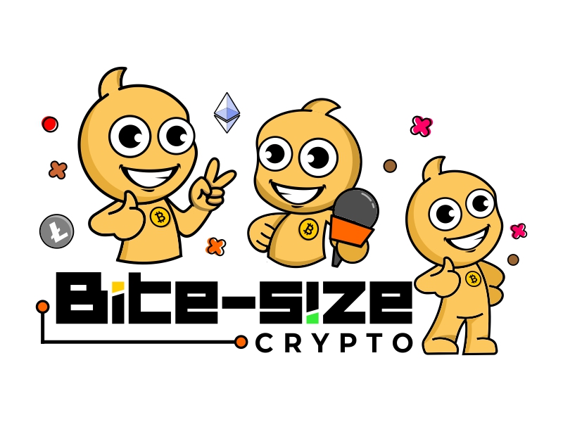
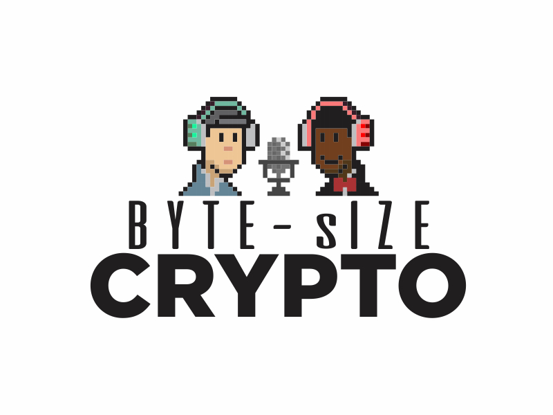
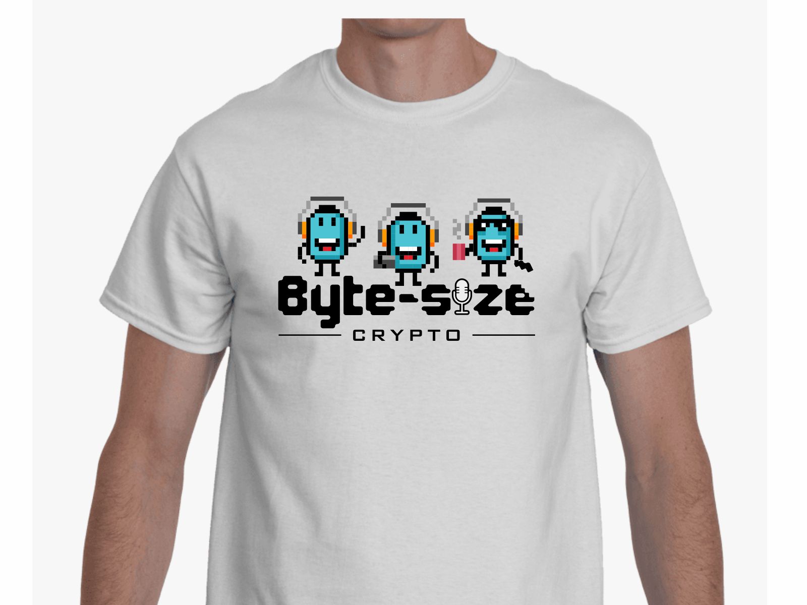
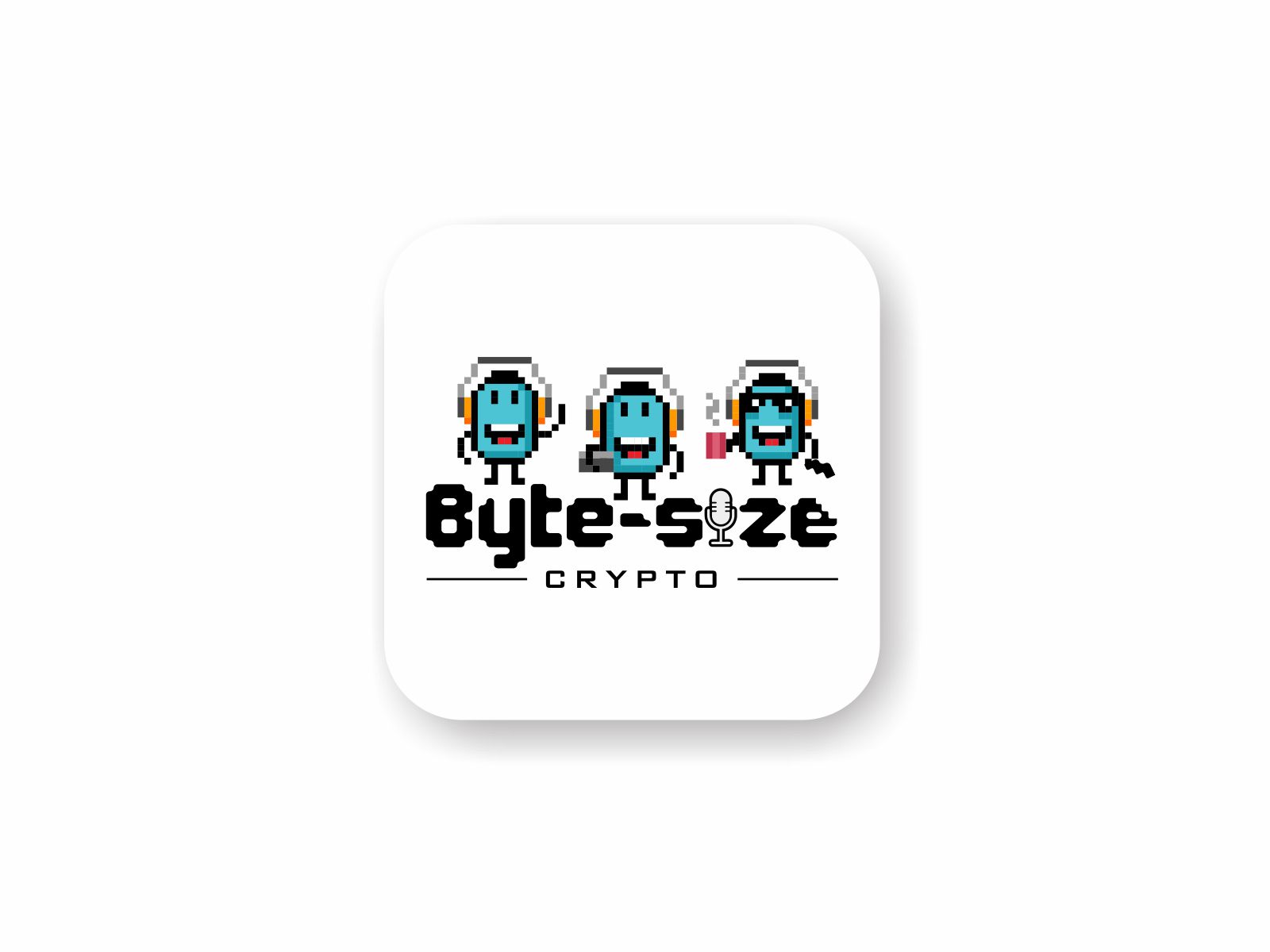
Byte-size Crypto Logo Design Contest

Byte-size Crypto is a podcast that targets a wide range and different profiles of people. As stated in the design brief, the target group is all those who are interested in cryptocurrencies.
The client stated that he wants some sort of character/mascot/human/minions. Also, the client pointed out that he would like to get a solution that will represent the casualness of the show.
The design brief also states an idea from the client. “It could be 8-bit blocks wearing headsets or something different for each block character, kind of like minions.”
169 creative solutions were made from which the client could choose what he liked.
Winning design logo solution
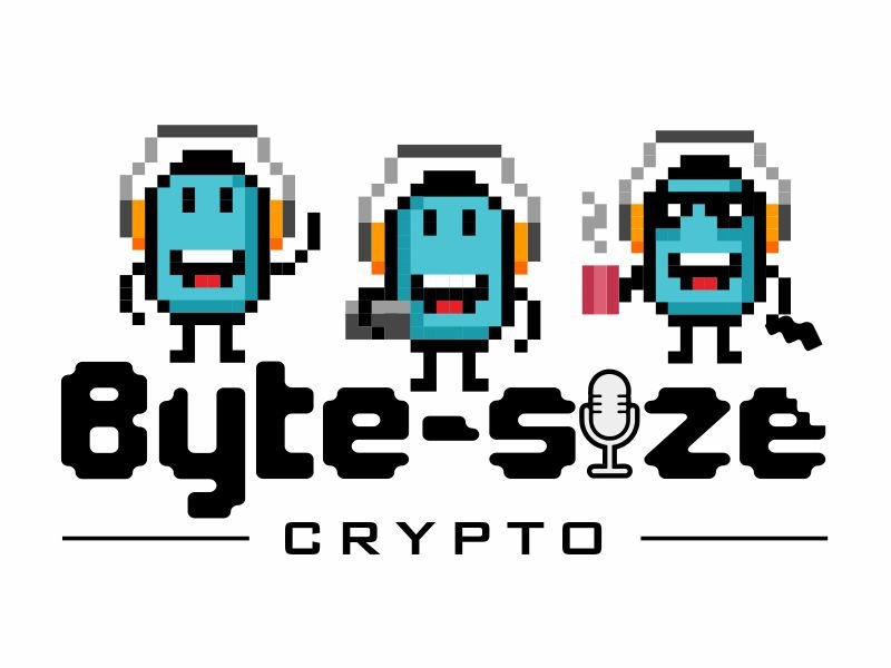
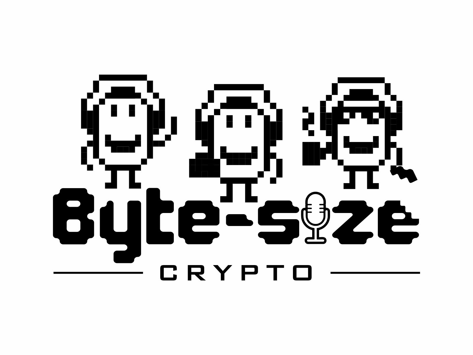
The winner of this design contest was agus
One of the specifics of making a logo for a podcast – we wrote about it in one of the articles – is that it is necessary to point out within the logo that it is a podcast. Of course, if it is not written with the letters “podcast”, it is done with elements, that is, icons. Here, the designer did it with the “microphone” element.
The designer applied the stylization of the letter “I” into the “microphone” element, within the word “size”. A very creative, unobtrusive, non-aggressive solution, and directly functional.
The solution is pleasing to the eye and carries the energy of fun and “casualness”, which fulfills the goals of this creative task. The logo is very attractive and has a strong communication power, it simply sends the message that it is a podcast show that will entertain you and you will enjoy it.
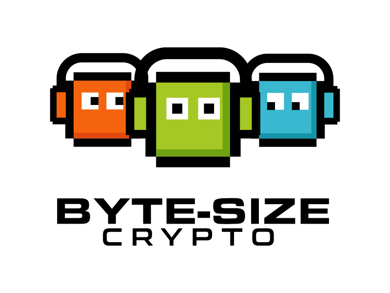
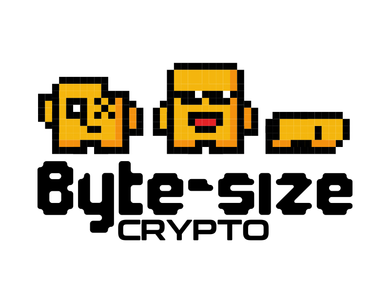
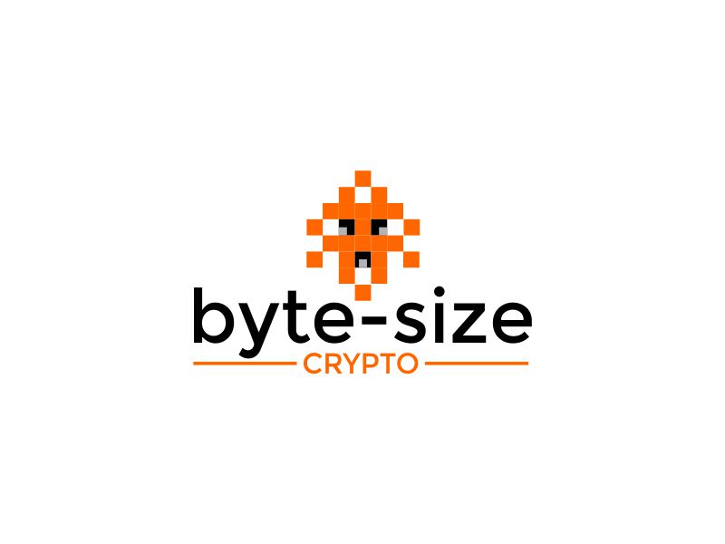
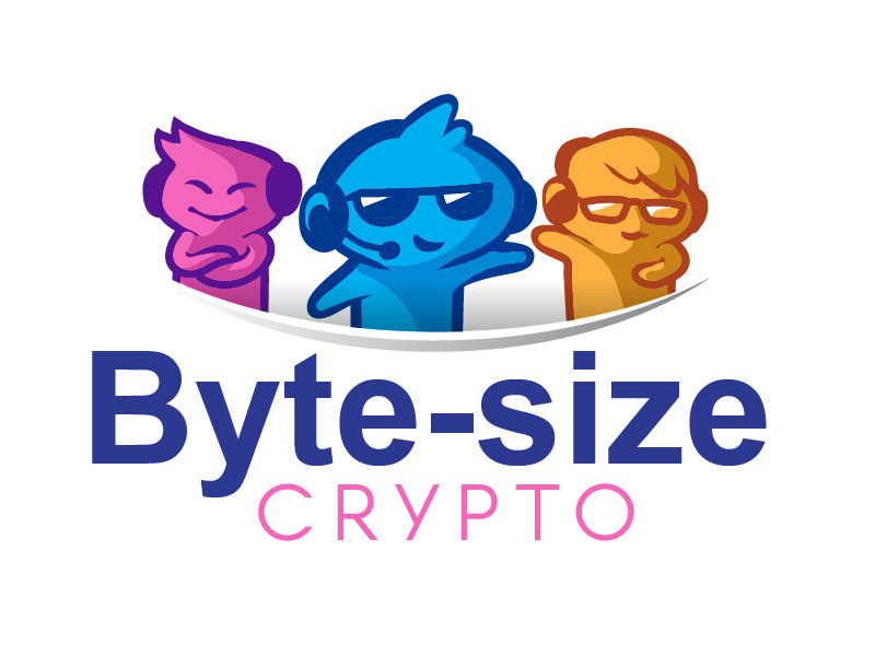
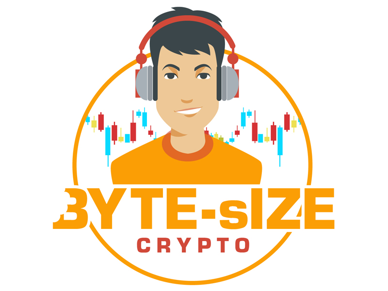
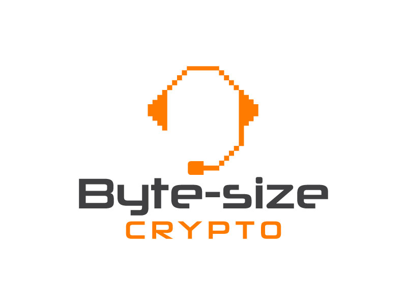
Some of the other solutions…