In the future, from now on, 48HoursLogo will present some of the many design contests from our platform, and we will strive to cover various industries and markets.
The goal is to present a kind of analysis of the quality of solutions achieved on our platform, and we hope that this will be helpful to people looking for new logos, as well as designers who encounter various logo design tasks on the 48HoursLogo platform.
This time we are dealing with a specific industry of restaurants and cafes, so enjoy!
“Saigon Haus” Logo Design Contest

The first example we present is the design contest for the “Saigon Haus” restaurant. The client had an extremely simple “design brief” consisting of just one sentence. “Vietnamese restaurant for all people”. Also, under the item “instructions” he wrote simply “free to design”.
The client gave complete freedom to 48HoursLogo designers and this “risk” paid off many times over. The client received an enviable number of design solutions, as many as 187 creative logo solutions.
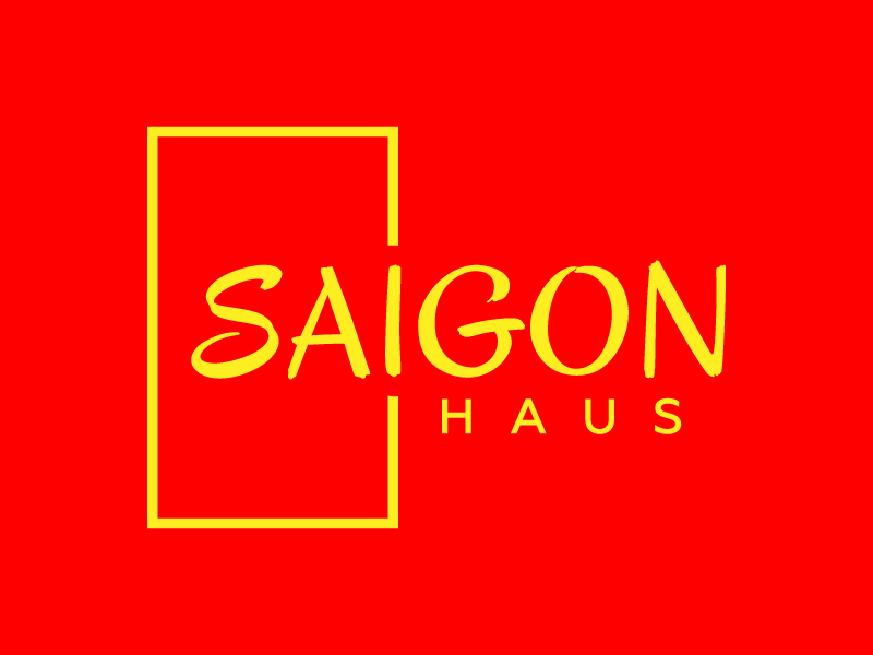
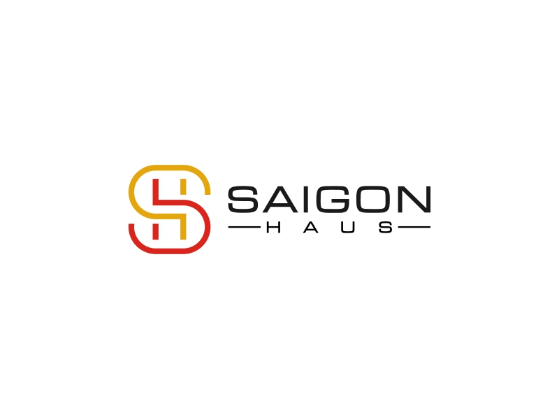
Winning logo design solution
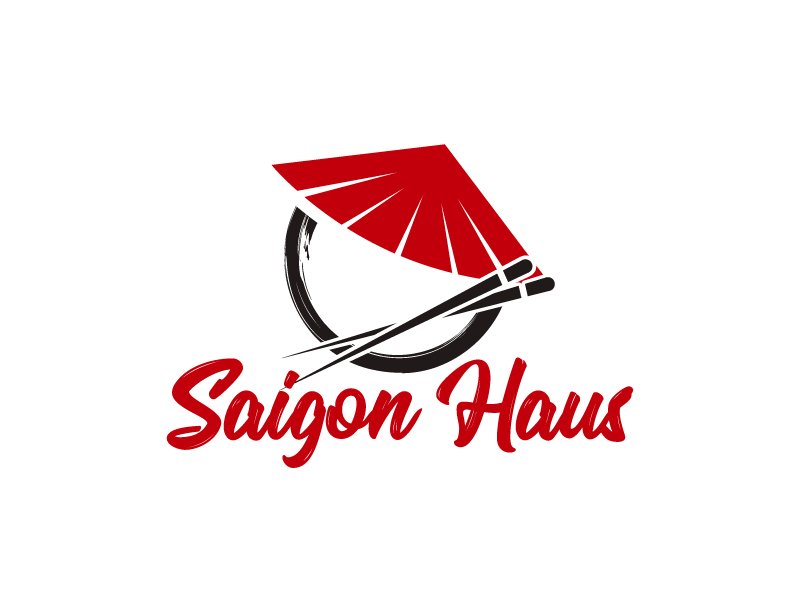
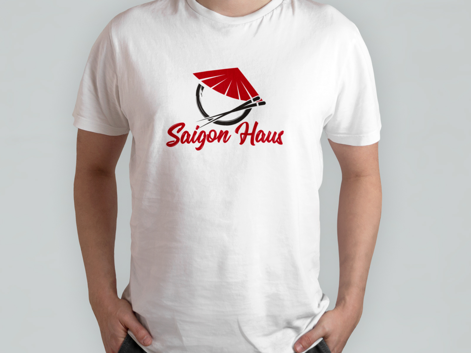

The designer that won this contest is Kirito.
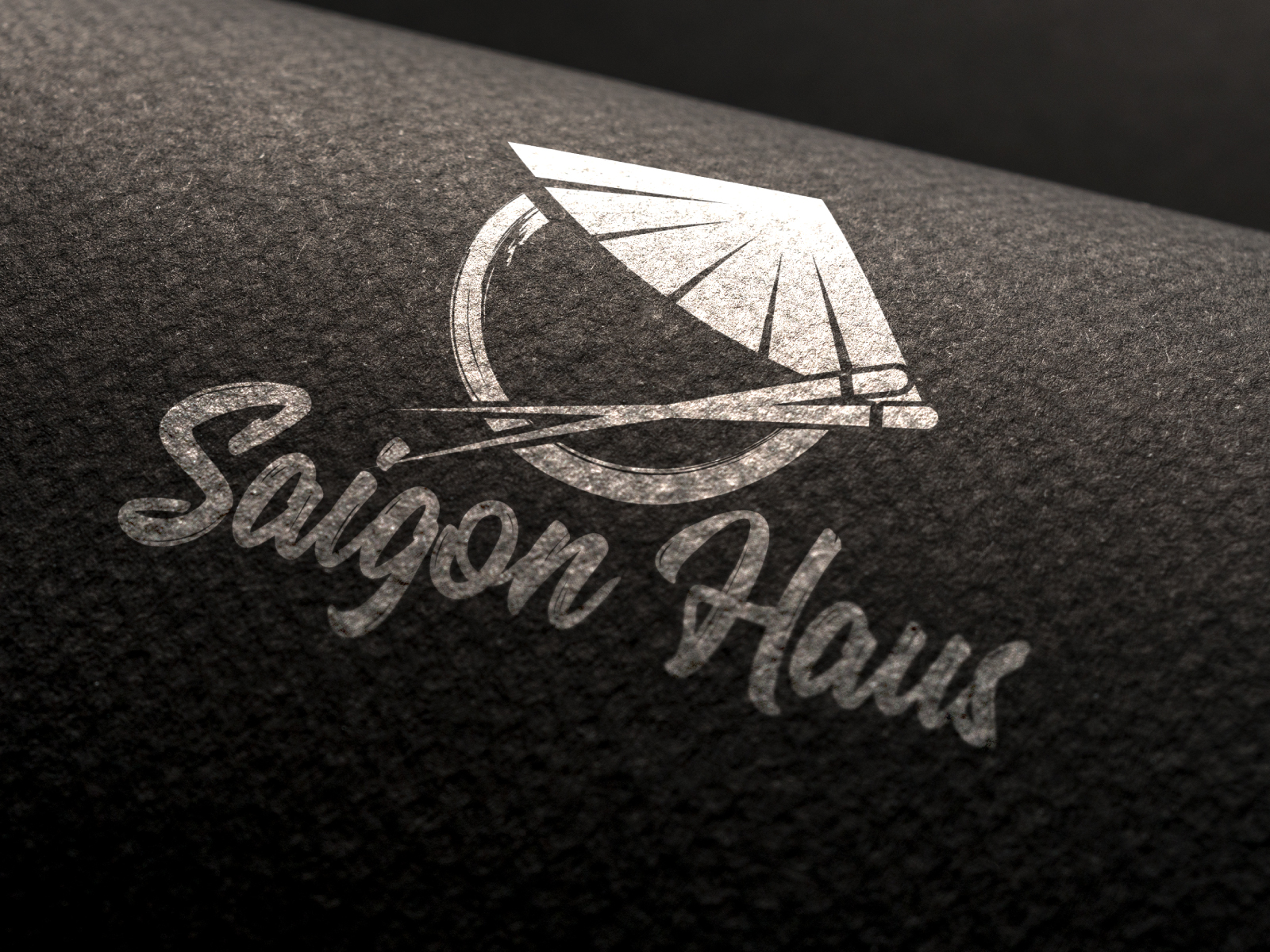
The winning logo design solution features a good eye-catchy combination of red and black, and incorporates authentic elements of Asian culture – “straw hat” and “chopsticks”. Very effective with its simplicity while having a good balance of modern and traditional.
The combination of red and black with a simple shape gives a wide range of applicability. The font used belongs to the so-called “hand-written” fonts, which additionally gives the logo the energy of “relaxation, closeness, friendly, warm, homely”.
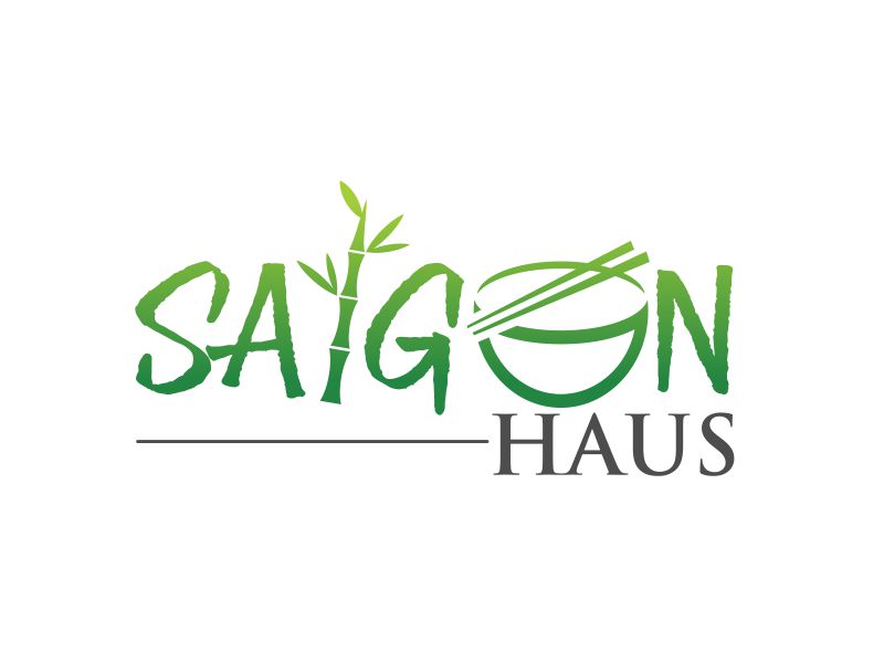
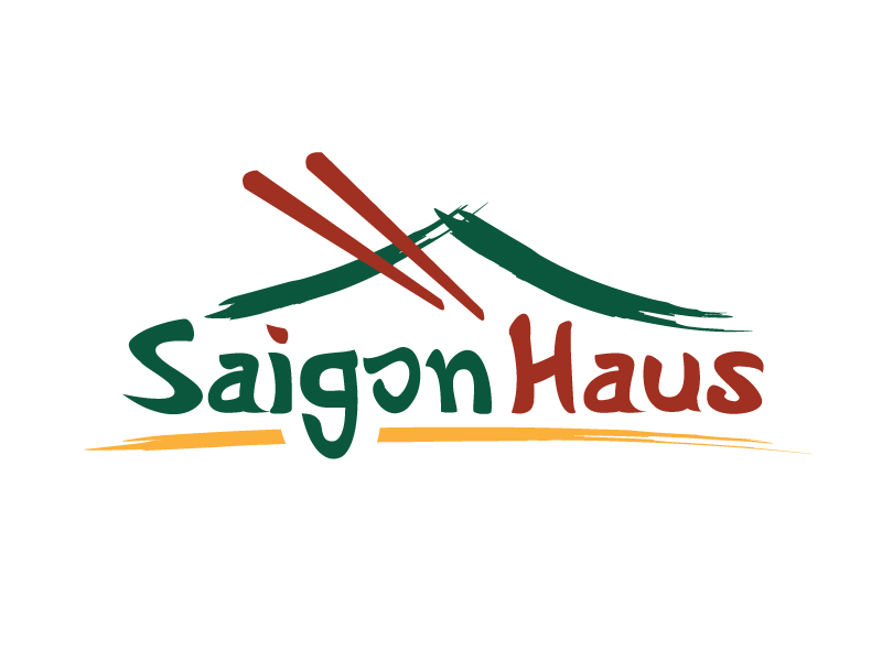
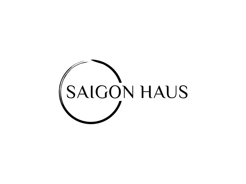
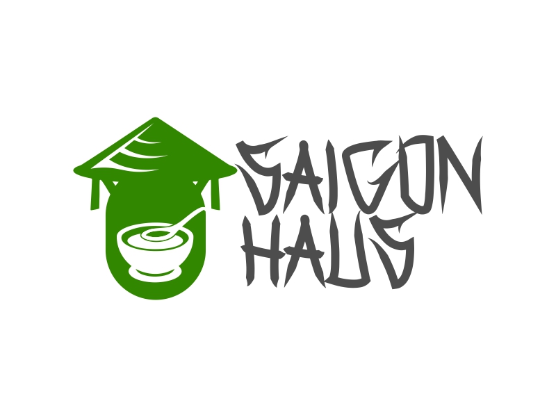
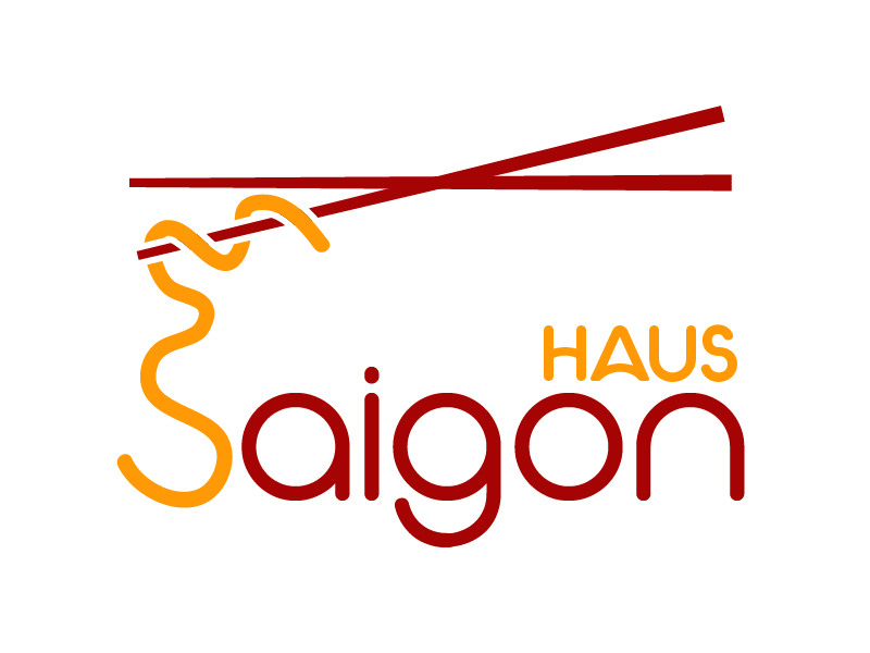
Some of the other solutions…

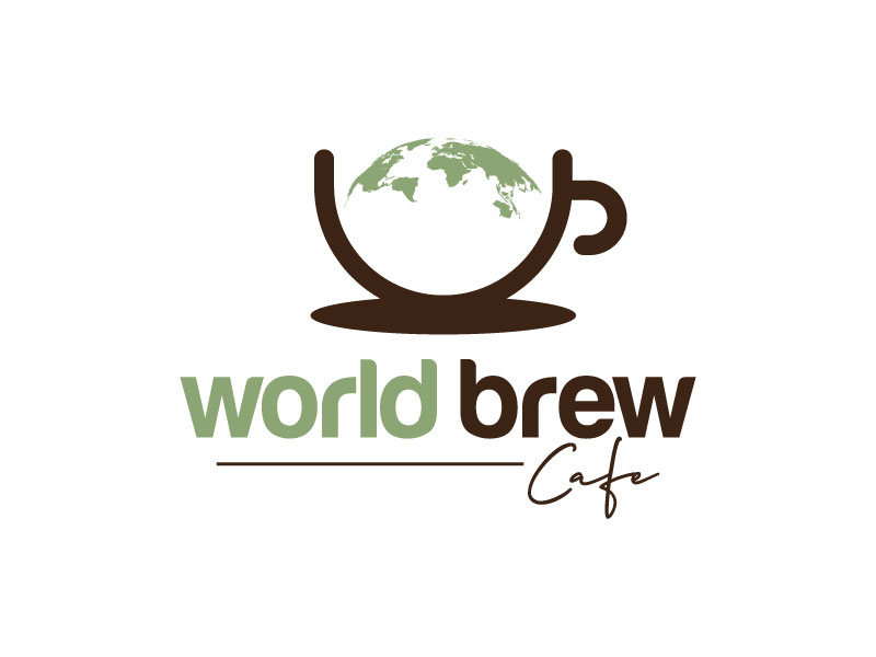
“World Brew Cafe” Logo Design Contest

This is a design contest launched by a client with a fairly precise brief. In addition to a clear description of their company, they were determined with the style they wanted. “We like two different styles, straight and flowy or circles.”
They also further described their business philosophy and the philosophy of their brand. “Some things we value, making multiple cultures feel welcome and being eco friendly.” This client also used the reference samples option, further describing with examples what they want. This is of great help to designers.
Winning logo design solution
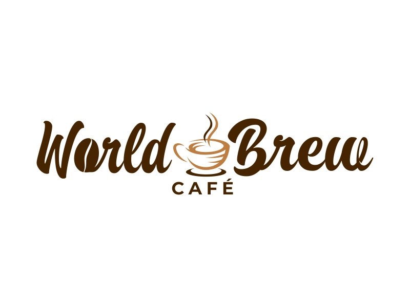
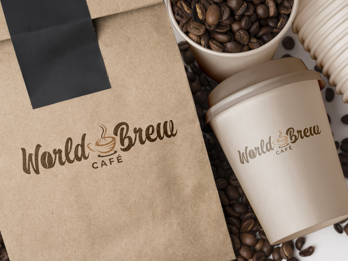
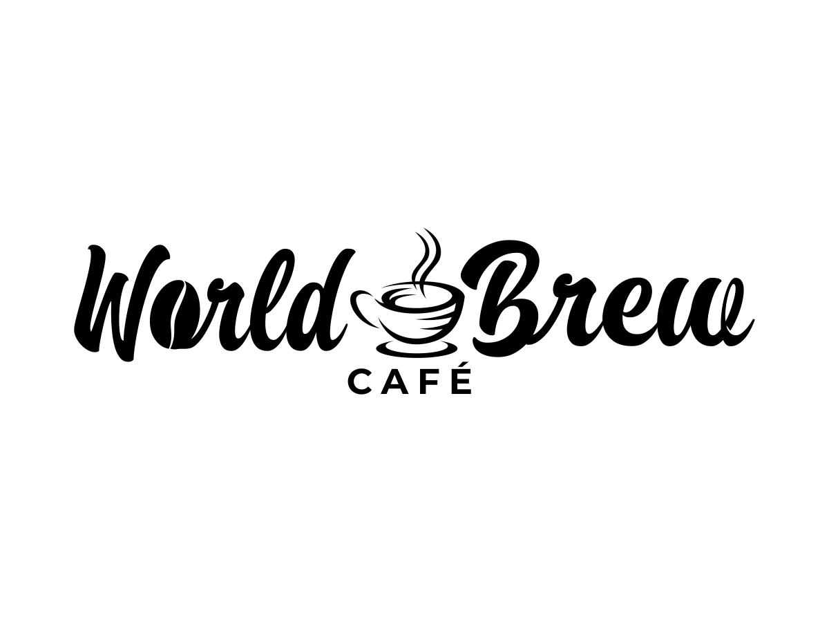
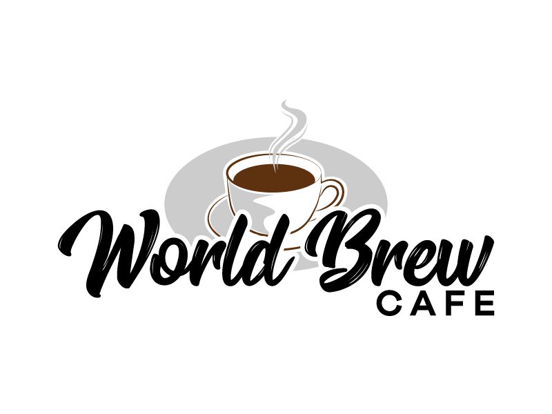
The winner of the “World Brew Cafe” design contest is Ingepro
What has dominated this design contest is the application of various variations and shades of brown. The winning solution also is based on brown. The font, which can be classified into two types of fonts, “display” and “hand-written”, gives an excellent effect, because it emits energy that is in line with the described philosophy of this brand.
As for the elements, there is a “coffee bean” and a “coffee cup” in a good “sweet home” style. The main design element of the solution is a centered “coffee cup” and with a large font a good line of corporate branding has been achieved, more precisely, the whole logo exudes an energy that instills trust and actually has the function of building trust with fans and customers.
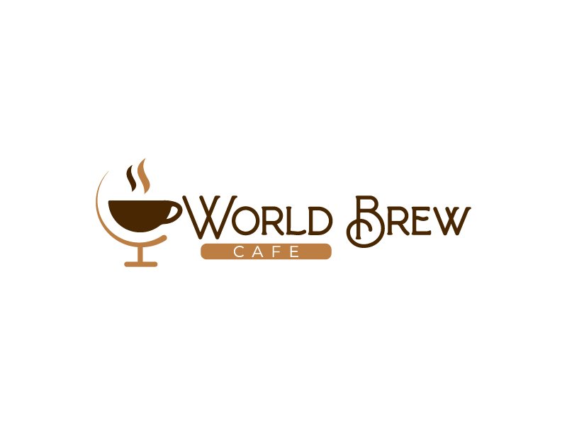
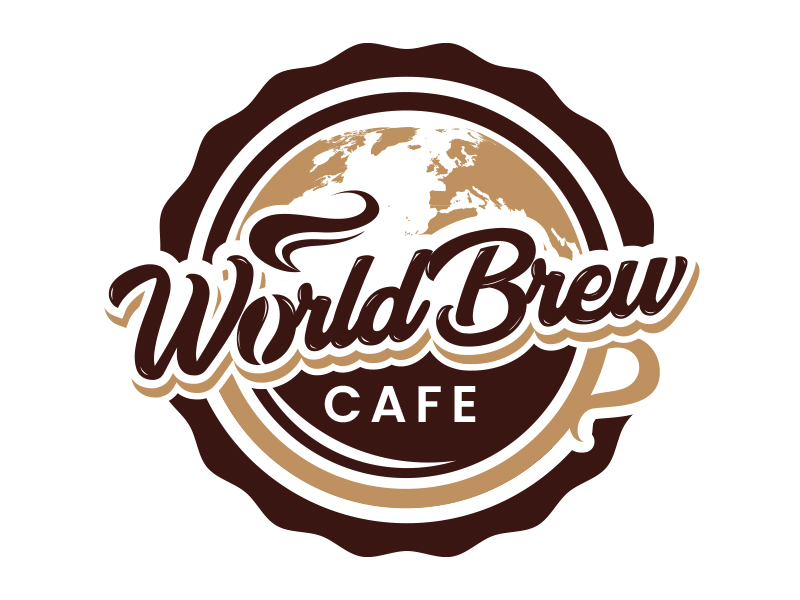
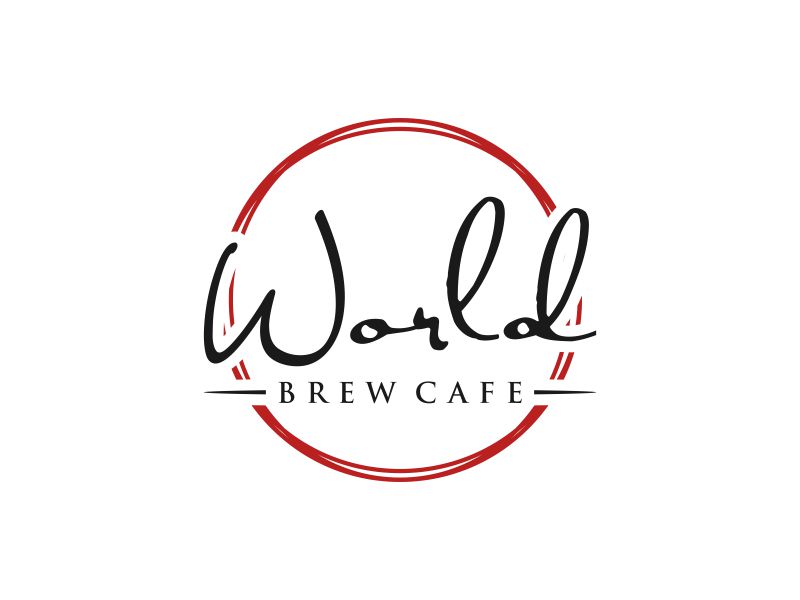
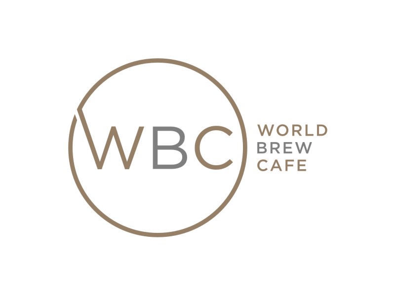
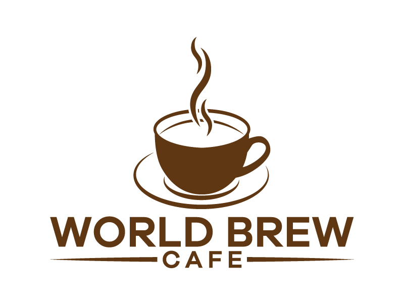
Some of the other solutions…


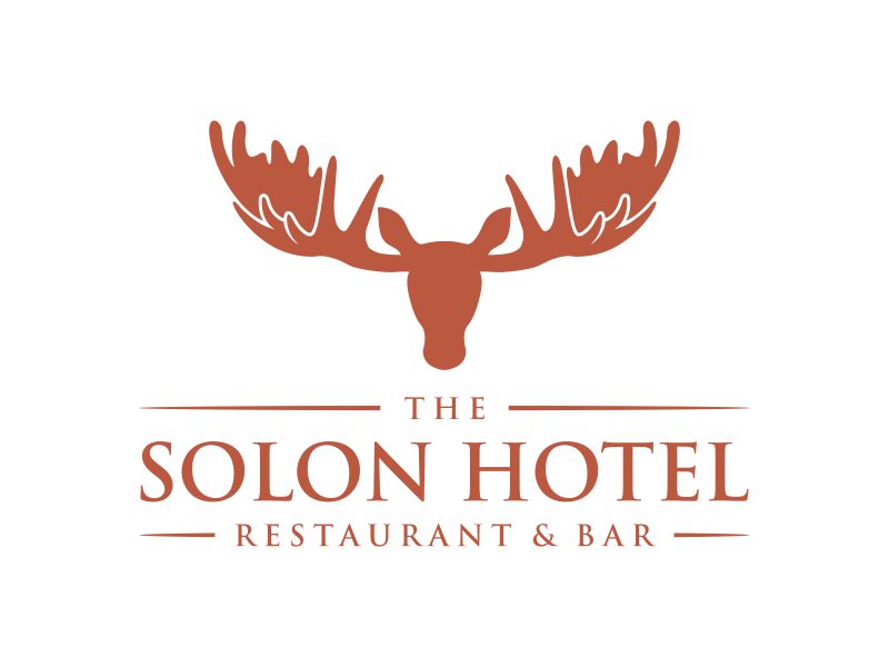
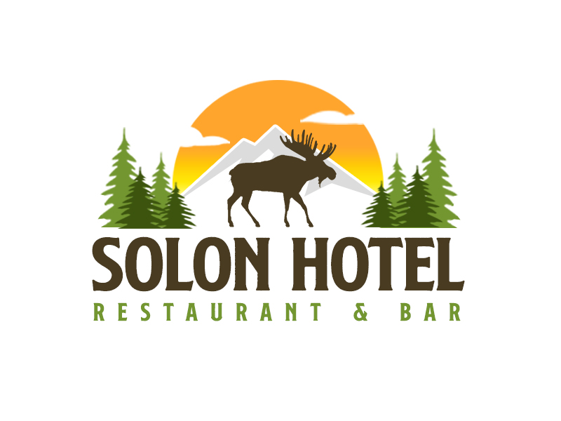
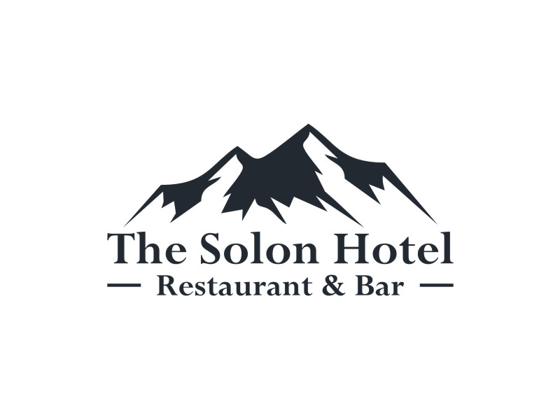
“The Solon Hotel Restaurant & Bar” Logo Design Contest

In this design contest, the client sought a solution that would feature an element of “historical” and “traditional”, and reference samples were dominated by solutions with a font of the same orientation. Eye-catchy “display” old-fashioned fonts.
A very clear and good description that gives designers the right direction of creative thinking. “Moose. Mountains. Trees. Maine. This is a historic building in the heart of Maine.”, the client said in a design brief describing the elements he would like to see in the logo solution.
Winning logo design solution
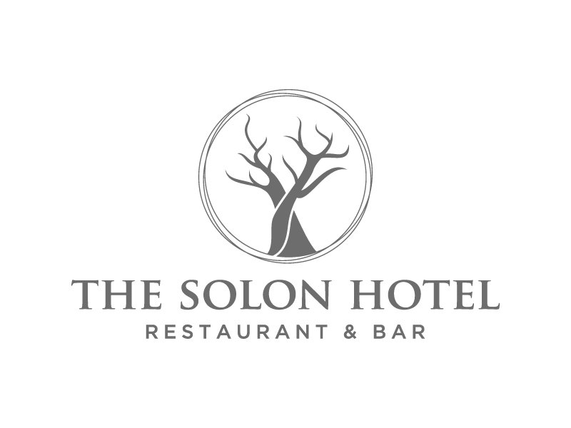
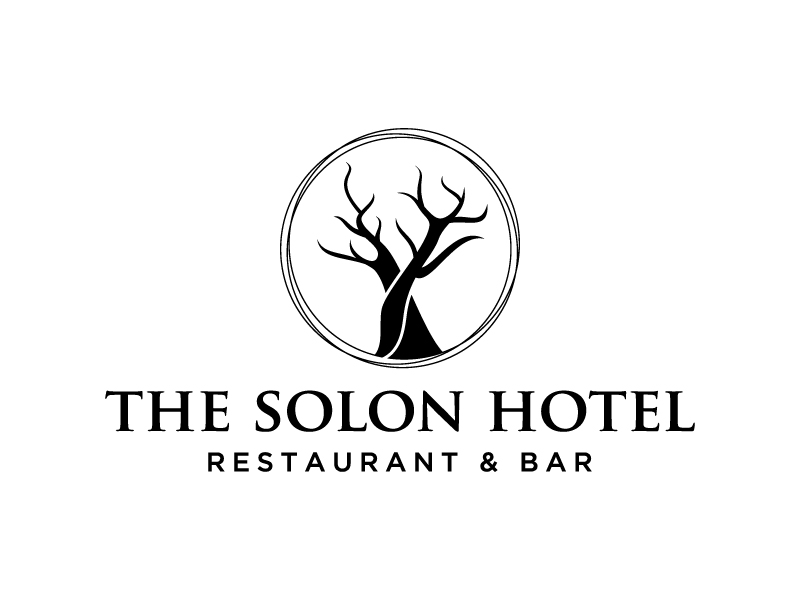
The designer winner of this contest is Fear
The winning solution is a creative combination of elements that the client described in the design brief. Trees are stylized in the shape of moose horns.
The designer used two fonts, “Trajan Pro Bold” and “Gotham Medium” fonts. The Sans serif font type gives the right dose of traditionalism, and with this other font that carries a note of modernity, a perfect balance has been created.
The logo is of a serious style, exuding a philosophy that perfectly matches what the client has described as his wish.
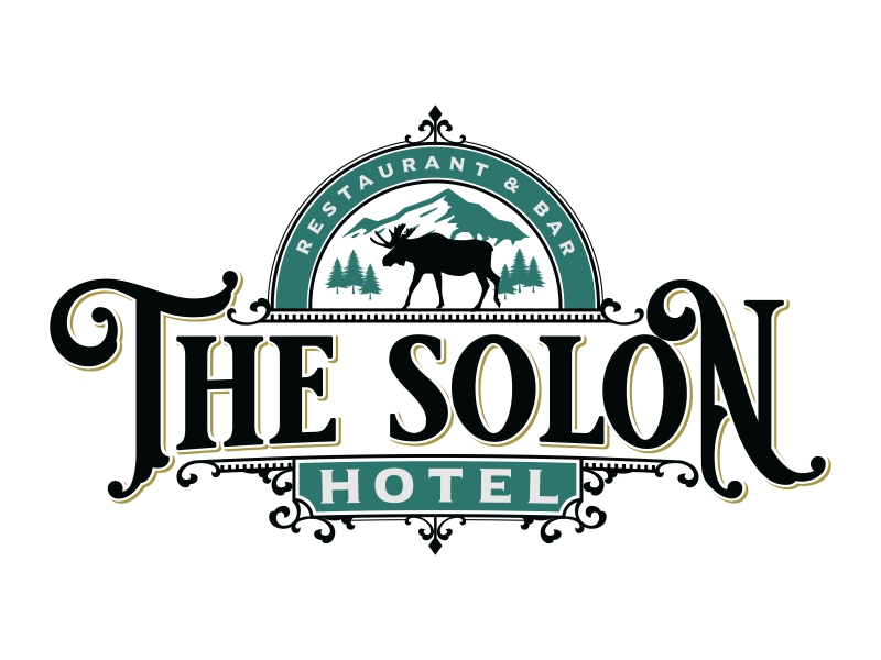
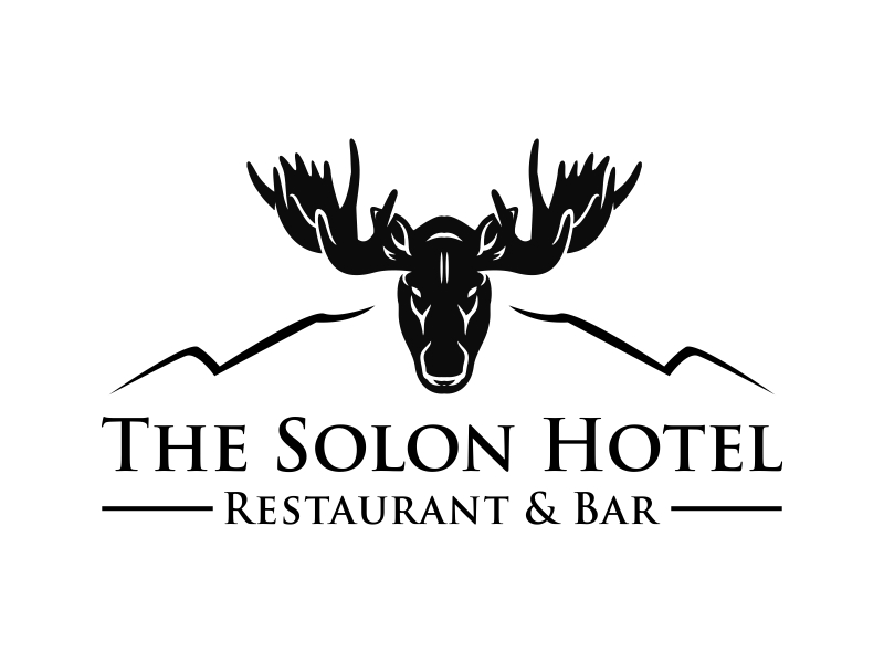
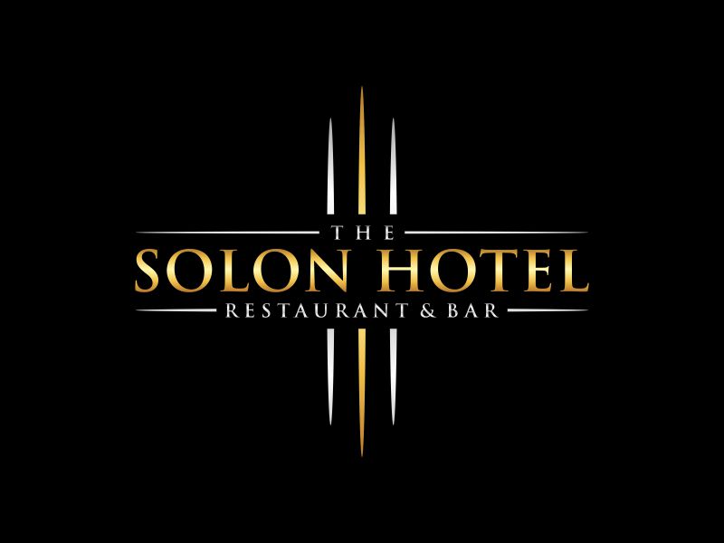
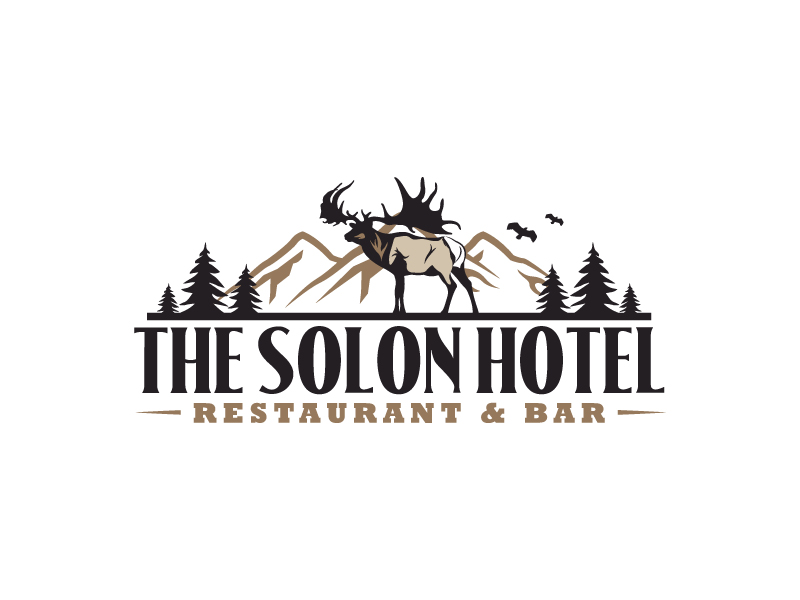
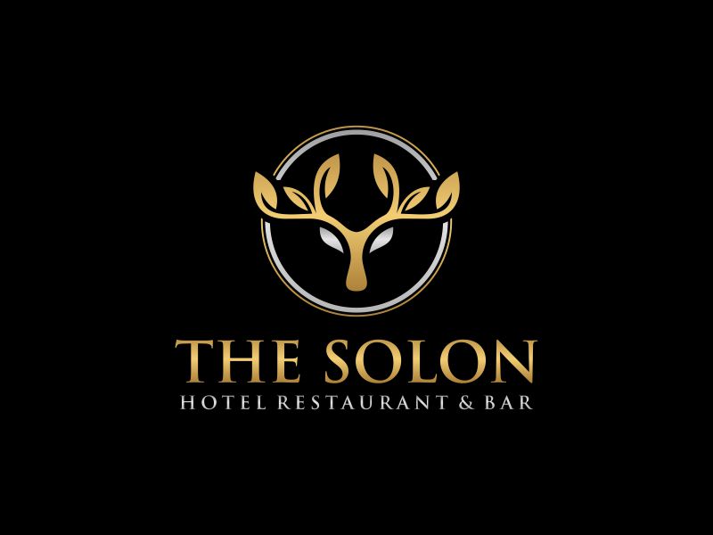
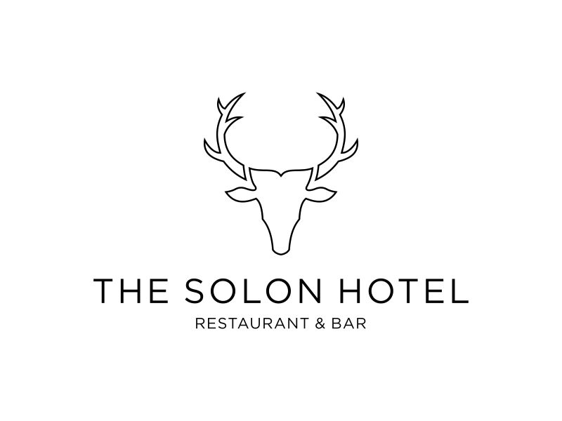
Some of the other solutions…