
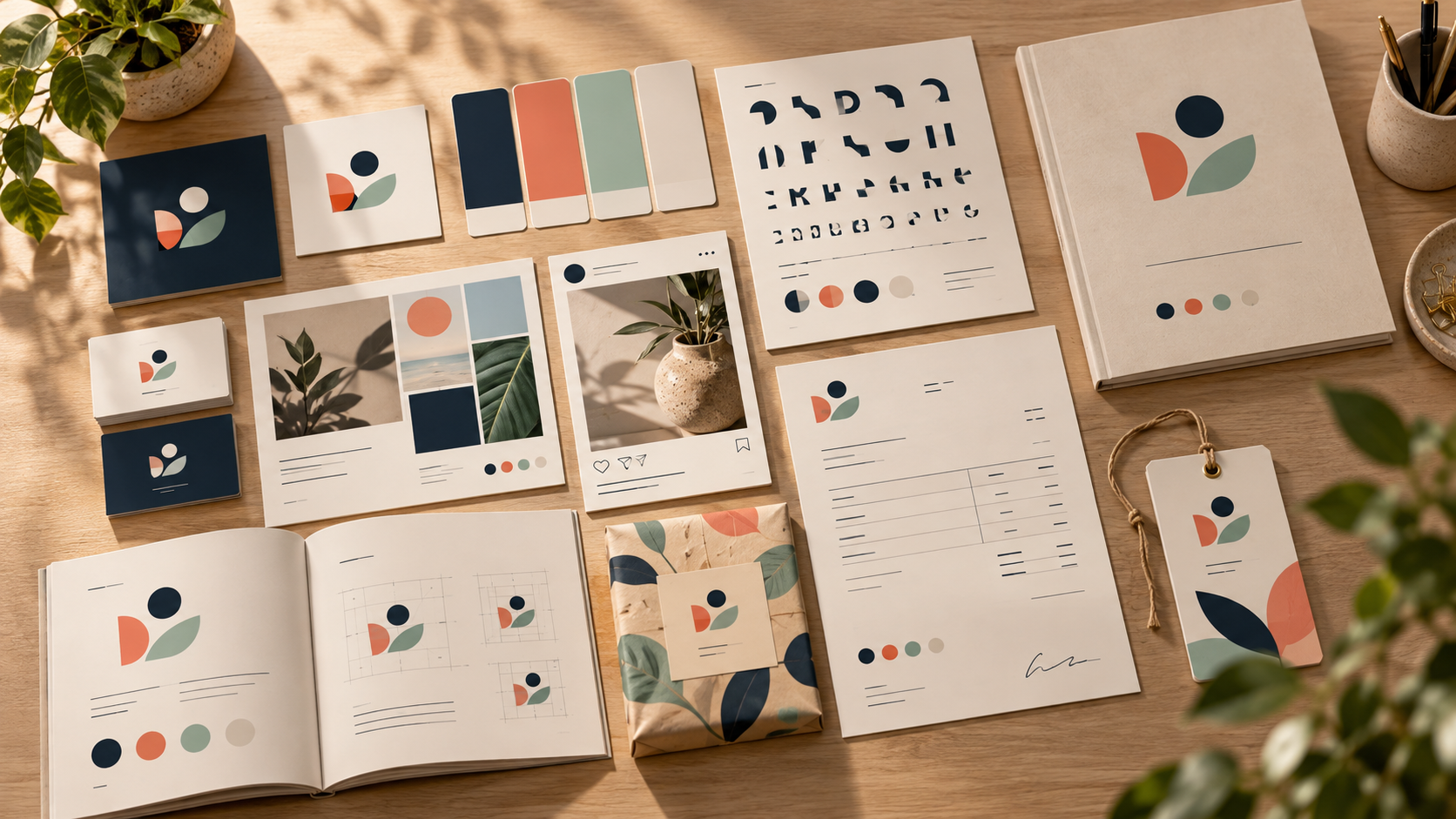
A logo is the starting point of a brand identity, not the whole identity. Customers meet your business through invoices, social posts, packaging, proposals, presentations, uniforms, and web pages. A brand kit turns the logo’s visual decisions into a practical system so those touchpoints feel related without looking identical.
You do not need a 100-page manual to create consistency. A useful small-business kit can fit in a shared folder and a short guide. This article shows what to include, how to make decisions from the logo you already have, and how to keep the system flexible as your business grows.
What is a brand kit?
A brand kit is a curated set of visual assets and rules that helps people represent a business consistently. It usually includes logo files, color values, typography, imagery direction, layout examples, and reusable templates. The kit should answer everyday questions: Which logo version goes on a dark background? Which blue is approved? Which font is used for headings? How much space should surround the mark?
Think of the kit as a decision shortcut. It protects the recognizable parts of your identity while leaving room for different campaigns, formats, and collaborators. Start with the choices your team makes repeatedly rather than documenting every possible design scenario.
1. Organize the logo master files
Begin with a clean logo package. Include an editable vector master, transparent PNG exports, and versions for light, dark, one-color, horizontal, stacked, and icon-only use. Name files clearly, such as brand-logo-horizontal-dark.svg, so a teammate can select the right asset without opening every file.
Add a short usage page showing minimum size, clear space, approved backgrounds, and examples of misuse. Do not stretch the logo, rotate it, add effects, or place it on a busy image without a contrast solution. If your current files are blurry, rebuild the master before creating the kit; our guide to fixing blurry logos explains why a vector source matters.
2. Build a practical color palette
Use the logo as a starting point, then define a small palette with jobs rather than a random collection of swatches. Identify a primary brand color, a dark or neutral anchor, a light background, and one or two accents. Record HEX values for digital work and, where relevant, RGB, CMYK, or spot-color references supplied by your printer or designer.
Show how colors combine in real situations: dark text on a light background, a button color, a reverse logo, and a tinted panel. Do not assume that a color that looks attractive in a logo will be readable as body text. The W3C guidance on minimum text contrast is a useful reference when you test color pairings for digital content.
3. Choose typography with clear roles
A logo typeface and a reading typeface do not have to be the same. Define a heading family, body family, and optional accent style. Then specify a small hierarchy: headline, subhead, body, caption, and button or label. Include weight, case, line spacing, and a few examples so the system is easy to reproduce.
If the logo uses custom lettering, document the closest supporting fonts without implying that the logo should be retyped. Store licensing notes with the project files and check the terms for the exact font and use. Our guide to logo fonts for small businesses covers how to evaluate readability, personality, and production needs.
4. Define image and illustration direction
Your logo does not need to appear on every image. Instead, describe the visual qualities that should surround it. Are photographs bright and candid, quiet and editorial, or close-up and tactile? Are illustrations geometric, hand-drawn, or diagrammatic? Add five to ten sample images that show the intended mood, cropping, and amount of detail.
Write a few simple boundaries: avoid generic stock poses, keep backgrounds uncluttered behind the logo, and use authentic settings that match the audience. If you use AI-generated imagery, record the preferred prompt style and review every image for accidental text, inconsistent objects, or visual details that conflict with the brand.
5. Create reusable templates
Templates turn rules into habits. Start with the formats your team uses weekly: social post, story, presentation cover, proposal, invoice, email signature, flyer, and simple ad. Put logo placement, margins, colors, and type hierarchy into each template, but keep enough editable space for real content.
A good template prevents two common problems: every employee improvising a new layout and every asset looking exactly the same. Provide one flexible composition and one more structured composition for each important channel. Include a thumbnail preview and a link to the editable source.
6. Add voice and messaging cues
A visual kit is stronger when it includes a small amount of verbal guidance. Write three to five words that describe the brand voice, then show a sentence that sounds right and one that does not. Include the preferred business name, capitalization, short description, and any approved tagline. Keep this section practical; it is not a full copywriting manual.
Connect voice to visual choices. A warm, plain-spoken voice may pair with open spacing and candid imagery. A technical, precise voice may need tighter layouts, diagrams, and restrained color. These connections help new collaborators make consistent decisions even when no template exists.
7. Document responsive logo behavior
Plan for the logo to change shape across contexts. A horizontal lockup may work on a website header, while a stacked lockup fits a square profile image. An icon-only mark may be necessary for an app tile, favicon, embroidery, or small sticker. Show the approved sequence and define when to switch versions.
Test every version in one color and at small size. If a tagline disappears or two shapes merge, simplify the small-size version rather than reducing the entire logo until it becomes unreadable. The logo complexity tests can help you find the right level of detail.
8. Build a simple file structure
A shared folder is part of the brand kit. Create top-level folders for Logo, Colors and Type, Templates, Photography, Guidelines, and Archive. Keep approved files separate from explorations. Include a small README with the date, owner, current version, and a contact for questions.
Avoid naming folders “final-final” or leaving multiple files with identical names. Version changes with a date or clear number, and archive old assets rather than deleting them if they may be needed for an existing campaign. Good organization reduces the chance that an old logo quietly returns.
9. Write the one-page brand guide
The guide should be short enough to read and specific enough to use. A practical sequence is: brand idea, logo options, clear space, color palette, typography, imagery, layouts, templates, and contact information. Use real examples instead of paragraphs of abstract rules. Show the correct treatment beside the incorrect treatment whenever possible.
Ask someone who did not create the kit to use it for a small task. Their questions will reveal missing information. If they ask which logo to download, where to find the font, or whether a color can be used for body text, add the answer to the guide.
10. Keep the kit alive
A brand kit should evolve deliberately. Review it after a major product change, a new audience, or a redesign—not every time someone wants a different social post. Assign one owner who can approve additions and retire outdated templates. Keep a change log so collaborators understand why a decision changed.
For a new business, our branding checklist can help you identify the essentials before launch. If you are still choosing the logo structure itself, compare wordmarks, icons, and combination marks before you build the supporting system.
A launch checklist for your brand kit
- Can a teammate find the correct logo in under a minute?
- Are color values recorded for both digital and print conversations?
- Does every important template show clear placement and spacing?
- Are fonts, licenses, and editable sources documented?
- Do logo versions remain recognizable in one color and at small size?
- Do the image examples show the mood, crop, and level of detail you expect?
- Is one person responsible for keeping the kit current?
The best brand kit is not the biggest one. It is the one that removes uncertainty from everyday work while preserving the distinctive choices that make your business recognizable. Start with the logo, turn its visual logic into colors, type, imagery, and templates, and test the system in the real places customers will see it.