
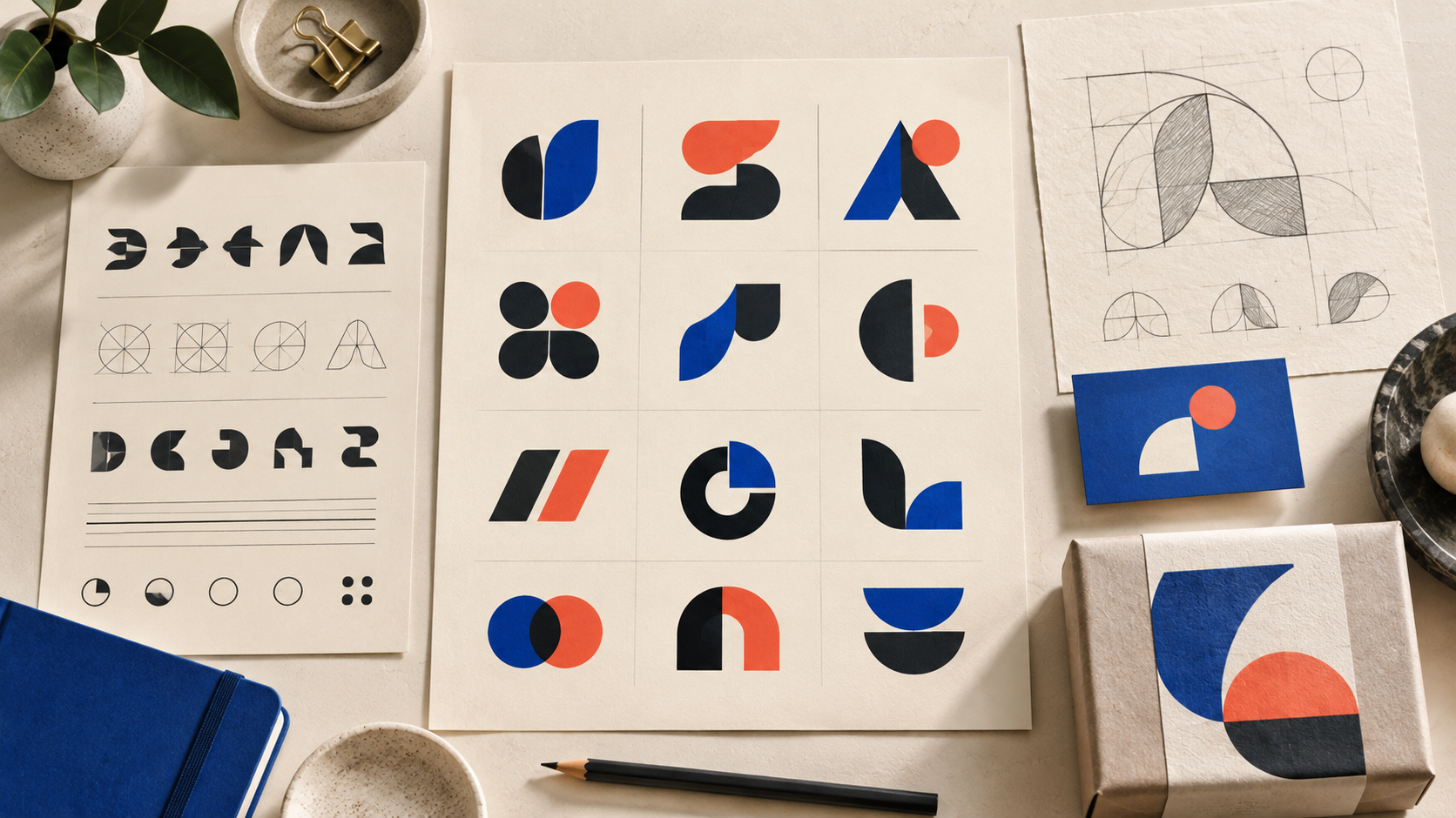
The right typeface can make a small business look established before a customer reads a single sentence. A friendly rounded sans serif can make a neighborhood service feel approachable; a high-contrast serif can make a boutique feel considered; a compact slab serif can suggest reliability on a work truck. The wrong font can make the same business look generic, dated, or difficult to read.
This guide presents 25 useful logo-font starting points and a practical way to choose among them. Treat every name as a direction to explore, not a finished logo. A designer will often adjust letterforms, spacing, terminals, or one distinctive character so the final wordmark belongs to your business.
25 logo fonts and the brand personalities they suggest
1. Inter. A neutral, contemporary sans serif that works well for software, consulting, and service brands that value clarity.
2. Manrope. Soft geometry gives technology, wellness, and modern retail a calm, welcoming voice.
3. DM Sans. Its open shapes are easy to scan, making it a flexible choice for local businesses and digital-first startups.
4. Work Sans. Practical proportions suit contractors, studios, and teams that want a capable, unfussy identity.
5. Nunito Sans. Rounded details add warmth without becoming childish; consider it for education, family, or community brands.
6. Montserrat. Strong geometric forms create a confident sign-ready wordmark for fitness, hospitality, and events.
7. Poppins. Circular geometry feels energetic and contemporary for apps, creative services, and youth-oriented brands.
8. Avenir Next. Its balanced humanist geometry can make professional services feel polished but not stiff.
9. Futura. Simple geometric construction gives architecture, fashion, and design businesses a precise, modern tone.
10. Helvetica Neue. A restrained neo-grotesk direction works when the brand needs to feel dependable and highly adaptable.
11. Source Sans 3. Humanist details improve approachability for nonprofits, education, and information-heavy services.
12. Gill Sans. Its distinctive humanist character can add editorial warmth to cultural, travel, and lifestyle brands.
13. Frutiger. Clear letterforms and generous counters are a useful direction for healthcare, transportation, and public-facing services.
14. Garamond. A classic old-style serif signals craft, heritage, and literary confidence for makers and premium goods.
15. Baskerville. High contrast and elegant proportions can elevate food, beauty, publishing, and hospitality brands.
16. Playfair Display. Dramatic serifs create a fashion-forward voice for boutiques, florists, and celebratory businesses.
17. Libre Baskerville. Traditional forms remain readable at useful sizes and can make a small firm feel thoughtful and trustworthy.
18. Lora. Curved, calligraphic details bring a personable editorial feel to coaches, cafés, and creative studios.
19. Roboto Slab. A sturdy slab serif adds authority without the formality of a traditional book face, useful for trades and food brands.
20. Rockwell. Blocky serifs are memorable on packaging, signage, and uniforms when a business wants a confident voice.
21. Cooper Black. Its rounded, playful weight suits dessert shops, entertainment, and nostalgic consumer brands; use it selectively.
22. Abril Fatface. Bold display contrast can create a distinctive headline-style wordmark for fashion and event businesses.
23. Caveat. A casual handwritten direction can feel personal for makers, artists, and small hospitality brands, but test its small-size clarity.
24. Pacifico. Brush-script energy works for relaxed food, surf, and lifestyle concepts when the name is short enough to stay legible.
25. Cinzel. Monumental capitals can suggest ceremony, luxury, or heritage for venues and premium services; pair them with generous spacing.
Start with the business, not the font list
Before testing type, write three words describing the brand you want customers to remember. “Precise, calm, expert” leads somewhere different from “playful, local, generous.” Then identify the practical setting: a van, storefront, mobile header, product label, social avatar, or all of them. A logo that looks excellent on a desktop mockup may collapse when embroidered or reduced to a favicon.
Name length matters too. Long names usually benefit from a highly legible family with several weights. Short names can carry more character, contrast, or unusual shapes. If your name includes narrow letters such as i and l, test the spacing carefully; if it includes wide letters such as M and W, check how the whole word fits in a horizontal lockup.
Choose a category that matches your positioning
Humanist sans serifs are a dependable choice for services that need to feel clear and approachable. Geometric sans serifs feel systematic and contemporary, but can become interchangeable if every competitor uses the same circular forms. Neo-grotesks are restrained and versatile, though they need custom spacing or a memorable symbol to avoid looking anonymous.
Serifs can communicate craft, history, or premium quality, yet delicate strokes need enough contrast to survive small applications. Slab serifs are useful when you want weight and durability, especially for trades, food packaging, and outdoor signage. Scripts and decorative faces are best used when personality is the strategy; keep a simpler supporting typeface for menus, invoices, and web copy.
Seven tests that separate a promising font from a pretty one
1. One-color test. Print the wordmark in black only. If its personality disappears without color, the structure needs work.
2. Distance test. View it from across a room and at thumbnail size. Customers often meet a logo at exactly those scales.
3. Production test. Place it on a vehicle panel, embroidered cap, cardboard box, and phone header. Look for counters that close and thin strokes that vanish.
4. Name test. Use the real business name, not a sample word. Awkward joins and repeated letters can change the decision.
5. Neighbor test. Put three competing local logos beside yours. The goal is recognizable difference, not novelty for its own sake.
6. Voice test. Ask someone unfamiliar with the project what three words the logo suggests. Compare their answer with your intended positioning.
7. Future test. Imagine adding a new service or location. A flexible wordmark should not lock the business into one narrow product.
Spacing, customization, and the difference between a font and a logo
Typography becomes branding through decisions around it. Adjust tracking until the word feels balanced, then inspect difficult pairs such as AV, Ta, or rn. Optical spacing—not a single automatic value—usually produces the most convincing result. A designer may redraw one letter, remove a terminal, connect two characters, or create a custom ligature. Those small changes can make a familiar typeface feel owned rather than downloaded.
Do not force every brand into a wordmark. A long name may need a compact monogram or icon for small spaces, while a short name may work beautifully as a standalone wordmark. Our guide to wordmarks, icons, and combination marks can help you decide which structure fits your growth plans.
Licensing and handoff questions to ask early
A font’s availability does not automatically tell you how every future use is licensed. Save the family name, version, source, and license information with your project files, and ask your designer what is being delivered as outlined vector artwork. The Google Fonts FAQ explains the licensing approach for its library; it is a useful starting point, but always read the terms for the exact font and use case.
Request editable vector files, a one-color version, reversed artwork, clear-space guidance, and the chosen typeface or custom-lettering notes. If your team needs to edit text later, document the font and approved alternatives. If the lettering has been converted to outlines, keep a separate editable source for internal reference.
Build a small, usable type system
A logo font is not necessarily the best font for paragraphs. Choose a complementary text family for websites, proposals, and invoices, then define a simple hierarchy: display, subhead, body, and labels. Keep contrast practical. When type appears in digital interfaces, review the W3C guidance on minimum text contrast so color and weight do not undermine readability.
Document the system in one page with the logo, minimum size, color versions, type choices, spacing examples, and a few “do not” examples. A new-business branding checklist is helpful when you are collecting those decisions before launch. If the mark starts to feel crowded, use the practical checks in our guide to testing logo complexity.
How to make the final choice
Shortlist three directions, not three nearly identical fonts. For each, create the same wordmark, icon lockup, social avatar, sign mockup, and one piece of real copy. Score them for fit, distinctiveness, legibility, flexibility, and production confidence. The winner is the direction that keeps working when the presentation polish is removed.
A designer can also explore these directions for you. In a clear logo brief, describe the audience, personality, applications, competitors, and words to avoid. You can leave the exact style open and ask for informed recommendations; the brief should give the designer enough context to make that choice responsibly.
The best logo font is therefore not the trendiest name on a list. It is the one whose shapes express the brand, survive real production, remain readable, and leave room for the business to grow. Explore broadly, test with the actual name, and refine the final lettering until it feels unmistakably yours.