
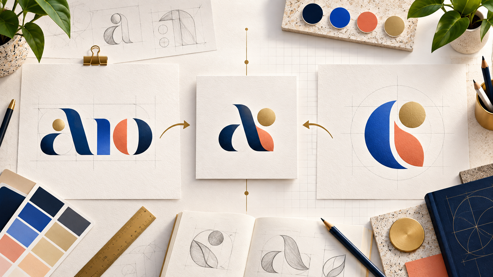
Choosing a logo often begins with one deceptively simple question: should your business use its name as the logo, rely on a symbol, or combine both? The answer affects how quickly customers recognize you, how easily your logo adapts to different spaces, and how much work your brand must do to build familiarity.
A wordmark can make a new name easier to remember. An icon can create a compact visual shortcut. A combination mark gives you both—and, for many new businesses, offers the most flexible starting point. This guide explains the major logo styles, which brands they fit best, and when it makes sense to let a designer or AI choose for you.
Wordmark vs. icon: the essential difference
A wordmark is a logo built primarily from the company name in distinctive typography. Its biggest advantage is immediate identification: every impression reinforces the name. Wordmarks work especially well for short, memorable, or unusual names and for businesses whose name already communicates what they offer.
An icon is a symbol, pictorial mark, or abstract shape that represents the brand without relying on the full name. Icons are compact, memorable, and useful in small spaces such as app buttons and social avatars. Their drawback is that an unfamiliar symbol does not automatically tell customers who you are.
A combination mark pairs a name with an icon. The two elements may sit side by side, stack vertically, or integrate into one composition. A well-designed combination mark can later separate into a full logo for formal uses and a standalone icon for compact applications.
Should I use a wordmark or an icon for my business?
Choose a wordmark when your business name is distinctive, reasonably short, and important to teach customers. This is often the right direction for consultancies, law firms, fashion labels, media companies, software products, and personal brands. A wordmark also helps when customers are unlikely to understand a symbol without explanation.
Choose an icon-led logo when the brand needs to work constantly in compact spaces, the symbol can express a meaningful idea, or the business already has enough recognition for the icon to stand alone. Apps, games, sports brands, consumer products, and global services often benefit from a strong visual shorthand.
If you are torn between the two, do not force the decision too early. Start with a combination mark and ask for versions that work together and separately. You will gain a clear name-led logo for launch plus a compact icon that can earn recognition over time.
The main logo styles and the brands they fit
Wordmark
A stylized business name. Best for brands with distinctive, short, or descriptive names. Wordmarks can feel modern, premium, playful, technical, or traditional depending on the typography. They are less effective when the name is extremely long or must fit tiny square spaces.
Lettermark or monogram
Initials or interlocked letters that shorten a long name. This style suits professional services, institutions, property businesses, fashion brands, and companies commonly known by an abbreviation. It creates a compact mark but may require the full name nearby while awareness grows.
Pictorial icon
A recognizable object, animal, plant, or other real-world symbol. It works well when the chosen image connects naturally to the product, audience, origin, or brand story. The best pictorial icons are simple enough to recognize instantly and distinctive enough not to feel generic.
Abstract mark
A unique geometric or conceptual symbol rather than a literal object. Abstract marks suit technology, finance, global services, and ambitious brands that want to own a distinctive visual idea. They are versatile but require a clear concept and consistent marketing to gain meaning.
Combination mark
A wordmark plus an icon. This is a strong fit for startups, local businesses, online stores, restaurants, trades, wellness brands, and most companies that need both immediate clarity and long-term flexibility. It is often the best default for a new business.
Emblem
Text enclosed within a badge, seal, shield, or crest. Emblems can communicate heritage, authority, craft, or community. They suit schools, clubs, breweries, automotive businesses, outdoor brands, and traditional makers. Because they can become detailed, always request a simplified version for small screens and embroidery.
Mascot or cartoon mark
A character who becomes the face of the brand. Mascots work well for food, sports, entertainment, family services, education, gaming, and friendly consumer brands. They provide personality and storytelling opportunities but need simplified variants for formal or tiny applications.
Signature logo
A handwritten or calligraphic name. Signature logos can feel personal, artisanal, luxurious, or expressive, making them useful for photographers, beauty professionals, artists, designers, hospitality businesses, and founder-led brands. Legibility and reproduction at small sizes are the main considerations.
Illustrative logo
A detailed drawing or scene that communicates atmosphere and story. It can suit specialty food, tourism, independent retail, craft products, venues, and brands with a rich sense of place. Illustration creates character, but the system should include a reduced mark for practical everyday use.
Let your brand designer choose
A design brief should explain the business, audience, positioning, personality, competitors, applications, and any genuine constraints. It does not always need to prescribe a wordmark, icon, emblem, or combination mark. If you are uncertain, leave the style open and invite designers to recommend the best structure based on the brief.
This can produce more varied and thoughtful concepts. One designer may discover that the name has strong typographic potential; another may identify a symbol that captures the brand promise; a third may find that a flexible combination system solves both needs. You can then judge real options rather than making an abstract decision before seeing any design work.
When launching a design contest with 48hourslogo, focus the brief on what the brand should communicate and where the logo will be used. If no style is essential, say that you are open to designer recommendations.
Let AI recommend a logo style
A logo generator can also reduce the pressure to choose a category upfront. LogoAI says its generator reads the business name, industry, and intent to identify suitable visual directions. On the logo-style screen, users can select options such as wordmark, combination, abstract, emblem, mascot, monogram, signature, cartoon, or illustrative—or skip manual selection and choose Surprise me so the AI proposes a direction.
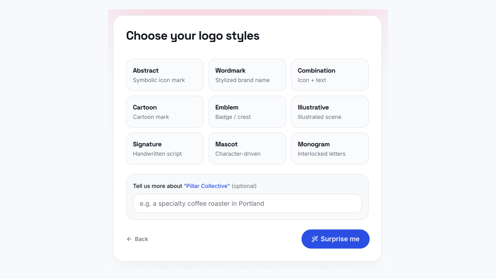
This is useful when you want to explore possibilities without anchoring yourself to one format. Treat the AI recommendation as a starting hypothesis. Review whether the result reflects your positioning, is distinct from competitors, reads at small sizes, works in black and white, and can adapt across the touchpoints your business actually uses.
A practical way to make the final decision
Ask for two or three strategically different routes rather than dozens of random variations. Test a name-led option, a symbol-led option, and a combination system against the same real applications. Place each one on a website header, phone screen, social avatar, business card, storefront, and one-color document.
Then evaluate recognition, readability, distinctiveness, relevance, scalability, and versatility. The winning logo is not simply the most attractive at full size. It is the one that helps the right people recognize and remember the business wherever it appears.
Frequently asked questions
Should I use a wordmark or an icon for my business?
Use a wordmark when teaching the business name is the priority and the name is distinctive enough to carry the identity. Use an icon when compact recognition matters and the symbol has a strong, ownable idea. If both needs matter, use a combination mark.
Should a new business use a combination mark?
In many cases, yes. A combination mark is usually the safest and most adaptable choice for a new business because it introduces both the name and the visual symbol at the same time. Customers do not have to guess what an unknown icon represents, while the icon begins building its own association with the brand.
Request a primary lockup, stacked and horizontal alternatives, an icon-only version, and a wordmark-only version. A new business may skip the combination route when its name is clearly its strongest asset, a founder’s signature is central to the positioning, or an emblem is essential to the brand story.
What logo style should I choose for my brand?
Choose according to your name, audience, brand personality, applications, and reproduction needs. Consider whether customers need to learn the name quickly, whether the logo must fit app icons or social avatars, what personality it should communicate, and whether it needs to print, engrave, embroider, animate, or work in one color.
A long institutional name may benefit from a monogram. A short original name may become a memorable wordmark. A children’s activity brand may need a mascot. A heritage food maker may suit an emblem or illustration. Do not select a style only because it is currently popular; if you remain unsure, let designers explore several strategic directions.
What is the best logo style for a new business?
For most new businesses, a simple combination mark with separable elements is the most versatile default. It helps people connect the name to the symbol, supplies useful arrangements for different spaces, and allows the icon to stand alone after recognition grows.
That does not make combination marks universally superior. A unique company name may be more powerful as a wordmark, while a mascot, emblem, signature, or illustration may fit a specific personality more naturally. The best style is the one that communicates the right idea and remains clear wherever customers encounter it.
Final takeaway
A wordmark builds name recognition. An icon creates compact visual recognition. A combination mark connects the two and is often the most practical launch system. But the strongest choice comes from the brand strategy and real-world uses—not from a rigid rule.
Give designers the freedom to recommend a style when you do not have a strategic reason to specify one. If you prefer an automated starting point, use a logo generator’s AI recommendation or “Surprise me” option, compare the directions in context, and choose the system that remains clear, distinctive, and useful as the business grows.