
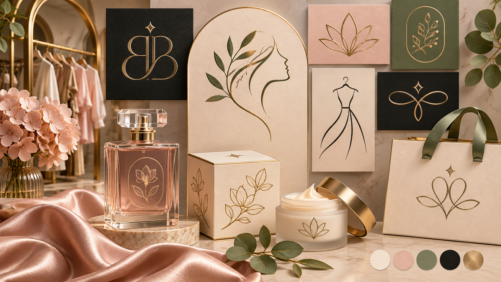
A premium-looking boutique or beauty logo does not have to be ornate, gold, or covered in script. It needs to make a clear promise about taste, quality, and the experience customers can expect. The best direction depends on the audience, price position, product category, and where the logo will appear—from a tiny social avatar to a storefront, product label, or shopping bag.
These 25 ideas are organized as starting points rather than rigid templates. Each one includes the visual logic behind it, the businesses it can suit, and a practical caution to test. Use the list to brief a designer, compare concepts, or identify a direction for an AI-assisted exploration.
25 boutique and beauty logo ideas
1. Refined wordmark. Use a carefully spaced serif or humanist sans serif for a fashion boutique, skincare studio, or personal styling service. Let the letterforms carry the identity and keep the lockup easy to read.
2. Initial monogram. Interlock one or two initials for a jewelry maker, private salon, or premium accessories label. Draw the connections deliberately so the mark remains recognizable at small sizes.
3. Botanical line mark. A single leaf, stem, or flower can suggest natural ingredients, calm, or craft for a skincare, florist, or wellness brand. Avoid generic leaves by choosing a distinctive silhouette.
4. Abstract profile. A simplified face or hair contour can work for a beauty studio or makeup artist. Keep the profile geometric enough to reproduce on a stamp and avoid relying on tiny facial details.
5. Cameo emblem. A profile inside an oval or medallion can create a heritage feel for fragrance, fashion, or bridal services. Use it when the brand wants ceremony rather than a casual tone.
6. Minimal flower symbol. Reduce a flower to three or four intentional shapes for a modern beauty brand. Test it in one color so the symbol feels designed rather than dependent on gradients.
7. Ribbon monogram. A flowing stroke that forms an initial can suit a bridal boutique, event stylist, or premium gift shop. Make sure the loop does not become an unreadable knot.
8. Fragrance bottle icon. A simplified bottle or atomizer can identify a perfume business immediately. Keep the outline distinctive and avoid copying a recognizable product silhouette.
9. Architectural boutique mark. Use an abstract arch, doorway, or façade for a curated retail shop, interior studio, or luxury accommodation brand. Strong geometry helps the mark work on signage.
10. Handwritten signature. A controlled signature can feel personal for an independent designer, makeup artist, or stylist. Pair it with a clean supporting line so customers can read the business name.
11. Seal and date line. A circular seal can signal craft, tradition, and small-batch production for a maker or apothecary. Keep the text minimal; crowded seals lose clarity quickly.
12. Gemstone geometry. Faceted shapes can suggest jewelry, nail art, or high-end accessories. Use one unusual angle or cut instead of a predictable diamond clip-art symbol.
13. Soft arch wordmark. A shallow arch over the name can frame a spa, skincare clinic, or wellness studio. The curve should support the wordmark, not squeeze it into a badge.
14. Two-letter ligature. Connect two adjacent initials into one compact shape for a boutique with a short name. Explain the reading order in the brand guide so the symbol does not feel accidental.
15. Botanical monogram. Integrate a small leaf or petal into one letter for a natural cosmetics or floral fashion brand. Keep the letter legible when the mark is embroidered or stamped.
16. Editorial serif. A high-contrast serif wordmark can create a magazine-like mood for a fashion label or concept store. Check thin strokes at small sizes and create a sturdier alternate version.
17. Rounded modern sans. Soft geometry feels welcoming for an inclusive beauty service, salon collective, or lifestyle shop. Distinguish the design with spacing or a custom character rather than relying on a common font alone.
18. Art-deco frame. Symmetry and restrained geometric lines can suit an eveningwear boutique, barbershop, or hotel salon. Use the frame as an optional asset so the name remains flexible in digital layouts.
19. Abstract petal grid. A modular petal pattern can become a useful icon, packaging texture, or social background for a beauty brand. Build a simple one-color version before adding color variation.
20. Mirror initials. Reflecting two initials can create a memorable badge for a fashion duo, design studio, or family-run boutique. Test the mark at a distance because symmetrical forms can become ambiguous.
21. Wax-stamp mark. A compact emblem with a slightly imperfect edge can suggest artisan production for candles, soaps, or handmade accessories. Keep the “handmade” quality controlled rather than distressed.
22. Minimal hanger icon. A single hanger or clothing line can clarify a resale shop, tailor, or capsule wardrobe service. Simplify it enough to work as a favicon and avoid literal detail.
23. Celestial beauty mark. A crescent, star, or orbit can support a nighttime skincare, fragrance, or self-care brand. Pair the symbol with grounded typography so it feels premium rather than mystical by default.
24. Custom lowercase wordmark. Lowercase lettering can feel modern, calm, and approachable for a direct-to-consumer beauty label. Adjust one letter to create a memorable signature and test the name in packaging sizes.
25. Combination mark with a flexible icon. Pair a clear name with a symbol that can stand alone on a bottle cap, profile image, or clothing tag. This is often the most adaptable direction for a new brand.
How to make a logo feel premium without overdecorating it
Premium perception usually comes from control: consistent spacing, intentional proportions, a limited palette, and high-quality applications. Start with a strong silhouette and a readable name. Then test paper texture, foil, embossing, or a restrained metallic accent only if the production method supports it. A simple mark used consistently can feel more luxurious than a complicated mark that changes in every channel.
Typography does much of the work. A refined serif can signal heritage, while an open sans serif can feel contemporary and inclusive. Combine one distinctive display choice with a practical supporting family. Our guide to logo fonts for small businesses explains how to test personality, readability, and small-size performance.
Color choices for boutique and beauty brands
Black and cream create a classic editorial base. Blush, terracotta, and muted rose can add softness; sage, olive, or deep teal can suggest botanical or modern wellness cues. Gold and silver work best as production finishes or restrained accents rather than as the only source of distinction. Always create a one-color version first, then check color pairings for readable text. The W3C contrast guidance is a useful reference when your palette appears on websites, menus, and product information.
Choose the idea that fits the business
Ask what customers are buying beyond the physical product. A bridal stylist may sell reassurance and ceremony; a resale boutique may sell discovery and curation; a skincare studio may sell expertise and calm. The logo should support that promise without making unsupported claims about ingredients, results, or status.
Then list the real applications: storefront, garment label, bottle, shipping box, booking page, social avatar, staff uniform, and printed card. A delicate illustration may be beautiful on a large sign but impossible on a small stamp. A badge may work on packaging but feel crowded in a mobile header. Request horizontal, stacked, icon-only, light, dark, and one-color versions as needed.
Common mistakes to avoid
- Using a generic leaf, crown, diamond, or lipstick icon without a distinctive treatment.
- Choosing a script that looks elegant in a mockup but cannot be read on a phone.
- Adding too many thin lines, small initials, or decorative frames.
- Using metallic gradients when the business will mostly print in one color.
- Copying the visual language of a famous luxury brand instead of defining your own.
- Forgetting a practical secondary typeface for menus, invoices, and web copy.
Use the checks in our guide to testing logo complexity before you approve a highly detailed concept. If you are still deciding between a wordmark, icon, or combination mark, compare the structures in our logo-style guide.
Turn the chosen logo into a complete experience
Once you choose a direction, build a small brand kit with approved colors, typography, imagery examples, packaging layouts, social templates, and logo usage rules. Our guide to building a brand kit from your logo shows how to organize those decisions so collaborators can use them without guessing.
For a new business, a designer can explore these styles from a brief without forcing you to select a style in advance. Share the audience, product, mood, competitors, and applications, then let the designer recommend the structure that best fits. A clear logo design brief gives the creative process useful boundaries while leaving room for an unexpected but appropriate idea.
The best boutique or beauty logo is not simply the most decorative option. It is the one that makes the right promise, remains recognizable in real use, and gives the brand a distinctive visual language to grow into. Start with the business, test the mark everywhere customers will see it, and let refinement—not ornament—create the premium feel.