
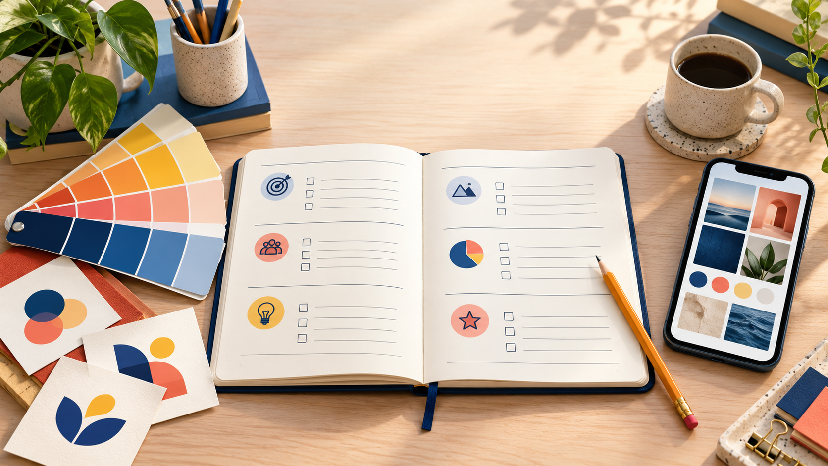
Updated October 2026. A logo design brief is not a test of your design vocabulary. It is a short, useful explanation of your business and the decision you need a designer to make. The strongest briefs give context: who you serve, what makes you different, how the logo will be used, and what the customer should feel. They leave enough room for designers to bring their own ideas.
You do not need a perfect mood board or a preselected logo style to begin. In fact, prescribing an icon, font, and color before you have seen any concepts can limit the work. A clear brief is better than a long list of instructions. Use the guide and copy-and-paste template below to turn what you already know about your business into a productive design conversation.
What a logo design brief should accomplish
A useful brief aligns the business owner and designer around the same goal. It tells the designer what the company does, who will encounter the logo, what should make it distinct, and where the mark has to work. It also identifies true constraints: a long business name, a legacy color that must remain, a storefront sign, a vehicle wrap, or a tiny app icon.
The brief is not meant to solve the design before the process begins. Think of it as the difference between saying “make a blue logo with a mountain” and saying “we are a regional outdoor guide for first-time hikers; customers should feel prepared rather than intimidated; the logo will appear on trailhead signs, hats, and a small mobile booking screen.” The second version gives a designer a problem to solve.
Start with your business, not the logo
Write two or three plain sentences about what the business does. Include the product or service, the customer, the location if it matters, and the reason someone chooses you. Avoid vague claims such as “high quality” unless you explain what that means in practice. Is the company fast, local, highly specialized, family-run, premium, low-friction, or unusually friendly? Those details give the designer material to work with.
Next, name the audience. “Everyone” is not an audience. A business may serve busy homeowners, office managers, first-time parents, restaurant owners, procurement teams, collectors, or outdoor enthusiasts. The U.S. Small Business Administration notes that market research and competitive analysis help businesses find customers and identify an advantage. You do not need a formal research report for a brief, but you do need a believable picture of the people the logo should reassure or attract.
The eight details designers need most
1. Business name and descriptor
Give the exact legal or customer-facing name, including capitalization, punctuation, spacing, and any required descriptor. If “North Point” must be followed by “Home Services,” say so. If the logo can use initials or a shortened name in some situations, say that too. Small spelling details are much easier to resolve before concepts are created.
2. What you do and what makes you different
Describe the offer in one sentence, then explain the difference in another. A local bakery is not just a bakery if it specializes in naturally leavened bread and neighborhood delivery. A consultant is not just a consultant if they work only with family-owned manufacturers. Designers use these distinctions to avoid generic symbols and surface a more specific visual direction.
3. Target customers
Include who chooses the service, what they care about, and how familiar they are with the category. A logo for a commercial supplier may need to emphasize precision and reliability; one for a children’s activity program may benefit from energy and warmth. You do not need to stereotype customers. Just give the designer a grounded audience to consider.
4. Brand personality
Pick three to five descriptive words. “Warm, simple, capable” is more useful than “nice.” “Technical, calm, quietly premium” creates a different path from “bold, playful, neighborhood-focused.” Also name one or two qualities to avoid. For example: “not childish,” “not aggressive,” or “not overly corporate.” This is one of the fastest ways to improve a designer’s first round.
5. Competitors and differentiation
List two or three competitors or alternatives your customer is likely to see. Explain what is common in the category and what you want to avoid repeating. You are not asking the designer to copy a competitor; you are helping them see the visual landscape. If every nearby contractor uses a roofline in red and black, a different structure or palette may help your company become easier to remember.
6. Where the logo will be used
This is often the most overlooked part of a brief. List the first applications, such as a website header, social profile, product label, storefront, vehicle, workwear, proposal cover, or mobile app. A logo that looks good on a presentation slide may fail when embroidered, reduced to a favicon, or printed in one color. The applications tell the designer which trade-offs matter.
7. Visual preferences and references
References work best when you explain what you like about them. Instead of pasting five logos, write “I like the confident spacing,” “I like how the icon is simple enough for a cap,” or “I like the restrained use of color.” You can also include non-logo references: an interior, a product, a landscape, or a material can communicate a mood more clearly than another brand mark.
8. Non-negotiables and open questions
Separate real requirements from early hunches. A required color, established name, existing customer recognition, or legal constraint belongs in the brief. Whether the logo should be a wordmark or an icon may be an open question. If you are not sure, say that you want designers to recommend the right structure. That preserves useful creative range.
Copy-and-paste logo design brief template
Business name: [Exact business name and any required descriptor]
What we do: [One or two sentences describing the product or service]
What makes us different: [Your specific advantage, origin story, specialty, or customer promise]
Our target customers: [Who they are, what they need, and what matters to them]
We want customers to feel: [Three to five adjectives]
We do not want to feel: [One to three qualities, styles, or clichés to avoid]
Competitors or alternatives customers may compare us with: [Names or links, plus a sentence about what is common in the category]
Where the logo will appear first: [Website, social avatar, signage, packaging, vehicle, uniforms, etc.]
Color and style preferences: [Preferences, references, and the reason behind each one]
Must include: [Required name, wording, color, symbol, or practical constraint]
Please avoid: [Specific clichés, colors, symbols, or visual moods that do not fit]
Style decision: [Choose a direction if it is essential, or write: “We are open to designers recommending the best logo style for this brief.”]
An example of a stronger brief
Here is a concise example for a fictional business: “Harbor & Hearth is a local home-organizing service for busy families and older homeowners in coastal Maine. We help people make everyday spaces easier to live in, without making their homes feel staged. We want to feel calm, practical, warm, and trustworthy—not luxury-minimal or overly cute. The logo will appear on a white service van, a booking website, navy work shirts, and small social avatars. We like natural, grounded colors and simple shapes. Please avoid cluttered house icons, cursive lettering, and obvious coastal clichés. We are open to a wordmark, icon, or combination mark if it fits the business.”
Notice what this brief does not do: it does not demand a lighthouse, a specific font, or a finished logo idea. It provides enough information to inspire several different directions while making it clear which choices would be off target.
How much detail is too much?
Detail is useful when it clarifies the business problem. It becomes unhelpful when it dictates every line, color, and symbol before a designer has explored the brief. If your notes are long, organize them under the headings above and distinguish “must have” from “nice to have.” A designer should know which instructions cannot change and which preferences are open to interpretation.
Avoid treating references as a menu. A mood board should communicate a direction, not authorize a copy. If you are concerned about a specific similarity or legal question, get appropriate professional guidance rather than asking a designer to replicate an existing mark.
Use the brief to give better feedback
The same brief becomes your feedback filter. When you receive concepts, return to the audience, personality, and applications. Instead of saying “I do not like this,” try “the name becomes too quiet on the van,” “this feels more playful than calm,” or “the icon is strong, but it does not yet reflect our practical service.” Feedback tied to the brief gives designers a direction they can act on.
If you plan to run a contest, use the guide to a successful logo contest alongside your brief, and check the 48hourslogo FAQ for the current process. If you are still unsure whether to specify a wordmark, icon, or combination, our guide to choosing a logo style explains why it is sometimes best to leave that decision open.
A good logo brief is not a promise that every concept will be perfect. It is a practical way to make the first round more relevant, make feedback more useful, and arrive at a logo that actually fits the business you are building.