Many designers claim that design is mathematics and that correct design is mathematically accurate. This can be understood in many ways, accepted or not, but the fact is that there are rules in design, especially if we talk about colors.
In this article, we will deal with the rules regarding colors in logo design, that is, we will try to single out the most important things and color rules such as "max 3 logo colors" that should be followed during logo design. We all know that choosing the fonts is always a big deal and a very important process, but choosing the colors for your logo is also a strategically important step, so here is some advice that can be useful to both, clients and designers. We have five rules to recommend!
1. THE PSYCHOLOGY OF COLORS AND YOUR LOGO
The psychology of colors. A topic that is widely written about, and every designer, even a beginner, is familiar with the basics of color psychology theory. It should be noted here that certain colors have different meanings in relation to the gender and age of people.
For example, the scientific conclusions of the greatest authority when it comes to color theory, Faber Birren, show that older people are more in favor of blue, far more than younger ones, while, say, pink is a favorite color among the female population.
Finally, we must not lose sight of the cultural framework, that is, certain colors in different societies have special meanings or they are connected to some things in a very special way. For example, if you are having the task of designing a church logo, then you should pay attention to colors that are connected to the religion to which this church belongs. It is an example of a specific cultural sphere in which the psychological influence of colors is a very sensitive issue and plays a very important role.
Everything should be considered in relation to the brand, subject, and the company for which the logo is designed, that is, in accordance with their needs and their brand philosophy.
Here we present some emotions and psychological elements related to colors ...
Black
Strength, Authority, Simplicity, Power, Mystery, Elegance, Boldness, and Sophistication
White
Pure, Peaceful, Spiritual, Clean, Clarity, Goodwill, Innocence, Goodness, and Relaxing
Grey
Neutrality, Silence, Severity, Money, Balance, Authority, Traditional, and Seriousness
Red
Energy, Attraction, Passion, Love, Sex, Anger, Emotion, Happiness, Power, and Excitement
Yellow
Optimism, Nature, Happiness, Warmth, Innovation, Clarity, Positivity, and Caution
Blue
Professionalism, Power, Trust, Authority, Stability, Harmony, Peace, Calm, and Loyalty
Green
Harmony, Natural, Healthy, Renewal, Money, Growth, Fertility, Balance, and Generosity
Orange
Optimism, Creativity, Adventure, Enthusiasm, Success, Vibrant, Playful, and Energetic
Purple
Imagination, Royalty, Luxury, Celebration, Femininity, Mystery, Erotic, and Elegance
Pink
Feminism, Playfulness, Immaturity, Innocence, Erotic, Youth, and Beauty
Brown
Reliable, Solid, Strength, Masculine, Calm, Dirt, Slow, Old, and Natural
Silver
Mysterious, Luxury, Seriousness, Leadership, Strength, Intellect, and Speed
Gold
Luxury, Passion, Richness, Strength, Tradition, Spirituality, Optimism, and Leadership
2. START THE LOGO DESIGN WITH BLACK AND WHITE COLORS
A rule you should never bypass is to start your logo design using black and white. This "colorless" approach to creating the basic design of your logo allows the structure, shape, and relationship between the elements to be defined and thought out in the best way.
Simply put, it is the skeleton of your logo. A good parallel is a relationship between HTML and CSS. Build this skeleton first, and then apply color palettes. Adding colors will then be styling, that is, what CSS is when added to HTML.
Set yourself the rule that, in the first place, the logo must look good in the black and white (or so-called "greyscale") combination.
3. MAX THREE LOGO COLORS + (60/30/10) PALETTE RULES
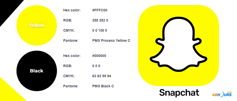
The rule we are going to recommend here is not to use more than three colors. It's not the law, but three colors are enough. Using more than three colors can be good, but experience shows that in most cases it is an unnecessary complication and aggravating destabilizing element in the overall design concept.
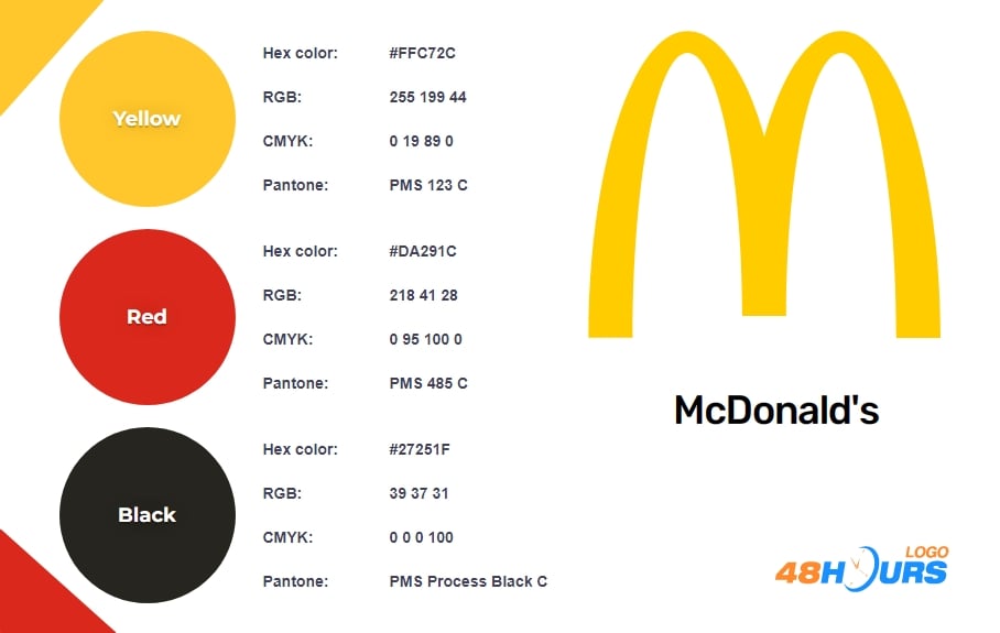
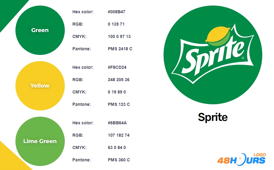
In accordance with this, we also recommend the so-called 60/30/10 rule for creating a color palette. When you are building a new color palette, it should be done like this... 60% of the palette should be the one main color you choose, 30% of the palette should contain complementary color, and 10% of it should be an accent or shade color.
Of course, we will also mention color contrast as a very important thing in logo design. The ratio of colors, the ratio of letters and background - the contrast in every sense is something you should pay special attention to. Don't lose sight of the fact that about 8% of people in the world have a problem with color recognition, so in the field of accessibility, the issue of color contrast is extremely important.
Pro Tip: If you’re unsure how to build a balanced palette, lots of AI tools like AI-powered color palette generators can suggest harmonious color combinations based on your brand style. These tools help you follow the 60/30/10 rule and test for accessibility contrast, saving time and improving design quality.
4. USE THE COLOR WHEEL FOR YOUR LOGO
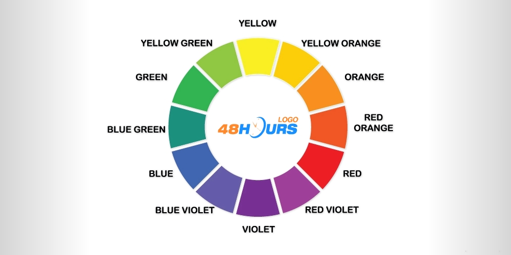
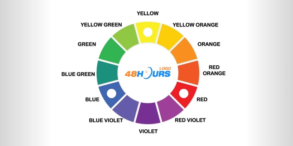
The smartest solution for the unmistakable creation of good color palettes and schemes is the color wheel. It is a diagram showing 12 colors and the relationship between them. There are primary, secondary, and tertiary colors. As for color schemes, following the rule of a maximum of three colors, here we will turn our attention to complementary, split-complementary, and triadic schemes.
Primary colors
Blue, red and yellow are the primary colors. By combining these colors we form secondary colors.
Secondary colors
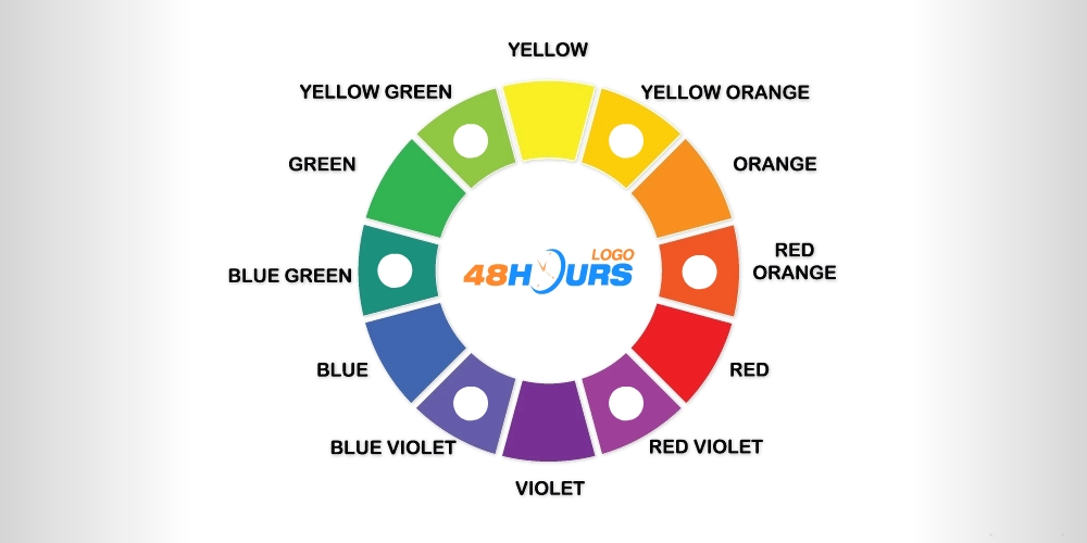
The secondary colors are purple/violet (red + blue), green (blue + yellow), and orange (red + yellow). Tertiary colors are obtained by combining primary colors with secondary colors.

Tertiary colors
As we have said, tertiary colors are a combination of primary and secondary colors. For example, red orange, blue violet, etc.
Complementary colors scheme
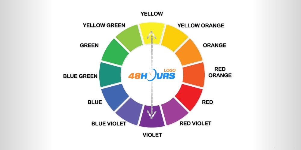
Complementary colors are the ones that are on opposite sides of the color wheel, simply said. The basic complementary colors are blue and orange, red and green, and yellow and purple/violet. This is a very important rule to follow in creating your color palette, that is, the color scheme.
Split-complementary colors scheme
This scheme incorporates the two neighboring hues of a color’s complement. For example, yellow + blue violet + red violet.

Triadic colors scheme
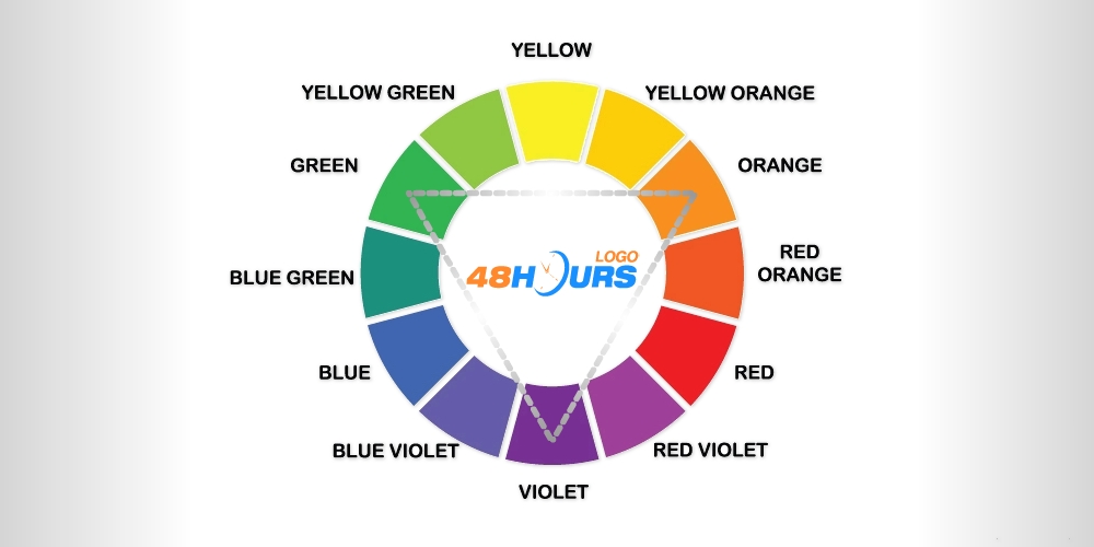
A triadic scheme consists of three colors that are placed equidistant from each other. It can include three primary, secondary, or tertiary colors. For example, green + orange + violet.
5. CMYK AND RGB COLORS + LOGO BOOK OF STANDARDS
Finally, from a series of important rules, we will single out the need for CMYK and RGB versions of the logo. When you’re applying your logo to packaging such as custom Mylar bags, pouches, or printed boxes, it’s vital to ensure the CMYK version of your logo is optimized for the print substrate. Simply put, CMYK is a color system used for printing purposes, and RGB is a system that suits more digital space. In addition to exporting logos in vector and other basic formats, it is especially important to make versions of the logo in CMYK and RGB so that the client has everything he needs to successfully use his new logo.
We will additionally mention, if your scale of professionalism is raised high, then you will document everything that defines the design concept of a logo. This includes colors, color palettes, fonts, the layout of all logo elements in detail in each pixel, as well as the overall color psychology and philosophy of the logo. Often such a document contains dozens of pages.
Whether you are designing a small local pizzeria logo or it is a logo for a larger construction or roofing company, as a designer try to have at least a short document with basic information about the logo concept. Every client should request this from their hired designer.
This document "Logo Book Of Standards" or as it is also called "brand guidelines book", "logo guidelines book", "logo toolkit", etc … is imperative for every top professional designer.