
The typeface, or font, is a basic element of logo design. There are hundreds of fonts in contemporary use, and new designs are introduced every year. The classics are still the bestsellers – no surprise, considering some have withstood a centuries-long test of time.
Whether you’re using a standard like the simple, elegant Helvetica, or a fresh and fun Cocon, the typeface you choose adds character to your logo. You might even say it’s the voice of your brand name.
If you’re designing a new logo and wondering which typeface would suit, take a look below. These fonts, some of the most famous in history, are widely used in wordmarks. Consider the character each one lends to a design, and take a cue from the brands that use them now. You’re sure to find something just right for your business!
Popular fonts for logo design
Frutiger
The Frutiger typeface (Adrian Frutiger, 1975) is playful and professional, simple and fun. As a sans serif font it offers good flow and readability, ideal for a logo that lives in the digital space.
It was originally designed for signage at the Charles de Gaulle airport in France. The intention was to design a font that could be seen clearly from a distance, and it remains one of the most legible fonts in both print and web.
Which brands use the Frutiger typeface?


Times New Roman
Yes, you guessed right: it's the original newspaper font. Times New Roman (Victor Lardent and Stanley Morrison, 1932) was first commissioned by The Times of London and replaced the Didone styles that were favored for newsprint at the time.
It’s a relatively readable serif typeface, still used for book printing and as the standard for Microsoft program interfaces.
Which brands use Times New Roman?

Didot
This serif font is actually a family of typefaces, developed by the Didot family of the French printing industry. Didot is characterized by conjoined thin and thick lines and is often used by luxury brands. It imparts an imperial, classic look, reminiscent of pillars in ancient Greek architecture or a royal palace. It denotes esthetic tradition and luxury.
Although Didot fonts possess a commanding presence, they have low legibility. This type is best for a known brand with a logo that is easily recognizable without being read.
Which brands use the Didot typeface?
Garamond
Garamond is an old-style, serif typeface developed between 1520 and 1560 by Claude Garamont. It was heavily used in book printing for the next two centuries until the Didone style was favored instead.
Developed during the golden age of the printing press, Garamond is a true classic: elegant, minimalist, prestigious, and strong. It has enjoyed multiple revivals, including a revision for digital media.
Garamond is used in brand names with a long history and is easily recognizable. It’s also used in titles with large point sizes and non-digital media like movie posters, TV show titles, and album covers.
Which brands use the Garamond typeface?

Avenir
Another from the revered designer Adrian Frutiger, this font was his latest (1988), and in his opinion, his greatest work.
Avenir is a simple, rounded sans serif typeface family that offers a variety of styles and weights to accommodate color-on-color presentation. Its flexibility makes it ideal for logos that appear primarily in digital media.
Which brands use Avenir in their logos?

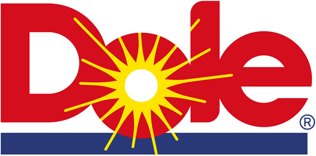
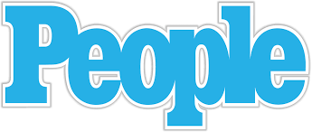
Helvetica
Helvetica (Max Miedinger and Eduard Hoffman, 1957) is perhaps the most famous of fonts. It’s widely used for wordmarks, and is even the subject of a feature-length film.
This sans serif typeface has simple, classic lines and a professional appeal. Its designers intended a typeface with no connotation – as plain as possible – that could be used on a wide variety of signage.
As a result, Helvetica is highly legible and offers maximum utility as a logotype: It’s simple enough that slight typographical variations produce a dramatically different look.
American Apparel, Lufthansa, Staples, Jeep, Nestle, Toyota, BMW, Sears, American Airlines, Microsoft, Panasonic, 3M, Evian, and many more brands all use Helvetica in their logo.
Take a look at the variety of logos that use Helvetica:
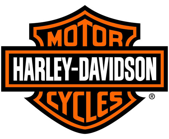
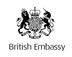
FF Dax
The FF Dax typeface is a modern sans serif, designed by Hans Reichel in 1995. Its light, streamlined style gives the impression of movement, access, and inspiration for action while remaining heavy on character.
FF Dax has been widely used in marketing and communications, and as a logotype for political parties, banks, embassies, airlines, and communications and delivery services.
Which brands use FF Dax in their logos?
Clarendon
Clarendon (Robert Besley, 1845) is a classic slab-serif font that hails from a time when all media was print media. It was originally designed for a London letter foundry, and has historically been used for posters (think WANTED… DEAD OR ALIVE) and print displays with three-dimensional type. The serifs, and the varying thickness of its curved lines are heavy on style, which is well-tolerated in print and large point size.
Consider Clarendon for a logo that primarily appears in print, on textiles, on signs, or for a wordmark that uses only a few letters in large print.
Which brands use the Clarendon typeface?
Optima
The Optima typeface (Hermann Zapf, 1955), with its long, curved lines, was inspired by the ancient art of stone carving. It’s also highly legible thanks to its sans-serif style. Optima has a fluidity that makes it both elegant and readable, unique among typefaces with variable line width.
Which brands use the Optima typeface?
Cocon
Cocon (Evert Bloemsma, 2001) is a rounded, asymmetrical sans serif font that’s fun, imaginative, non-conformist, and creative. It sports unique detail and offers good readability in small point sizes.
Cocon is different: it features ligatures but doesn’t attempt to imitate type or handwriting. Instead, it has a flowing character like Chinese calligraphy, something many people come across when they learn Chinese and study traditional writing styles.
Which brands use Cocon in their logos?

Do any of these typefaces have virtues that would work well in your logo? Do you see a pattern among the big names in your industry?
Taking your time to make a selection is worth it. Fonts are famous for a reason - they add as much character to a logo as a symbol or a name. Choosing well will enhance the image of your brand and grow your business.