
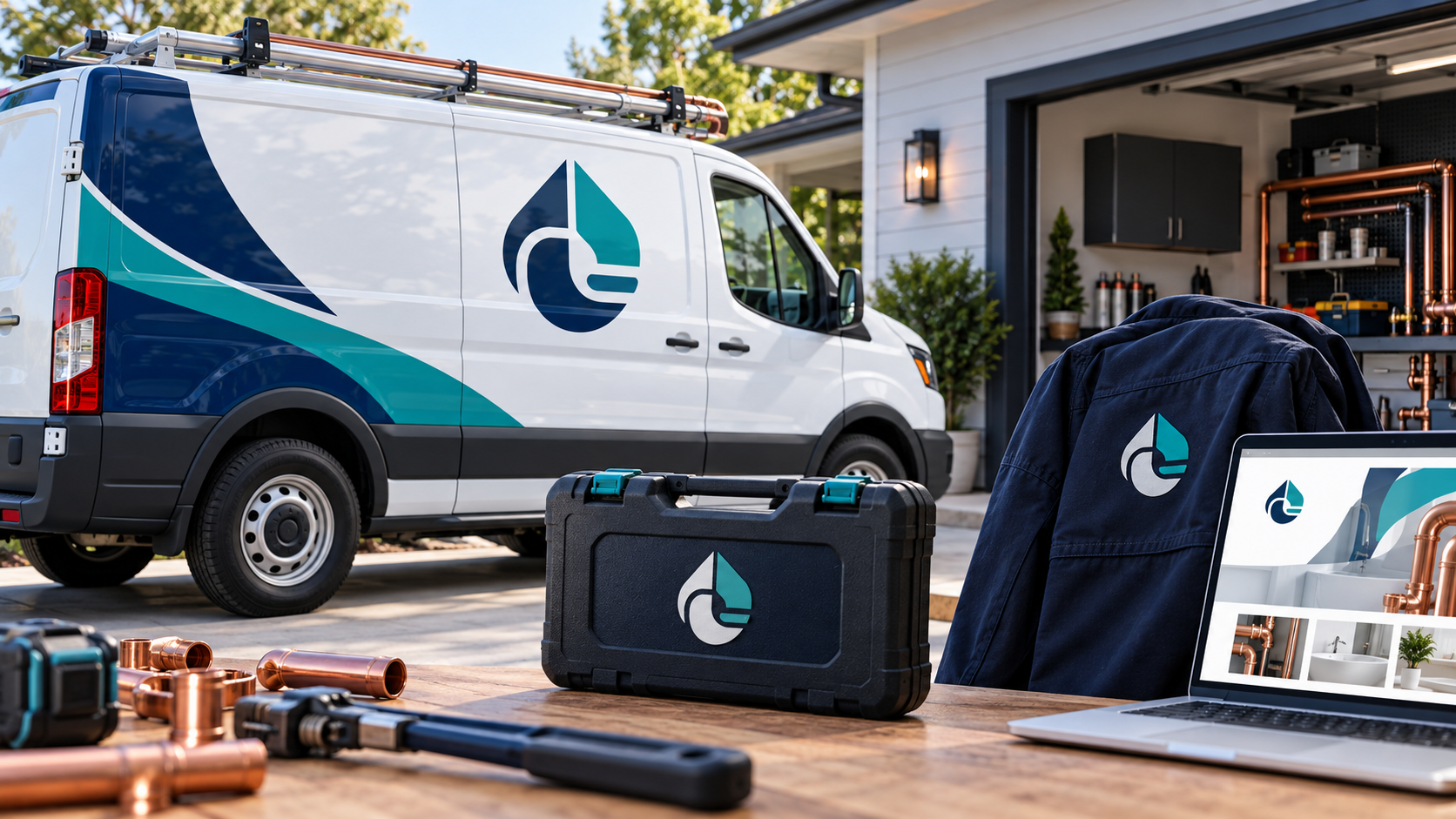
Updated October 2026. A plumbing logo has to perform in places where people make quick decisions. A homeowner may notice it on a van outside, a technician may wear it on a dark work shirt, and a property manager may see it at the top of an estimate or website. The strongest plumbing identities stay clear at every size while giving customers a reason to remember the company behind the service.
These 25 plumbing logo ideas cover residential service, commercial installation, drain work, emergency response, and specialized water systems. Each direction is meant to help you discuss a useful design brief, not prescribe a single symbol. The 48hourslogo plumbing and heating gallery is another place to study how different visual approaches work in this category.
What a plumbing logo needs to communicate
People usually want a plumber to feel capable, prompt, tidy, and trustworthy. Those qualities can be expressed through proportion, spacing, typography, and a simple visual idea. A logo does not need to show every service. A pipe, wrench, droplet, faucet, house, and water heater in one badge can make the business harder to recognize.
New plumbing companies often benefit from showing their name clearly, because customers have not learned a standalone symbol yet. A wordmark or combination mark can build recognition while a compact icon handles social profiles and uniform patches. For a broader comparison of logo structures, see wordmarks, icons, and combination marks for business logos.
25 plumbing logo ideas for vans, workwear, and websites
1. Clear, name-led directions
1. A confident wordmark. Use a sturdy sans serif with open counters so the company name reads quickly on a moving vehicle and on a phone.
2. Initials inside a pipe loop. Interlock two initials in a rounded form for a compact badge, then place the full name beside it in a simple layout.
3. A stacked name and service line. Put the business name first and a small descriptor such as “Plumbing · Drain · Water” underneath when customers need immediate category clarity.
4. A horizontal nameplate. A long, low arrangement can fit naturally along a van side or website navigation bar without requiring a separate illustration.
5. A strong monogram. A two-letter mark can work on a shirt chest or tool case while the complete wordmark appears on quotes, vehicles, and the homepage.
2. Water and flow without the obvious clip art
6. A controlled water curve. Use one smooth wave or droplet contour to suggest flow, keeping the silhouette broad enough for embroidery and decals.
7. A negative-space pipe bend. Let an elbow shape appear inside a circle or letterform instead of drawing a detailed length of pipe.
8. A balanced droplet and line. Pair a simple droplet with a level baseline to suggest reliable water service and careful installation.
9. A circular flow mark. A single loop can communicate circulation and maintenance without making a claim about a particular technology.
10. A geometric waterway. A few wide, angular bands can feel more distinctive than a stock blue droplet, especially when the business serves a defined region.
3. Technical and commercial plumbing identities
11. A modular pipe grid. Large connected blocks can suggest planned systems and suit a commercial contractor working on building projects.
12. An engineered shield. A restrained shield paired with a pipe detail can signal protection and responsibility for facility managers.
13. A clean junction mark. Three simple lines meeting at one point can reference connections and installation without looking like a wiring diagram.
14. A measured valve symbol. A simplified dial or cross shape can suit a technical service, provided the details remain legible at small sizes.
15. An architectural wordmark. Strong alignment and rectangular letterforms can feel dependable for a firm that designs or installs systems in new buildings.
4. Friendly residential service directions
16. A home with one water line. Keep the house outline minimal and let one flowing line connect it to the service name.
17. A welcoming rounded badge. Rounded type and a compact enclosure can feel neighborly for a local repair company without becoming cartoonish.
18. A neighborhood contour. A subtle roofline, street shape, or local landscape reference can make the brand feel rooted in its service area.
19. A calm wave and doorway. Combine a simple entrance shape with a broad wave to suggest help arriving at the home.
20. A family-name wordmark. If the business trades on local reputation, let the name lead and use a small service descriptor for clarity.
5. Specialty and emergency service ideas
21. A drain-path icon. A bold winding path can indicate drain cleaning or inspection when the company wants a specialty mark.
22. A water-heater monogram. Use a compact tank-like form with a single temperature or flow cue for a company focused on hot-water systems.
23. A high-contrast response badge. An after-hours service can use a clear badge layout and readable phone number space without relying on an alarming red-only palette.
24. A clean water assurance mark. A simple shield, droplet, or seal can suit filtration and water-quality services when it reflects the actual offer.
25. A secondary patch symbol. Build a simplified icon from the main identity for shirt sleeves, social avatars, equipment labels, and the vehicle door.
Design for the van before the mockup
A service van is often a plumbing company’s largest moving sign. Ask to see the logo on the actual vehicle color, at the viewing distance people will have on a street, and beside the information customers need to act. The business name should be easy to find. A phone number or web address should have enough contrast. Decorative graphics should guide the eye toward the identity rather than compete with it.
Use large, uncomplicated shapes on doors and side panels. Avoid placing the mark across handles, seams, windows, or equipment. If the vehicle will be wrapped, request a layout that works when viewed from both directions. Public-sector vehicle identity guidance from British Columbia emphasizes consistent fleet placement and high-contrast variations for visibility; the same practical thinking helps a private service van read clearly.
Make the workwear version durable
Embroidery and screen printing reward simple forms. Test the logo as a one-color patch on the shirt, jacket, cap, and safety vest your crew will actually wear. Fine outlines and tiny type can fill in or disappear. A separate icon can be useful on a sleeve, but keep the complete name on the chest or back where customers need to identify the company.
Choose colors that work with both light and dark garments. Navy, teal, white, charcoal, and a muted copper accent can feel appropriate for plumbing without copying the same bright blue used by every competitor. Always keep a solid black and reversed white version available for invoices, stamps, and inexpensive applications.
Build a website-ready logo system
The website version needs to behave well in a navigation bar, a square favicon, a service page, and a small mobile header. Request a horizontal logo for the header, a stacked option for narrower areas, and a compact mark for social profiles. Keep the name as selectable text near the logo on the page so customers and assistive technologies can understand it.
Use accessible contrast and a readable typeface. NYC’s public logo guidelines recommend that marks be simple, unique, recognizable, and effective in black and white, because logos can be reproduced in different conditions and viewed by people with different visual abilities. Those principles are useful for any plumbing business that needs its identity to survive print, screens, and real-world distance.
Write a plumbing-specific design brief
Tell the designer whether you serve homeowners, builders, property managers, restaurants, industrial sites, or several groups. List your primary services, locations, emergency availability, and the applications that come first. Mention the vehicle colors, uniform colors, and any existing reputation the name already carries. Then describe the feeling you want: prompt and practical, established and technical, friendly and local, or premium and meticulous.
Separate requirements from preferences. A required business name, a regulated descriptor, or a vehicle constraint belongs in the must-have section. “We are open to a wordmark, icon, or combination mark if it fits the audience” gives the designer room to solve the real problem. This copy-and-paste logo brief template can help you organize those details before requesting concepts.
Test five real situations before approving the mark
View each finalist on a white van, a navy work shirt, a one-color invoice, a square social profile, and a website header. Can you read the name quickly? Does the symbol stay clear when small? Does it work in black and white? Does the design feel appropriate beside local competitors without looking interchangeable? Is there a simplified version for patches and favicons?
The common logo design mistakes guide is a useful final check. It covers clutter, weak small-size performance, poor feedback, and missing file handoffs—the problems that often become expensive after a vehicle is printed or uniforms are ordered.
Choose the plumbing logo that can keep working
The best direction is the one your customers can identify quickly and your team can use consistently. A simple flow idea, a capable wordmark, or a focused combination mark can carry more recognition than a crowded collection of tools and water symbols. Choose the visual idea that matches the service you deliver, test it where it will appear, and ask for the files and variations that let the identity travel from van to workwear to website.