
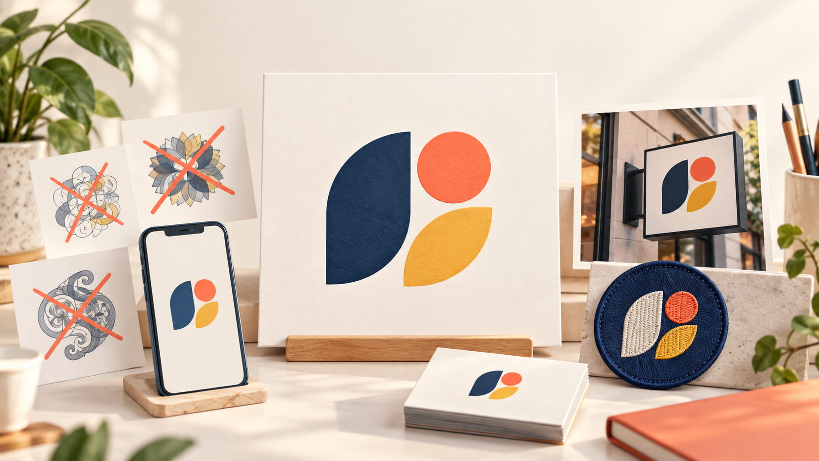
Updated October 2026. A small-business logo does not have to look expensive to look professional. It has to be clear, appropriate for the audience, and usable in the places customers actually meet the brand. Most weak logos do not fail because the owner lacks taste. They fail because the design was judged only on a large screen, rushed before the business was understood, or asked to communicate too many things at once.
The good news is that the most common mistakes are easy to spot before they become expensive signs, vehicle decals, or printed materials. Use this checklist to review a new logo—or to explain more useful feedback when a design is close but not quite there.
1. Trying to show every service at once
A plumber who also handles heating, remodeling, drains, and emergency calls may be tempted to include a pipe, wrench, flame, roof, house, and phone number in one mark. The result usually looks less capable, not more. A logo is a recognition device; it does not need to be a complete service catalog.
Choose one visual idea and let a short descriptor do the explaining when necessary. The business name might carry the personality, while a simple symbol creates recall. Your website, vehicle, and marketing copy have more room to tell the fuller story.
2. Choosing a generic industry symbol
A house for real estate, a leaf for landscaping, a tooth for dentistry, or a sparkle for cleaning can be useful shorthand, but they become forgettable when every competitor uses the same treatment. The problem is not the category symbol itself. The problem is relying on it without a distinctive shape, relationship, color system, or name treatment.
Ask what makes your business different before asking what icon represents the industry. A local history, a meaningful initial, the way you work, or the audience you serve can offer a better creative starting point. The mark should feel connected to the company, not borrowed from a generic search result.
3. Using type that cannot be read quickly
Intricate script, ultra-thin letters, extreme letter spacing, and novelty fonts can look appealing in a static mockup. They often fail on a phone, work shirt, banner, or small online listing. If the customer cannot read the business name on the first glance, the logo is not doing one of its main jobs.
Test the name at the size of a social profile, a vehicle door, and a business card. Read it from a few steps away. If the wordmark is hard to read, simplify the type or use a clearer supporting version. A distinctive logo does not have to be difficult to decode.
4. Relying on low-contrast color
Pale text on a light background, dark text on a nearly dark background, and colors with similar brightness often look refined in a perfect presentation but disappear in the real world. This is especially risky when the name is part of the logo. The web accessibility guidance from the W3C on contrast is written for text content, but its core lesson is useful here too: readable color relationships matter.
Build a flexible palette instead of one fragile color pairing. Your logo should have a full-color version, a one-color version, and a reversed version for dark backgrounds. If the design needs a specific pale background to remain visible, it is too dependent on a situation you cannot control.
5. Adding effects that do not survive small sizes
Gradients, shadows, highlights, bevels, textures, and tiny outlines can add energy to a large screen image. They can also turn muddy in embroidery, printing, browser favicons, or black-and-white reproduction. Effects are not automatically wrong, but the underlying logo must work without them.
Start with solid shapes and clear type. Then ask whether an effect supports the concept or merely makes an ordinary idea feel busier. A good test is to remove all effects: if the mark loses its identity, the core design needs more work.
6. Making the name or tagline too small
Founders often want to include a slogan, location, service list, certification, and phone number inside the logo. Those elements may be useful in a layout, but they are rarely useful inside the primary mark. A tiny line of text can turn into visual noise long before a customer can read it.
Create a hierarchy. The company name comes first. A short descriptor may come second. Taglines and contact details can be added in flexible marketing layouts, where there is room to change the size for the situation. This makes the identity easier to use without losing important information.
7. Ignoring the one-color version
A logo that only works in several colors is not ready for everyday business use. It may need to appear on a stamp, invoice, promotional item, window decal, workwear patch, or low-cost print run. A one-color version is not an optional afterthought; it is a basic resilience test.
Look at the design in solid black and solid white. Does the form still read? Are the details still distinct? Is the business name still clear? If not, reduce the number of small internal cuts, simplify the overlapping forms, or create an approved secondary mark for restricted uses.
8. Approving it without real-world mockups
A logo may look excellent centered on a white artboard and weak everywhere else. Before approval, place it on the surfaces that matter: a storefront, menu, van, appointment card, social profile, presentation cover, product label, or uniform. The context often reveals problems with spacing, contrast, proportion, and layout.
For example, our guide to construction logos for trucks, signs, and uniforms shows why a design needs to be tested at realistic distance and size. You do not need expensive mockups to learn this; even a quick printed test or a phone-sized preview can reveal what a polished presentation hides.
9. Copying a trend or competitor too closely
Trends can be useful signals, but a logo built entirely from a fashionable style can date quickly or blend into the category. The same is true of copying a successful local competitor. You may gain instant familiarity, but you lose the distinctiveness customers need to remember your business.
Use references to describe qualities—warm, compact, confident, premium, energetic—not to prescribe a near-match. Search the category before you decide. If every competitor uses navy and a circular badge, a different structure may give your brand more room to stand out while still feeling appropriate.
10. Treating feedback as a popularity contest
Too many opinions can make a logo worse. Friends and family may prefer different colors or symbols for personal reasons, and trying to satisfy every reaction can remove the clarity that made the concept strong. Useful feedback is tied to a business question: Can you read the name? What service do you assume this company provides? Does it feel trustworthy for the intended audience?
Collect comments in themes, then decide based on the brief. If three people independently say the name is hard to read, that is actionable. If one person simply dislikes green, it may not be. Good feedback makes the business goal clearer rather than generating a longer list of decoration requests.
11. Forgetting the file and ownership handoff
A logo is not complete when you receive a pretty image. You need usable files and a clear final package so the mark can be placed on websites, print materials, signage, and future campaigns. Ask what you will receive and where it will be stored. Keep the approved versions organized rather than downloading whatever image happens to be visible online.
If you are finalizing a contest entry, review the guide to logo file formats and make a basic asset folder for the business. This prevents a common future problem: paying to recreate a logo because only a small, compressed version can be found.
12. Asking the logo to solve a brand problem
A logo can strengthen recognition, but it cannot fix an unclear offer, inconsistent customer experience, weak photography, or mismatched pricing. When a logo feels “not professional enough,” the issue may be the surrounding brand system rather than the mark alone. Colors, type, imagery, voice, and the way the logo is placed all affect the impression.
That is why it helps to decide what you need before choosing a process. If you need a fast visual foundation, start lean and leave room to grow. If you need a broader system, budget for the strategy and assets around the mark. Our comparison of AI logo makers and professional designers can help you pick a route that fits the business stage.
A final five-minute review
Before you approve a logo, ask five questions. Can I read the name quickly? Does it work in one color? Does it still look good at a tiny size? Does it make sense in the places customers will see it? Is it recognizably ours rather than a generic industry symbol? If the answer is yes, you have avoided most of the mistakes that make a small business look unfinished.
A professional logo is not the busiest or flashiest option. It is the one that makes the next customer feel that the business is prepared, considered, and easy to trust.