
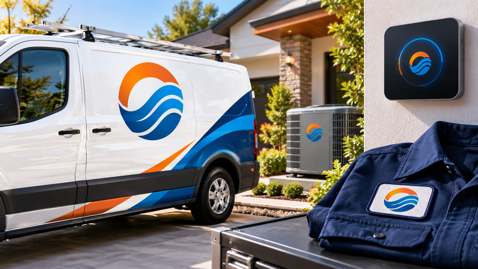
Updated October 2026. An HVAC logo has a demanding job: it must look dependable on a van at speed, legible on a shirt pocket, calm on a homeowner’s phone, and credible to a facilities manager. That is why the most effective HVAC identities communicate comfort, precision, and readiness without relying on a literal flame or snowflake.
HVAC is ultimately about maintaining a comfortable indoor environment, as the U.S. Department of Energy explains in its overview of HVAC efficiency. Your logo does not need to diagram the equipment. It needs to give people a quick, reassuring signal that your team can handle the job. These 30 directions can help you create an identity that works across service vehicles, uniforms, estimates, websites, and signage.
Why HVAC logos need more than flames and snowflakes
A flame says heat and a snowflake says cooling, so both are understandable starting points. The problem is repetition. When every competitor uses the same symbols, a customer scanning a street full of vans sees a category rather than a distinct business. Literal icons can also become too detailed at small sizes.
A better starting point is the promise behind the service: balanced comfort, controlled airflow, dependable scheduling, careful installation, or knowledgeable maintenance. Choose one promise your business can genuinely deliver, then express it with a simple shape, type style, and color system. If you are collecting examples, browse the HVAC logo design gallery to notice which ideas remain clear at a glance.
30 HVAC logo ideas to make your business recognizable
1. Start with a confident wordmark
1. Wide, clean sans serif. Use open letterforms and modest spacing for a modern, easy-to-read name on long van panels.
2. Strong initials plus the full name. Give your crew a compact mark for caps while keeping the business name readable elsewhere.
3. A subtle airflow line. Let one restrained curve pass through or beneath the wordmark instead of turning every letter into an illustration.
4. Name first, service line second. Pair a distinctive company name with a small descriptor such as “Heating · Cooling · Air Quality” when clarity matters locally.
5. A practical monogram. Interlock two or three initials inside a simple square or circle for invoices, app icons, and embroidered patches.
2. Turn comfort into an abstract symbol
6. Balanced warm and cool arcs. Two equal curves can suggest year-round temperature control without depicting fire or ice.
7. A single moving-air curve. One bold curve feels more ownable than several wispy lines and survives small-format printing.
8. A continuous comfort ring. A clean circular path implies an ongoing maintenance relationship and can frame an initial.
9. A controlled gradient, backed by solids. A restrained blue-to-warm accent can convey range, but make sure the mark also works in one solid ink.
10. Shelter around a center point. A roof-like angle or rounded enclosure can suggest protected indoor comfort without becoming a generic house icon.
3. Signal technical precision
11. A tidy grid. A small grid or set of measured modules hints at systems thinking and suits commercial service companies.
12. Connected, even nodes. Use a few deliberate connection points to reference integrated equipment, not a busy circuit board.
13. A geometric shield. A plain shield shape can communicate protection when paired with contemporary type and plenty of breathing room.
14. A calibrated indicator. A simplified dial or pointer can suggest adjustment and care; omit tiny marks that disappear on a uniform.
15. A check within an airflow path. This approach works for maintenance-focused brands when the check remains secondary to the company name.
4. Build residential trust
16. A home outline with a comfort ring. Keep the house minimal and let the surrounding form do the distinctive work.
17. Friendly initials in a soft shape. Rounded corners and approachable type can feel welcoming without looking childish.
18. A neighborhood horizon. A simple line of roof peaks or a local landscape contour can give a regional company an authentic sense of place.
19. A sunrise paired with a cool curve. Suggest all-season service through contrast, but use abstract lines rather than stock sun and snowflake art.
20. A service-route motif. A clean line that arrives at a point can subtly express responsiveness and scheduled visits.
5. Make commercial work feel capable
21. Sturdy condensed typography. A compact, bold wordmark can feel organized on fleet graphics and job-site signage.
22. Modular building blocks. Interlocking rectangles can reference equipment and scalable systems without showing a specific unit.
23. A vertical-and-horizontal system. A disciplined arrangement of bars can resemble ducts or pathways while staying abstract.
24. An engineered vent pattern. Use a few large, repeatable openings instead of intricate grilles that will fill in when printed small.
25. A no-nonsense wordmark only. For a business built on long-term facilities relationships, excellent typography can be the entire identity.
6. Adapt the idea to your specialty
26. Smart-home signal lines. For controls and connected systems, combine a home or monogram with one calm wireless cue.
27. An efficiency-focused curve. If efficiency is a real part of your service offering, use a refined upward or circular motion rather than making unsupported performance claims.
28. An after-hours badge. Emergency-service companies can use a high-contrast badge layout that reads quickly at night, without relying on an alarming red-only look.
29. A local landmark abstraction. A mountain ridge, coastline, or skyline can make sense when it genuinely connects to the area you serve.
30. A secondary patch mark. Create a small companion symbol from the main logo for shirt sleeves, social avatars, equipment labels, and vehicle doors.
Choose colors and type for the places the logo will live
Blue and orange are common in HVAC because they communicate cool and warm at a glance. They can still work, but they are not mandatory. Navy with a muted aqua accent feels composed; charcoal with a bright blue detail feels technical; deep green with cream can suit a comfort-and-maintenance position. The important test is contrast. Your logo should remain recognizable in one color, reversed in white on a dark van, and reproduced in ordinary black on a work order.
For typography, prioritize readability over personality tricks. Thick strokes, clear counters, and generous letter spacing usually travel better across a van, a small website header, and an embroidered chest. Script type, overly narrow letters, and fine outline fonts can lose their character fast. A simple wordmark is often stronger than an elaborate emblem—especially for a newer company still building name recognition. For more perspective on that decision, read whether a wordmark or icon is the better logo style for your business.
Run the five-place test before you choose
Before approving a concept, place it in the situations customers and technicians will actually encounter. First, view it on a white service van from a distance. Second, shrink it to a shirt-pocket size on a navy polo. Third, make it a square social profile image. Fourth, set it in a website header beside a phone number or booking button. Fifth, print it in one color on an invoice or service sticker.
If the name cannot be read, simplify it. If the icon needs an explanation, remove detail. If the colors are doing all the work, strengthen the silhouette. Those checks prevent the common problems covered in these logo design mistakes that can make a small business look unprofessional.
Give your designer a useful HVAC logo brief
A logo becomes more relevant when the designer knows what kind of work you actually do. In your brief, explain whether you serve homes, commercial properties, or both; the services that matter most; the locations you cover; what customers value about your team; where the logo must appear; and styles you want to avoid. Mention whether you need a mark that feels established, premium, neighborly, industrial, or technology-forward—but leave room for a professional to challenge a predictable visual choice.
Include real-world constraints too: the primary vehicle color, uniform colors, whether you need vehicle magnets or full wraps, and whether a one-color version will be used on equipment. You can use this copy-and-paste logo design brief template to organize the details before requesting concepts.
The best HVAC logo is the one customers remember
You do not need to abandon warm and cool cues; you need to use them with purpose. A distinct name, a confident typeface, and one memorable visual idea will typically do more for recognition than a crowded collage of tools, flames, snowflakes, and vents. Choose a direction that reflects how you want customers to feel when they call: comfortable, looked after, and confident the work will be done well.