Over the years, racing logos have evolved from simple to modern yet dynamic designs representing the changes in the sport itself, technology, and different influential trends. In this article, we'll show you the historical evolution of racing logos with samples from 48hourslogo!
The Birth of Racing Logos
Start of a Tradition
Car racing has gained popularity since the early 20th century and in order to give identities to their teams, they solved their problem by using logos. Racing logos before were simple with only basic shapes and plain typography. The logos were created with the sole purpose of being recognized by the fans and officials.
Influence of Automotive Brands
The early designs of racing logos were greatly inspired by car manufacturers like Alfa Romeo, Ferrari, Mercedes-Benz, etc. since their brand logos are the most commonly used on race cars. The logos not only symbolize the team but also emphasize the engine's capability and the origin of its manufacturers.
The Golden Age: 1950s to 1960s
Design Flourishes
The golden peak of racing happened in the 50s and 60s. Logos were becoming a bit more visually attractive and modern making them more noticeable to people. Designers also began experimenting with different color palettes, fonts, and graphics to give their logos a fresher look.
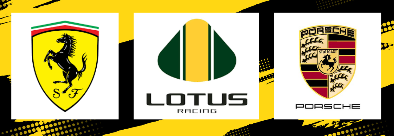
Iconic Logos of the Era:
- Ferrari - The famous Ferrari logo has always made red racing cars easy to recognize even if it's far. The black horse with a yellow background means speed and luxury.
- Lotus - The Lotus' green and yellow colors on their logo design is a symbol of pride that represents the maker's brilliant engineering and their British heritage.
- Porsche - The classy and elegant look of antlers and a horse from the Porsche crest placed in one design has made a few racing teams known by a lot of fans. The design itself is easy to remember.
Cultural Impact
Because of TV broadcasts, movies, and advertisements, racing has gained more popularity and has become influential in different cultures. Instead of just being identifiers, the logos have become cultural symbols to help build fan loyalty and attract sponsors. The logos were also their key to marketing the team to prospective viewers.
Transition and Modernization: 1970s to 1980s
Evolution of Style
During the '70s and the '80s, there were changes in how logos were designed. Racing logos were allowed to be more intricate and stylish by adding different elements and advanced technologies. Lines and geometric shapes were very common which shows the technological progress of the sport.
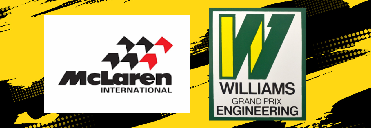
Key Changes in Logos
- McLaren - Initially, McLaren used a Kiwi bird for their logo before changing it into a chevron design. The new logo represents their team's forward thinking.
- Williams - A single letter "W" taken from the team's name which is Williams was first introduced as a symbol for speed, precision, and technological improvement.
Commercialization and Sponsorship
During this time, the commercialization of racing increased. Sponsorship deals became more common, and logos began featuring brand sponsors. This made logo designs a bit complicated since teams have to find a way to make sure they don't lose their identities while meeting their sponsor's needs.
The Digital Age: 1990s to Present
Impact of Digital Technology
The 1990s digital revolution created a new generation of logo design. Designers began using computers for advanced graphics with a range of graphic design tools. The use of computers allows logo designers to produce output that is scalable and visually attractive to the eyes of fans or other people. Today, many designers also leverage AI design tools for faster and smarter design workflows.
- Versatility - A modern logo should always be versatile. It should be noticeable on merchandise even on small sizes and on digital platforms.
- Minimalism - Different trends in minimalism use basic shapes and lines to maintain its simplicity while bringing a feel of a modern vibe that people can relate to.
- Symbolism - For contemporary logos, symbols, and elements which reflect the brand's history and origin are often used to ensure people can connect to it.
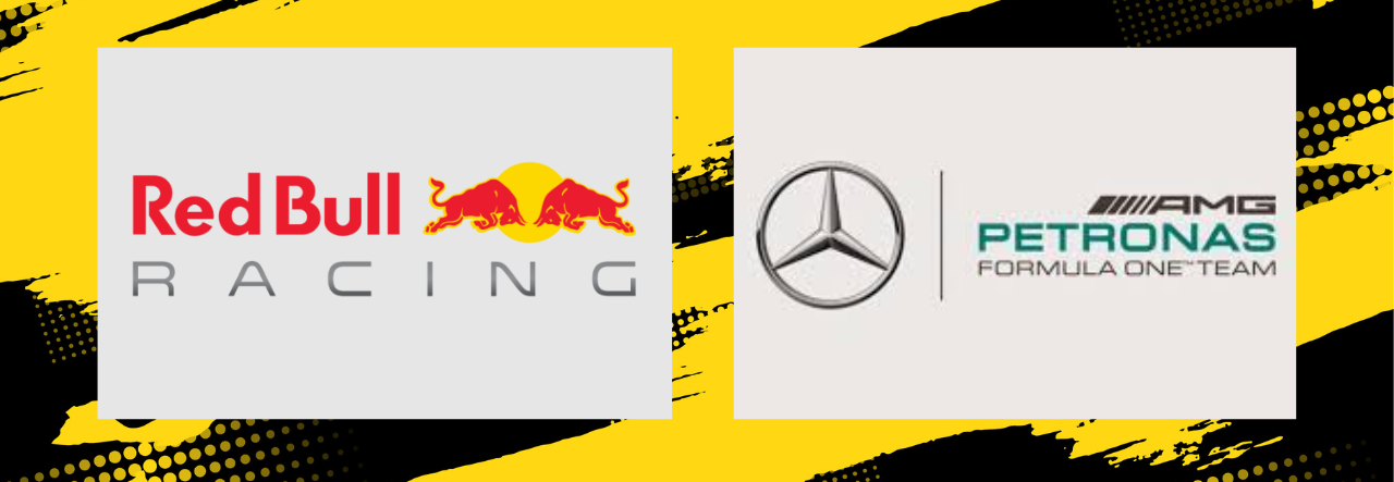
Notable Modern Logos
- Red Bull Racing - The RBR logo has a bull with red and yellow color palettes that symbolize strength and energy. The design perfectly captures the team's fighting spirit and is easy to remember and spot from quite a distance.
- Mercedes-AMG Petronas - Using the famous three-pointed silver star symbol from Mercedes and the turquoise color palette from Petronas is very modern and dynamic. The designer made sure the logo brings a feeling of excellent speed.
Technological Advances in Logo Design
 |  |  |
 |  |  |
Computer-Aided Design (CAD)
Logo designers started to use CAD software to smoothly add complex shapes to their business logo designs. The software allows designers to experiment and create unique shapes a lot easier while producing a quality and effective logo design be it for start-ups or small businesses logos.
Digital Platforms and Social Media
The influence of social media on logo designs is bigger than you expected. Because of online marketing, logo designs have to be adaptable to different resolutions and sizes. Logo designers have made racing logos look simpler yet modern to make sure the designs are visible on phones or billboards.
Common Modern Trends in Racing Logos
 |  |  |
 |  |  |
Sustainability and Eco-Friendly Designs
A lot of people have become more concerned about the environment and choosing a sustainable logo design attracts them the most. For racing, adding eco-friendly symbols and elements or looking for crowdsourced logos to use as their team logos is their way of showing support for sustainability.
Augmented Reality (AR) and Interactive Logos
The birth of AR or augmented reality has made logo designing an extremely amazing process. With only using a smartphone app, some paid and some free, designers can create their designs into interactive ones giving a more realistic and memorable experience for racing fans.
Customization and Personalization
The use of technology in logo designing has become more common nowadays. Designers can easily show their creativity and give their logos a more personalized touch be it hand-drawn logos for racing or other industries such as health or fashion logos.
To Sum Up…
The development of racing logos is really a great journey. From simple and basic designs to complicated and modern digital logos that we see today, these designs have helped racing gain the influence they currently have. As technology improves, racing teams will also be more creative in representing themselves. But one thing is for sure, racing logos will always continue to be a big part of the sport for the years to come!