
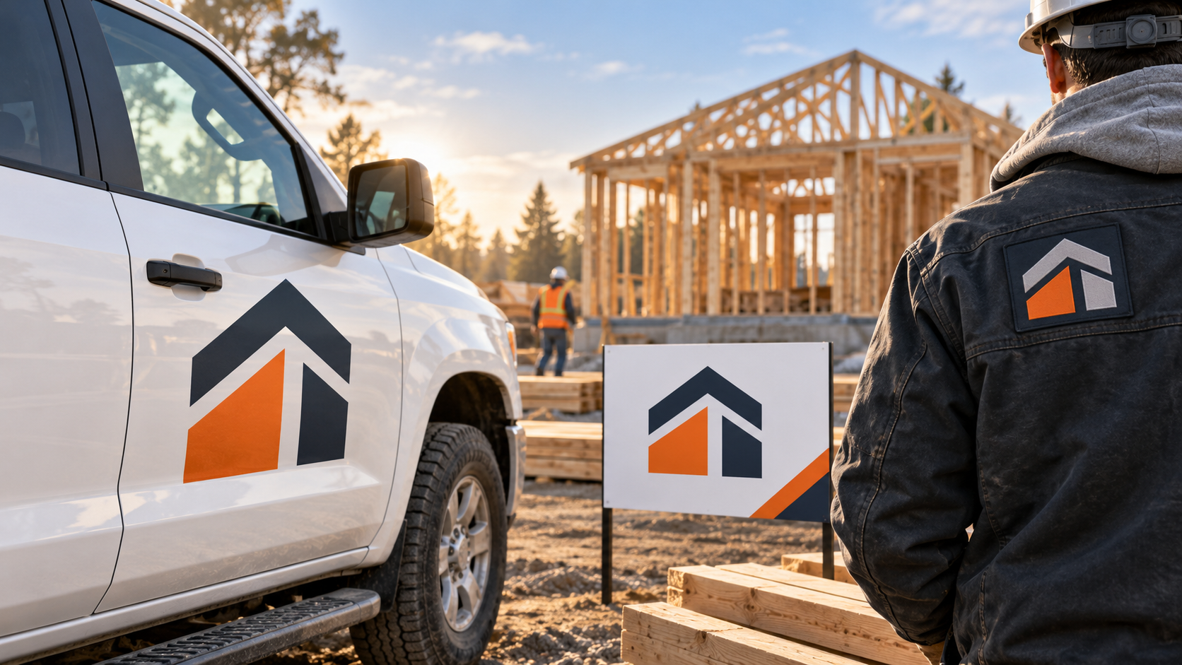
Updated October 2026. A construction logo rarely lives in one place. It has to work on a truck door at speed, a yard sign from the sidewalk, an invoice in a homeowner’s hand, a hard hat, and a tiny social profile. That is why the best construction logos are not the busiest ones. They are clear, sturdy, and easy to recognize before a customer has time to study them.
Whether you build homes, manage commercial projects, install roofs, pour concrete, or run a specialist trade, your mark should make the business look organized and dependable. Use these 35 construction logo ideas as creative directions rather than templates to copy. The goal is to find a visual system that fits your company, your customers, and the jobs you want to win.
Start with the surfaces that matter most
Before choosing a symbol or color, make a list of the first five places customers will see the logo. For many contractors, the list starts with a pickup, trailer, yard sign, workwear, and website. That immediately changes the brief. Fine details, narrow type, and low-contrast colors that look elegant on a screen may disappear on a dusty vehicle or a sign viewed from across the street.
Think of the mark as a recognition device, not a drawing of every service you provide. Your business name, a simple descriptor, and one memorable visual idea are usually more useful than a house, hammer, roof, wrench, crane, bricks, and skyline all competing for attention. For a useful parallel, the Federal Highway Administration’s wayfinding sign guidance addresses contrast and legibility distance—good reminders to test any yard-sign design at a realistic viewing distance.
35 construction logo ideas to explore
1. Strong wordmark directions
1. Wide industrial sans serif: Set the company name in a clean, heavy typeface with generous spacing. 2. Condensed vertical type: Use a taller, narrower wordmark when a truck door or vertical sign is the main canvas. 3. Initials in a solid block: Turn two or three initials into a simple badge for hats and equipment. 4. Underline as a foundation: Add one sturdy line under the name to suggest stability without drawing a literal building. 5. A subtle cut or angle: Let one carefully placed angle in a letter suggest precision or forward motion.
Wordmarks are especially effective when the business has a short, distinctive name or when name recognition is the immediate priority. They are also practical for companies that may expand beyond one trade. A name like “Northline” can grow from framing to renovations without being tied to a cartoon hammer.
2. Architectural and structural symbols
6. Abstract roofline: Use two or three clean angles, not a fully drawn house. 7. Framing grid: Create a square mark based on beams, windows, or a floor-plan grid. 8. Monogram as a building: Shape a company initial so it suggests an elevation or doorway. 9. Bridge or truss geometry: A strong option for civil, steel, or commercial work. 10. Blueprint line paired with solid form: Show the move from plan to finished project. 11. Corner brackets: Use four simple corners to suggest measurement and accuracy. 12. Stacked blocks: Create a modular icon for builders, masonry businesses, or project managers.
These directions can feel sophisticated because they reference construction through proportion and structure, not clip art. Keep the icon readable at one inch wide. If it only works after you explain it, simplify it.
3. Ideas for home builders and remodelers
13. Open-door shape: Pair a simple home outline with a warm negative-space doorway. 14. Before-and-after split: Use one clean line to move from an outline to a finished form. 15. Gable plus monogram: Nest a letter inside a restrained roof silhouette. 16. Crafted joinery mark: Use interlocking pieces to signal care and fit. 17. Neighborhood horizon: Build a minimal row of varying rooflines for a locally focused company. 18. Window-light icon: A small, precise window grid can suggest renovation and attention to detail.
Residential brands often need to balance competence with approachability. A hard-edged black-and-red identity may fit a demolition contractor but feel too severe for a family renovating a kitchen. Let the audience guide the mood: polished and calm for high-end renovation, friendly and direct for repair work, or traditional and rooted for a multigenerational local builder.
4. Ideas for commercial and industrial contractors
19. Steel-beam letterform: Build a bold initial from straight, structural strokes. 20. Crane hook as an accent: Use only if lifting or heavy construction is central to the work. 21. Rivet or bolt pattern: Turn repeated circles into an abstract, scalable mark. 22. Span and support: Use a horizontal beam held by two vertical shapes. 23. Tower silhouette: Keep it geometric for commercial builders, not overly detailed. 24. Concrete texture contained in a simple shape: Use texture sparingly so the one-color version still works.
For industrial companies, legibility can carry more weight than visual drama. A clear wordmark with one strong structural detail is often more credible on bid documents, equipment decals, and site signage than a complicated illustration. Test it in black and white first, then add color as an accent rather than a rescue.
5. Ideas for specialist trades
25. Masonry bond pattern: Use brick-like rectangles to create an initial. 26. Clean roof peak: Give roofers a recognizable angle without defaulting to a generic house. 27. Measured tile or floor grid: A crisp repeated pattern suits flooring and finish trades. 28. Electrical path: Use a controlled line or connection point instead of a lightning-bolt cliché. 29. Pipe bend monogram: Let a curved, simplified pipe shape inform a plumbing mark. 30. Landscape retaining-wall profile: Use stepped geometry for hardscape or excavation businesses.
A trade-specific element can help customers understand what you do quickly, but do not force it into every application. The primary logo can stay simple while a secondary badge carries the specialty descriptor. That gives you a compact option for hats and profile images and a fuller option for truck sides and proposals.
6. Badge, heritage, and local directions
31. Modern shield: Use a simplified shield with ample open space, not an overloaded crest. 32. Local landmark abstraction: Reduce a regional mountain, bridge, or shoreline to a few distinct shapes. 33. Year-established lockup: Add an establishment date only if it adds real credibility. 34. Work-boot or stamp texture: Use a rugged secondary graphic for apparel, while keeping the main mark clean. 35. Circular jobsite badge: Create a round seal for uniforms, social avatars, and equipment labels.
Badges work well when the company has a strong local story or a craft-led personality. They can become hard to read when squeezed onto a truck door, though. Create a separate horizontal lockup as part of the system instead of making one detailed badge do every job.
Choose color for visibility and personality
Construction brands frequently use navy, charcoal, orange, red, green, or yellow because those colors can feel confident and practical. The specific color matters less than the contrast and the system around it. Dark navy on white is usually easier to read than mid-blue on gray. A bright orange accent can guide the eye, while the main name stays in a neutral dark color.
Do not assume you need safety orange simply because your business works on jobsites. It can be useful, but it is not a personality on its own. A residential custom builder may be better served by deep green and warm sand. A concrete contractor may choose black, white, and one mineral-toned accent. Ask what the color should communicate: established, precise, premium, energetic, regional, or approachable.
Make the truck test part of the brief
Ask to see a straightforward vehicle mockup before approving a logo. Put the business name in the likely position on the door or side panel. Can you identify it from a car length away? Is the phone number secondary to the name rather than fighting it? Is there enough clear space around the mark to keep it from looking like a sticker?
Then repeat the test for a yard sign and a work shirt. A design that relies on a thin line, a long slogan, or three shades of the same color will often need adjustment. This is not a failure of the concept; it is exactly why a logo should be evaluated in context before money is spent on wraps, embroidery, or signs.
How to get better construction logo concepts
A clear design brief produces better options. State the trade, service area, typical project size, ideal customer, and what you want customers to feel. Add the applications that matter most: “must read on a white pickup,” “must embroider well on dark jackets,” or “must work as a one-color yard sign.” Include examples for mood, then explain what you like about them rather than asking for something similar.
You can start a construction builder logo design project with an industry-specific brief, or review the current logo design packages before deciding how much concept exploration and revision support you need. For a closely related example, see how a focused concept helped a roofing business build trust in this roofing logo design case study.
If you are deciding whether to explore independently first or work directly with a designer, our recent guide on AI logo makers versus professional designers can help you choose the right starting point. The best final result is not the one with the most construction symbols. It is the one a customer can recognize quickly, trust immediately, and remember when the next project begins.