
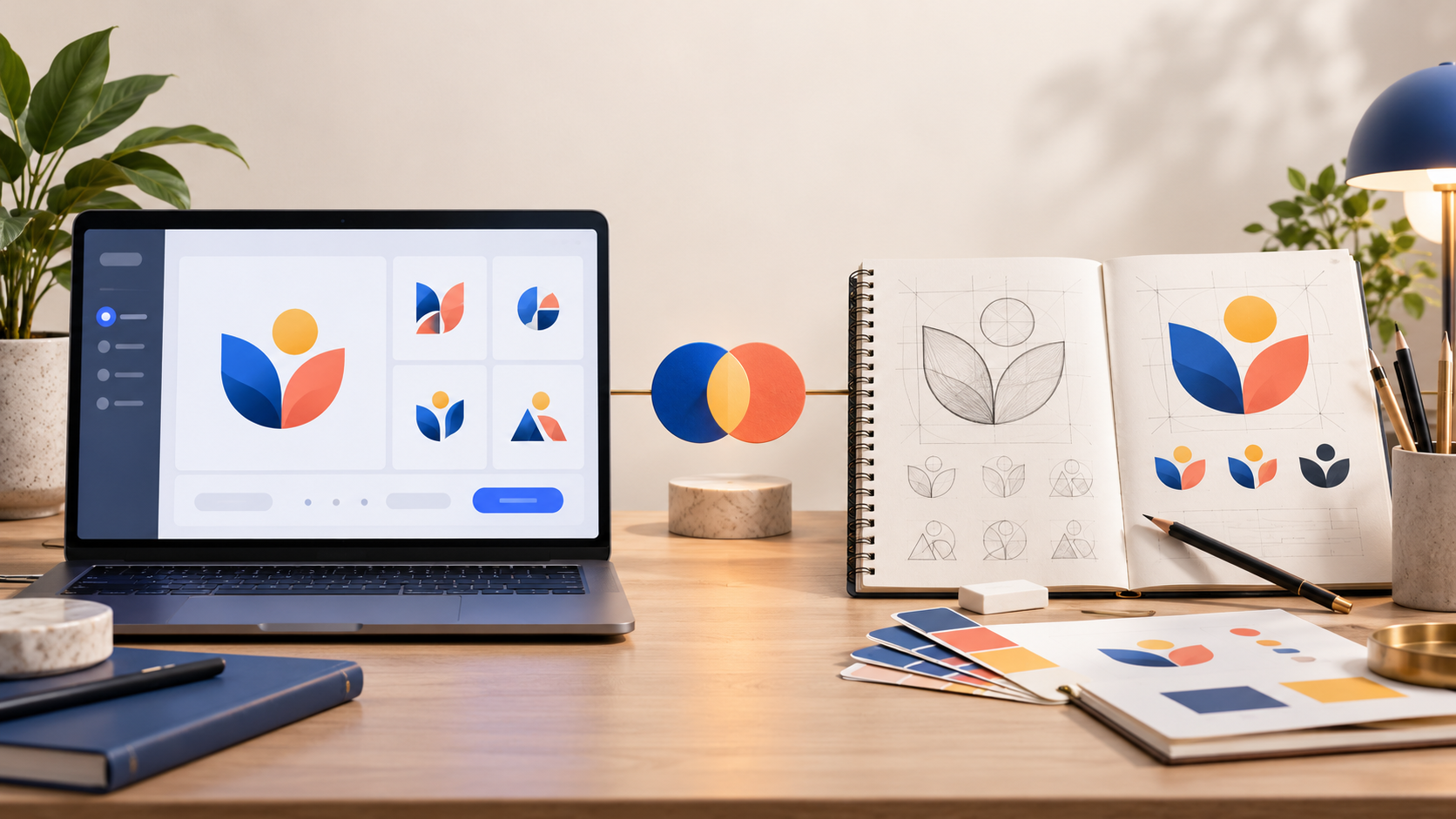
Updated October 2026. A new business needs a logo that is clear, credible, and usable everywhere it shows up. The question is not whether an AI logo maker or a professional designer is universally better. It is which route fits your timeline, budget, decision-making style, and the job your brand needs the logo to do.
An AI logo maker can help you explore directions quickly. A professional designer can turn a nuanced brief into a more considered identity and respond to feedback that is difficult to reduce to a menu of options. Both can be useful. The smart choice starts with being honest about what you need now—and what you will need six months from now.
The short answer
Choose an AI logo maker when you need a fast visual starting point, want to test several ideas yourself, and have a straightforward brand with a clear audience. Choose a professional designer when the logo needs to carry a distinctive story, work across complex applications, or benefit from a person who can challenge and improve the brief. For many businesses, the best path is hybrid: explore language and references with AI first, then give a designer the strongest direction to develop. If you are still deciding what kind of mark suits you, start with our guide to wordmarks, icons, and combination marks.
AI logo maker vs. professional designer at a glance
| What matters | AI logo maker | Professional designer |
|---|---|---|
| Speed | Generates concepts in minutes, so you can compare directions early. | Usually takes longer because the work includes discovery, concepts, feedback, and refinement. |
| Budget | Often a lower-cost way to start exploring. | Usually a larger investment, especially for a custom identity system. |
| Creative input | You guide the process directly through your prompts and selections. | A designer interprets the brief, asks questions, and brings an outside point of view. |
| Iteration | Quick for broad changes such as color, style, or layout. | Stronger for deliberate refinements, unusual constraints, and detailed feedback. |
| Brand system | Useful for quickly building an initial set of coordinated assets. | Best when you need a tailored system for packaging, signage, campaigns, or many formats. |
When an AI logo maker is the better fit
AI is particularly useful when momentum matters. Maybe you are naming a side project, opening a local service business, testing an ecommerce idea, or putting together a landing page before you invest in a full identity. Instead of staring at a blank page, you can enter your business name, industry, audience, and a few visual preferences, then review several approaches.
This is valuable even if you do not keep the first result. A batch of concepts can reveal what you actually prefer: a wordmark over an icon, a calmer palette over a loud one, or a simpler shape that still reads at small sizes. It gives you language for the next decision. Modern tools can also help turn a chosen direction into a practical starting set of colors, type choices, and social or web graphics.
The catch is that speed does not replace judgment. Do not select a logo just because it is the first polished option. Check it at a tiny avatar size, in one color, on a light and dark background, and beside competitors in your market. Make sure the business name is legible and that the design feels appropriate for the promise you are making.
It also helps to set a small review rule before you generate anything: keep only concepts that pass the same practical tests. Can a customer read the name at a glance? Does the symbol still make sense without color? Would it fit on the corner of an invoice, a profile image, or a storefront sign? A simple scorecard stops the process from becoming an endless scroll through attractive but interchangeable options.
When a professional designer earns the investment
A designer is most valuable when the problem is more than “make a nice-looking logo.” Perhaps you have a complicated name, multiple audiences, a family of products, a physical storefront, or a brand story that needs a point of view. A good designer can ask the questions a tool cannot anticipate: What should a customer feel before they read a word? Which competitor conventions should you avoid? Where will this mark be used first, and what has to survive at a tiny size?
Human collaboration also matters when you are not yet sure what you want. Rather than asking you to choose from familiar styles, a designer can translate fragments—your customers, your origin story, the atmosphere of your space—into a visual direction. With a logo contest on 48hourslogo, you can publish a brief, receive custom concepts from multiple freelance designers, select the direction that fits, and continue refining the winning design.
That process is especially helpful for brands that need a mark to work beyond a browser tab: on a truck, storefront, product label, event banner, uniform, presentation, or app icon. The more visible and expensive those applications become, the more worthwhile careful testing and expert refinement can be.
Before commissioning anyone, make the scope concrete. A logo project can mean a single finished mark, or it can include color variations, social avatars, a favicon, stationery, and basic usage guidance. Compare the deliverables as closely as you compare the visual work. The current 48hourslogo packages and inclusions are a useful example of the kind of questions to ask: how many concepts will you see, who can be revised, what files are included, and what brand assets are needed after the final choice.
A practical decision framework
Ask four questions before you choose. First, what decision are you trying to make: a quick launch look or a long-term identity? Second, do you already have a clear visual direction? Third, where must the logo work in the next year? Finally, how much feedback and back-and-forth do you need to feel confident?
If your answers are “quick launch,” “clear direction,” “mostly web and social,” and “I am comfortable choosing,” start with AI. If they are “long-term identity,” “I need help defining it,” “many physical and digital touchpoints,” and “I want expert collaboration,” start with a designer. There is no penalty for starting lean, as long as you leave room to improve the identity when the business proves itself.
A useful middle ground is to set a decision deadline. Spend an afternoon generating and narrowing visual directions, then decide whether the chosen route is strong enough to launch or whether it has exposed questions that deserve designer input. This keeps a low-cost exploration phase from quietly becoming weeks of indecision. It also means that, when you do hire a designer, you arrive with clearer feedback than “make it more modern.”
The hybrid route: use each tool for what it does best
You do not have to frame this as an either-or decision. Use AI to collect references, identify a color mood, and discover whether your instinct leans toward a wordmark, monogram, or combination mark. Then write down what works and what does not. That becomes a much stronger design brief.
Give a designer the useful context: your business name, target customer, competitors, where the logo will appear, words the brand should feel like, and examples that show a direction—not a design to copy. Ask to see how the concept behaves in the situations that matter: a small favicon, a horizontal website header, a social profile image, and a one-color print version.
If you use a contest, be equally deliberate about feedback. Name the specific issue and the desired outcome: “the name needs more prominence on a vehicle door” is more helpful than “make it pop.” Explain what must stay unchanged as well as what should change. You can use the 48hourslogo FAQ to understand the contest process before you write the brief, then leave enough room for designers to propose solutions you may not have considered.
How to compare two promising logo directions
When you have a handful of finalists, do not ask only which one looks nicest at full size. Put each logo through the same short test. First, show it to someone for a few seconds and ask what business they think it belongs to. Next, reduce it to the size of a social avatar and print it in black and white. Finally, place it next to the names and logos of competitors. The strongest option usually has a clear name, a distinctive overall shape, and enough restraint to work in several contexts.
This is also where an outside opinion helps. A customer, advisor, or designer may notice that an icon looks like a familiar industry cliché, that a typeface becomes muddy at small sizes, or that the logo is communicating a premium promise your pricing does not support. Listen for patterns in the feedback rather than trying to satisfy every individual preference.
Do not skip the final checks
Whichever path you choose, treat the logo as a business asset rather than a single image. Keep the editable or vector files you need for future uses. Confirm that the name is spelled correctly in every variation. Test contrast and readability. Search your market for confusingly similar names and marks, and get appropriate professional advice before making legal or trademark decisions. In the United States, the USPTO trademark resources explain why searching for similar marks matters and how a mark identifies goods or services; they are a useful starting point, not a substitute for legal advice tailored to your business.
The best logo is not the one made by the most impressive process. It is the one that makes your business easier to recognize, looks right wherever customers encounter it, and gives you a foundation you can grow with. Start with the method that gets you to that standard with confidence.