
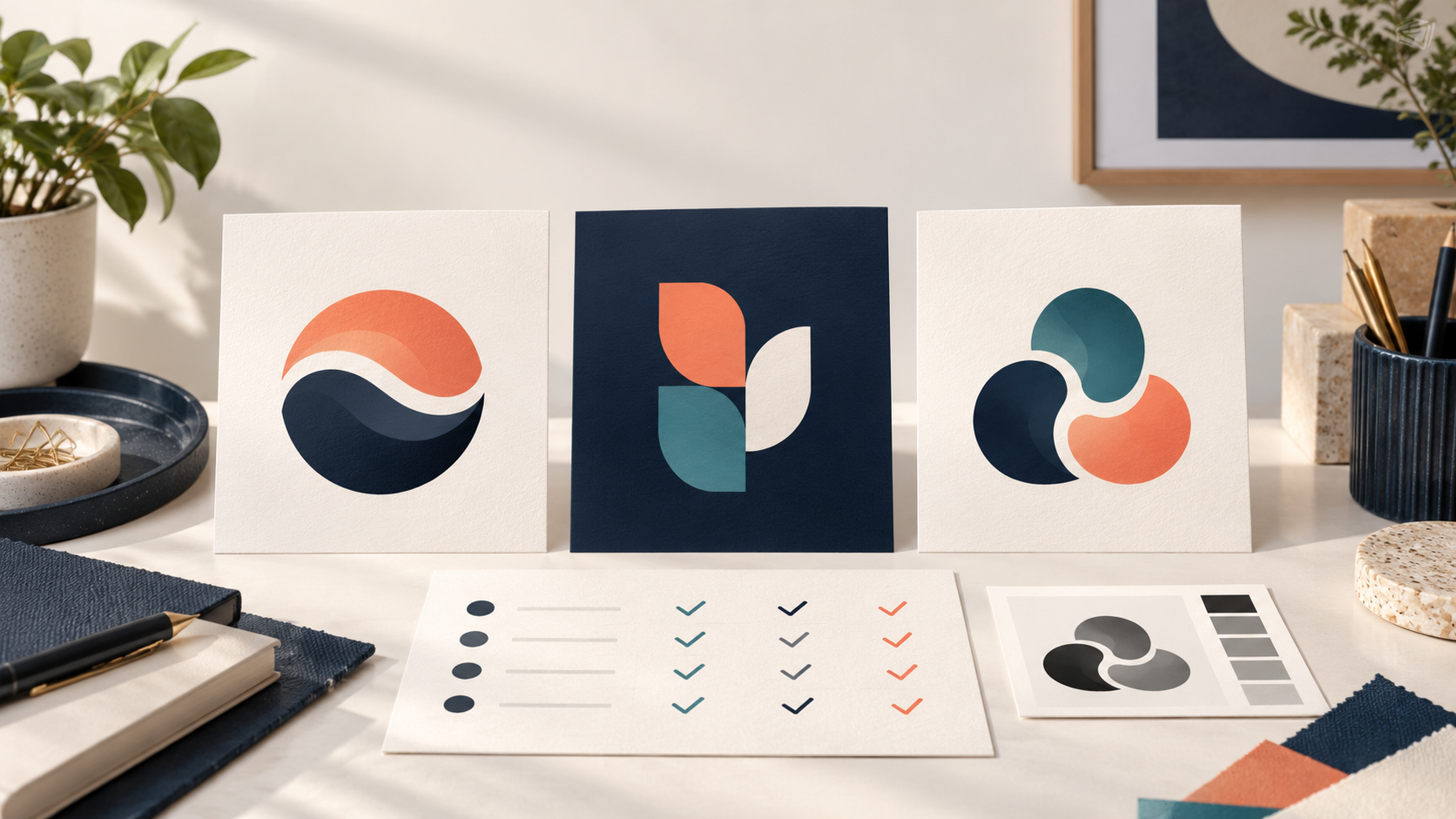
Updated October 2026. Choosing between logo designs can feel surprisingly personal. After all, the mark may be on your homepage, packaging, storefront, vehicle, invoices, and social accounts for years. The way through is not to find the concept that gets the most “wow” reactions on a large screen. It is to choose the design that best solves your business problem in the places your customers will actually see it.
Use this seven-point checklist when two or three logo directions all look promising. It turns a vague preference into an informed decision and gives you useful language for feedback.
Before comparing designs, return to the brief
Do not judge a logo against an imaginary “perfect” logo. Judge it against the brief: who the business serves, what it offers, what makes it different, what people should feel, and where the logo needs to work. A bold, industrial-looking mark may be excellent for a commercial contractor and wrong for a calm family wellness practice. A delicate monogram might suit a premium stationery brand but disappear on a service van.
If the brief was never written down, pause and make a short version before voting. The logo design brief template for business owners is a useful place to begin. It keeps the decision about the audience and application—not just individual taste.
The 7-point checklist for choosing between logo designs
1. Does it match the business you are building?
Start with meaning. Ask a simple question: if the right customer saw this logo with no explanation, would its tone feel plausible for us? You are not testing whether they can accurately name every service from the symbol. You are testing whether the design feels aligned with the category and personality you want to own.
Make the comparison specific. One concept may feel established and capable; another may feel inventive and energetic; a third may feel friendly and local. None is automatically better. Choose the direction that supports the position in your brief. If your business is entering a crowded market, a design that is distinct while still appropriate is often more valuable than one that repeats every familiar category cue.
2. Can people read and recognize it quickly?
A logo has only a moment to register. Look at each concept from a few steps away, then at a small size. Can you read the business name without concentrating? Are letters colliding, overly thin, or hidden inside an illustration? Does the visual mark have one clear silhouette, or many competing details?
This is especially important for new businesses. Customers cannot recognize a symbol they have not learned yet, so the name often carries the first job of identification. A wordmark or combination mark can be a practical choice until the business has built more recognition. For a deeper look at those structures, compare wordmarks, icons, and combination marks before assuming an icon alone is more memorable.
3. Does it work at the smallest and largest sizes?
Ask to see every finalist small, not merely presented on a dramatic billboard. Put it at favicon size, on a social profile, in an email signature, and on a business card. Then view it on a storefront sign, uniform back, trade-show banner, or vehicle—whichever applications matter to you. A concept that looks impressive only when it is large is not yet a versatile identity.
Look for fine lines, tiny gaps, intricate gradients, and small pieces of text. These are not always wrong, but they need a clear alternative for constrained uses. A good system may include a horizontal version, a stacked version, a simplified icon, and clear-space rules. When a design becomes muddy at a small size, do not ask viewers to work harder; ask the design to do less.
4. Is the visual idea clear without being literal?
The strongest logo is not necessarily a picture of the product. A coffee company does not need a coffee cup, and an accounting firm does not need a calculator. Literal imagery can help when a business is very new or its name is highly abstract, but it can also make a mark look generic when every competitor reaches for the same object.
Evaluate the idea behind each option. Is it one deliberate thought, or a collection of unrelated symbols? Can you describe it in a short sentence that connects to the business? A simple, ownable visual idea is easier to remember and easier to carry into a wider brand identity. Avoid rejecting a good concept because it does not explain everything. The logo is a recognition device, not a complete brochure.
5. Will it stay clear in one color?
Color can set a mood, but a mark should not depend on color to remain intelligible. Review each finalist in black on white, white on black, and the one-color method most likely to be used on stamps, invoices, embroidery, labels, or inexpensive promotional items. Check contrast too: pale color pairings can disappear against light photography or a website background.
If one design only works because of a special gradient or a thin metallic effect, it may become inconsistent across vendors and applications. This does not mean every logo must be austere. It means the underlying shapes and type must be strong enough to survive practical reproduction.
6. Does it make sense next to competitors?
Put the finalists beside a handful of real competitors and alternatives customers may compare you with. Do not copy their colors, layouts, or symbols; look for patterns in the category. If every mark is a navy badge with the same mountain, leaf, roofline, or initial, another version may blend in. Conversely, a radically different direction can confuse customers if it sends the wrong signal for your market.
Aim for a useful middle ground: familiar enough to feel credible, distinct enough to be remembered. This comparison is also a reminder not to approve a mark that resembles someone else’s too closely. Before adopting a logo as a trademark, WIPO notes that prior rights can create an obstacle to registration and use, so an availability search is an important step. Read WIPO’s guidance on checking for prior trademark rights, and seek appropriate professional advice for your situation.
7. Can you use it consistently after launch?
The winning logo should be the beginning of a usable system, not the end of a presentation. Think about how it will sit with your website typography, sales materials, photography, signs, packaging, social templates, and future services. Is there a practical color palette? Does the type choice have readable companion styles? Is there a simple icon or crop that works in a square? Can a future employee understand how to use it correctly?
Ask for the expected file formats and versions as part of the final decision. You will need more than one attractive image file. A thoughtfully prepared identity includes versions for light and dark backgrounds and sizes suited to the channels you use. If a concept cannot travel beyond the original mockup, it may not be the right winner yet.
How to score the finalists without turning design into math
A scorecard gives a team a common language, but it is not a machine that picks the winner. Create one row for each of the seven questions above. Give each concept a simple score from one to five, then add a short reason. “Feels premium” is less useful than “the wider letterforms are easy to read on packaging and match our calm, high-quality position.”
Weight the factors that matter most to your business. A neighborhood restaurant may emphasize warmth, menu readability, and storefront visibility. A software product may emphasize small-screen clarity and a flexible icon. A trades business may emphasize vehicle recognition and one-color workwear. The exercise reveals where people agree and where they are reacting to a personal color preference rather than a business need.
Ask for feedback that helps rather than delays the choice
Too many opinions can flatten a strong idea. Choose a small group who understands the audience or will actually use the brand, and ask them the same focused questions: What kind of business does this seem to be? Which name can you read first? Which option would you notice on a phone or storefront? What feels distinctive but credible? Record patterns, not a popularity contest.
Give designers feedback tied to the brief. Instead of “make it pop,” try “the symbol is strong, but the name needs to be more readable on the van” or “this feels more playful than our financial-planning customers expect.” The process guide on running a successful logo contest offers the same practical principle: active, specific feedback helps the work move forward.
When none of the choices is ready
Sometimes the right decision is to request a focused revision rather than declare a winner. That is appropriate when one direction fits the brief but has a real usability issue: the name is too small, the icon is overly busy, the color contrast fails, or the structure lacks a compact version. Name the issue and preserve what is working. “Use concept B’s confident type, but simplify the symbol so it works in one color” is far more productive than asking for something “totally different.”
Be careful not to revise away every point of difference. A mark can be clear, appropriate, and still feel unfamiliar because it is not a copy of what is already in the market. Give a strong concept time to settle, test it in its real applications, and use the seven questions to separate unfamiliarity from a genuine problem.
Make the final choice with confidence
The best logo design serves your customers and can be used consistently. If one finalist is readable, distinctive, true to the brief, flexible across sizes, clear in one color, appropriate beside competitors, and ready to grow into a system, you have a defensible winner. Save the rationale with your final files.