In the highly competitive construction and roofing industry, a company's logo is often the first point of contact with potential clients. Whether it's printed on a yard sign, wrapped on a fleet of trucks, or displayed on a website, the logo needs to instantly communicate professionalism, reliability, and strength.
A recent logo design contest hosted on 48hourslogo for "Arrowhead Roofing & Exteriors" provides a perfect case study on how a simple, well-executed concept can elevate a brand's visual identity. Let's dive into the details of this project and explore why the winning design was so effective.
The Client's Vision: Simple, Professional, and Symbolic
Arrowhead Roofing & Exteriors serves a diverse clientele, including homeowners, commercial general contractors, multi-family properties, and HOAs. Because their audience ranges from individual families to large corporate entities, their branding needed to strike a balance: it had to be approachable yet highly professional.
The client's brief was straightforward but specific. They wanted a design that incorporated an arrowhead motif. During the contest, the client provided active feedback to the designers, refining their vision in real-time:
- "Incorporate green. Or red."
- "Maybe try some with follow arrow. Or maybe mountains. Or arrowhead with feather."
- "Simple and professional."
- "No feathers. Arrowhead point up. Simple, professional."
This iterative feedback loop is one of the most powerful aspects of crowdsourcing. The client was able to test different ideas (like adding feathers or mountains) and quickly realize that a cleaner, more minimalist approach was the right path forward.
The Power of Crowdsourcing: 420 Submissions
When you launch a project on 48hourslogo, you aren't just hiring one designer; you are tapping into a global network of creative talent. For the Arrowhead Roofing project, the client received an incredible 420 submissions from 77 different designers.
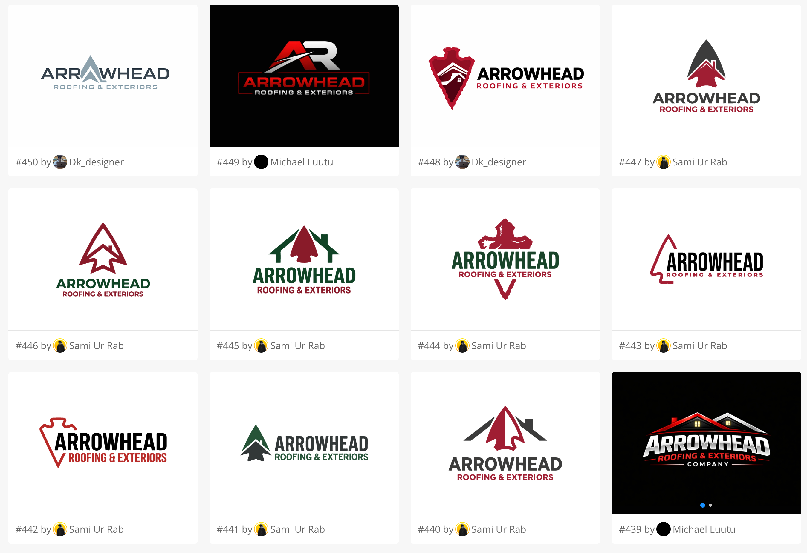
This massive volume of concepts allowed the client to explore every possible interpretation of an "arrowhead" logo. Some designers created complex, illustrative arrowheads. Others integrated rooflines and houses into the shape. Some focused on bold, industrial typography. By seeing all these variations side-by-side, the client could confidently narrow down their preferences and guide the designers toward the perfect solution.
Analyzing the Winning Design
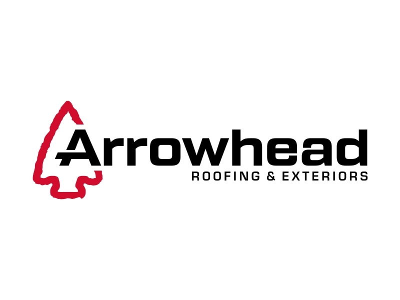
After reviewing hundreds of concepts, the client selected a winning design by the talented designer "ekitessar" (Design #325). The final logo is a masterclass in modern, industrial branding.
Here is why the winning design works so well for a roofing and exteriors company:
1. Clever Integration of the Arrowhead and the Letter 'A'
The most striking feature of the logo is the icon on the left. The designer created a stylized, geometric arrowhead using a bold red outline. But the true brilliance lies in the negative space and the integration with the typography. The crossbar of the letter 'A' in "Arrowhead" extends to the left, perfectly aligning with the cutout in the arrowhead icon. This creates a seamless visual connection between the symbol and the company name.
2. Bold, Industrial Typography
The designer chose a thick, extended sans-serif font for the word "Arrowhead." This typography exudes strength, stability, and structural integrity—exactly the qualities you want in a roofing contractor. The wide letterforms give the logo a grounded, heavy presence, which is ideal for a company that builds and protects physical structures.
3. High-Contrast Color Palette
Following the client's feedback to incorporate red, the designer used a striking combination of deep crimson red and solid black. Red is an energetic, attention-grabbing color that stands out beautifully on white trucks, yard signs, and uniforms. The black typography provides a professional, serious anchor to the vibrant red icon.
4. Scalability and Versatility
A great logo must work across all mediums. Because this design relies on bold shapes and clean lines rather than complex gradients or fine details, it is highly versatile. It will look just as crisp embroidered on a polo shirt as it will printed on a massive billboard. The icon can even be used as a standalone mark for social media avatars or hardhat stickers.
What the Client Achieved
By utilizing the 48hourslogo platform, Arrowhead Roofing & Exteriors achieved several key business objectives:
Visual Authority: They secured a logo that instantly positions them as a serious, established player in the roofing industry, capable of handling both residential and large-scale commercial projects.
Brand Clarity: Through the iterative feedback process, the client was able to refine their vision, stripping away unnecessary elements (like feathers) to arrive at a clean, impactful design.
Exceptional Value: For a budget of just $129, the client received 420 unique concepts and a final, production-ready logo that rivals the work of expensive boutique design agencies.
Conclusion
The Arrowhead Roofing & Exteriors project demonstrates that the best logos are often the simplest. By combining a clear symbol (the arrowhead) with strong typography and a bold color palette, the winning designer created a timeless identity that will serve the company for years to come.
If you are launching a construction, roofing, or home services business, your visual identity matters. A crowdsourced design contest gives you the options, flexibility, and speed you need to find the perfect logo for your brand.