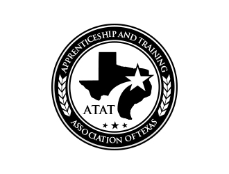
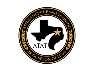
we are an association of construction trade apprenticeship programs. The trades we represent are electrical, plumbing & pipefitting, carpentry, ironworkers, heat and frost insulators, sheet metal workers, HVAC, etc. Our apprenticeship programs combine jobsite hands on training with classroom technical training. Each program develops the knowledge, skills, and abilities based on their unique discipline. We represent not only trade education but promote the trades as a viable and worthwhile career opportunity.
Apprenticeship and Training Association of Texas (ATAT)
Company Intro:
we are an association of construction trade apprenticeship programs. The trades we represent are electrical, plumbing & pipefitting, carpentry, ironworkers, heat and frost insulators, sheet metal workers, HVAC, etc. Our apprenticeship programs combine jobsite hands on training with classroom technical training. Each program develops the knowledge, skills, and abilities based on their unique discipline. We represent not only trade education but promote the trades as a viable and worthwhile career opportunity.
Instructions:
It would be nice to have the logo include the different trade logo's. Whether it be like the one i send as a reference design, or simple symbols that incorporates the different fields. My fear is making it too busy. The logo should be easily digested by the eyes and it should convey what we are and who we are without too much scrutiny.
Preview
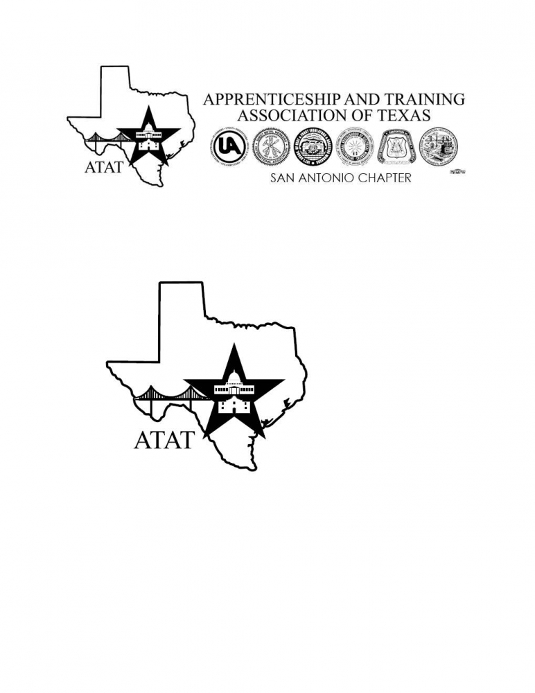
ATATSanAntonioLogo11541620908.jpg
Reference Samples:
C
Client607155 years ago
Again, i would like to see more similar to the 48 hour design styles.......
Design Concepts Completed5 years ago
Open design concept stage had ended with 99 submissions from 25 designers. Go to DESIGNS tab to view all submissions.
MarkindDesign, greak design. We are looking to make a couple of modifications to this logo.
I would like to add one more piece of wheat grain/arrow on each side of the main logo. This way there will be 7 on each side for a total of 14. Also, we love the logo as a black and white image but would like a few options with a color element. Could you produce a couple of samples with colored text. we like the idea of gold or yellow lettering to the letters on the ring to give a professional and official feel.
any assortment of color variations would be welcome but feel the gold would add another layer of depth to the design.
MarkindDesign5 years ago
sure mate! working on it today
Thanks!
C
Client607155 years ago
Can you manipulate the one we selected as the winner. the one with three stars on the bottom and not san antonio chapter. it would be neat to see the gold for the lettering and the inside and outside of the ring.
lastly, could we place another star inside of the star with a black border and color the inside of the star gold. i think this would add balance to the design if we go with the gold. I like the ATAT in the middle to stay black.
One last item for consideration, could you also manufacture a sample logo without the three stars on the bottom? just want to see if that does something for it.
MarkindDesign5 years ago
Hi mate. Please leave a comment on my design. So that notification will show on my inbox. So i can response asap. Anyways ill work on it today.
Cheers!
MarkindDesign5 years ago
kindly check 98 and 99.
Please comment on the design comment area. So I get notified.
Cheers!
C
Client607155 years ago
98 looks good with the coloring. can you modify 97 for just black and white?
97 just black and white, remove san antonio chapter and add the three stars.
is there a way to get 98 as is, and then 97 modified to black and white with the stars?
sorry for the delays in response, been swamped.
C
Client607155 years ago
my apologies, not 97, the the sweep leading to the star is too big. if you can just add the 7 grains of the wheat on each side of the selected winning design, keep it in black and white and we are good.
Call if needed to talk about the final revision please. 9194803336
C
Client607155 years ago
MarkindDesign,
Can you please make #98 just black and white. this would be exactly what we are looking for. From there i suppose i would be able to download the file?


 MarkindDesign
 uttam
uttam
 checx
checx
 Rashid
 BeDesign
 IrvanB
 Dhieko
 jaize
jaize
 done
done
 karjen
 serdadu
 nona
nona
 narnia
 dibyo
dibyo
 bricton
 graphica
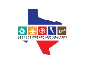
 Erasedink
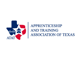
 shadowfax
 goblin
 alby
alby
 Suvendu
 beejo
beejo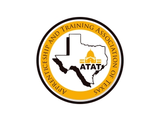
 naldart
 RIANW
RIANW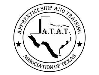
 Greenlight