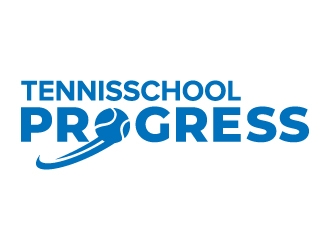
Tennisschool Progress organizes tennis trainings for various levels of players: recreational or competitive, young or old, beginner or (inter)national talent
Tennisschool Progress organizes tennis trainings for various levels of players: recreational or competitive, young or old, beginner or (inter)national talent
Instructions:
Logo should be clean, professional, dynamic and simple, preference for 'round' lines / forms
Logo has to radiate: energy, honesty, perseverance, quality.
Not more than 2 colors; so that it’s possible to use a negative version of the logo on a colored background
A subtle mention of a stylized tennis ball can be in the logo.
no gradients, no drop shadows, not too many details (should also be clear when it is printed very small)
Progress is the real name, tennisschool is descriptive; so Progress should be larger than Tennisschool
Preview
stylishtennisball1530353913.jpg
Reference Samples:
C
Client580486 years ago
ingenious007 is just invited to join this contest!
jaize is selected as the contest finalist!6 years ago
Design Concepts Completed6 years ago
Open design concept stage had ended with 38 submissions from 9 designers. Go to DESIGNS tab to view all submissions.


 jaize
jaize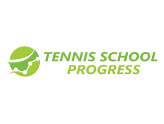
 megalogos
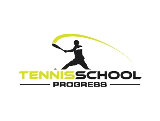
 zakdesign700
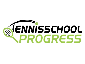
 ruki
ruki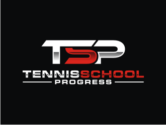
 bricton
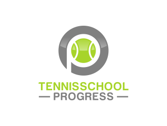
 BlessedArt
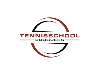
 checx
checx
 perf8symmetry
 mckris
ingenious007 is just invited to join this contest!