We breed and sell various snakes (pythons and boas), specializing in designer morphs of ball pythons.
Instructions:
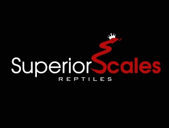
I would like a logo that incorporates a snake and/or a scaled pattern (whether it’s shaped into a letter(s) or just part of the overall design) and possibly a crown/scepter or some other symbol of royalty/superiority. I would also prefer the logo to have a standalone symbol that can be used alone (without words or the name of my company) that can easily be watermarked on social media pictures, etc. where there isn’t enough space for the words as well. For example, the Bullet Proof logo sample I chose, has that shield with the hands that could be used as a standalone symbol without the words. Most of the samples I chose exhibit this feature. I would like a black background with metallic red and silver/white as shown in the color schemes of most of the sample logos I chose. In addition, I’ll need a clear background so that I can watermark the logo on social media photos. Hope that helps! Can’t wait to see your creativity.
Preview
2018012423220254512.jpg
Preview
2018012423222154512.jpg
Preview
2018012423223754512.jpg
Reference Samples:
S
SuperiorScales8 years ago
I don't think I want an actual shield in my logo.
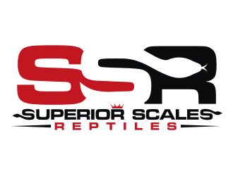
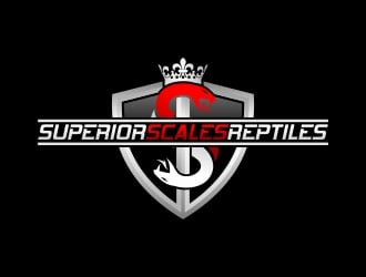
torresace is selected as the contest finalist!8 years ago
S
SuperiorScales8 years ago
Snake Eye idea for torresace.
S
SuperiorScales8 years ago
agil and torresace ..... both of your logo designs are amazing! I can’t decide between the two. I have created a poll on my social media accounts to get others’ opinions to help me decide.
S
SuperiorScales8 years ago
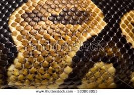
This is an example of the scales on a ball python head (example 1).
S
SuperiorScales8 years ago
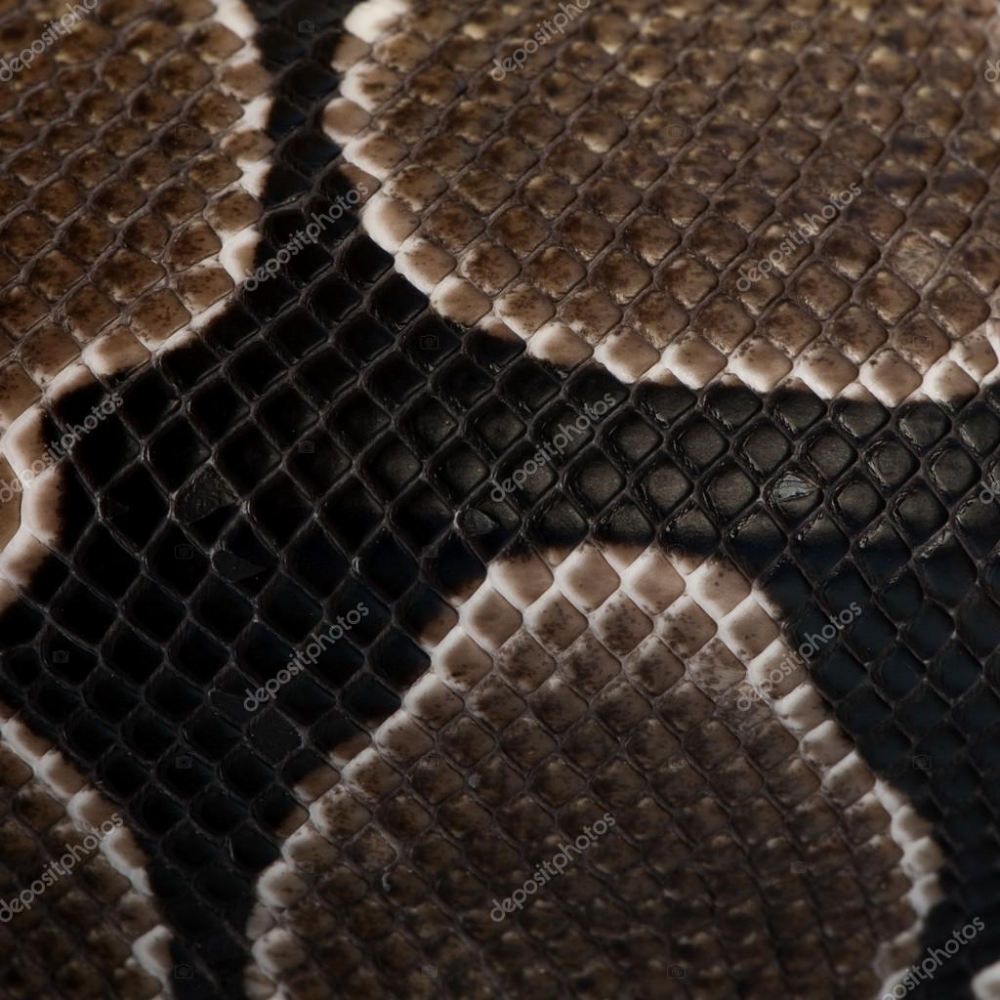
Example 2 of scales on head
S
SuperiorScales8 years ago
After hearing opinions and feedback from my social media followers, here are the revisions I would like to see made on your logo design (see the attached example where I roughly display several of these):
(1) make the red tongue shorter.
(2) change ALL gray color to white.
(3) add crown on top (from design #83, but this one is compressed so it is not as tall)....I would like to see a version with a white crown and one with a red crown.
(4) make the lines on both sides of "REPTILES" white.
(5) delete the bottom part of the eyes and make the remaining eye balls slightly larger
(6) Round out the underside of the top of the 2 "S"s that make up the snake head so there is a more visible heart in the middle
(7) Connect the bottom piece of the mouth to the top (otherwise, a lot of people thought the tongue and bottom piece of the mouth looked like a headless stick figure).
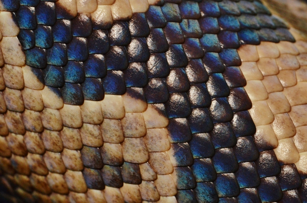
(8) Lastly, I would like to see a version where you add thin black lines inside of the 2 large white "S"s that make up a scaled pattern (see previous photos in this section for examples). Once you make the scales for one S, you can just mirror it over to the other S.
S
SuperiorScales8 years ago
Here's some of the suggested revisions I received from my social media followers that I would like to see incorporated:
(1) remove the large crown and place a smaller, compressed (shorter) version over the 2nd "R" in "SUPERIOR" (see the attached pic). I'd like to see a version with the crown red and one with it white.
(2) Put an extra space between "SUPERIOR" and "SCALES" so they don't run together as much.
(3) Make the word "REPTILES" a little larger.
(4) Instead of horizontal lines on both sides of "REPTILES", use the lines like what is in design #84 and make them white.
(5) Use the red color that's in design #87. It's a little brighter.
(6) Make the two "S"s circled in yellow (first and last) identical to the large black snake "S" except keep them white. The last S will be oriented just like the large black snake "S" and the first "S" will be inverted so the snake head is located at the lower left of that letter instead of upper right. Hopefully that makes sense.
(7) Lastly, I would like to see what it looks like if both the first "S" and the "R" in "SSR" are red instead of one being red and the other being white.
Design Concepts Completed8 years ago
Open design concept stage had ended with 111 submissions from 32 designers. Go to DESIGNS tab to view all submissions.
Here are the things I noticed about the design when viewing your higher resolution file downloads. These need to be corrected first. And then remember I will need a high resolution JPG, PNG with transparent background, PDF, EPS, and readme file for all 4 of the color combinations. So that should come out to be 20 files in the final package if I counted correctly.
(1) The bottom "REPTILES" line is not centered. The whole line (including the black horizontal tapered lines) needs to be shifted to the right. You can see how those tapered lines do not line up the same with the snake heads right above them on both sides.
(2) If you zoom in on the bottom right corner of the crown, there appears to be a small extra red piece.
(3) I noticed at least 4 spots in the big "SSR" lettering where it needs to be smoothed out. I circled in blue some examples of edges that are jagged or not smooth when zoomed in.
(4) The curve on the upper left of the big "R" did not line up correctly with the bottom left of the big "R". To make alignment easier, go ahead and make the upper left of the "R" a right angle (instead of a curve) as shown in the pic and make sure that edge lines up with the bottom left (see the blue arrows).
(5) Lastly, the top of the big "R" does not line up with the tops of the two big "S"s. The top of the big "R" is slightly lower, so it needs to be extended upwards to line up with the tops of the other two big letters.


 agil
agil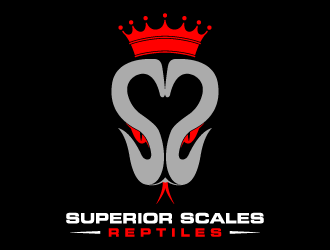
 torresace
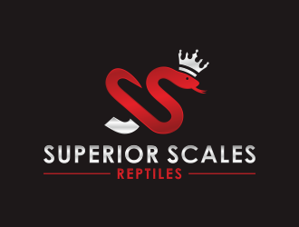
 arturo_
 Radovan
 BeDesign
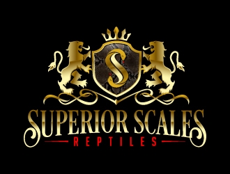
 jaize
jaize
 MarkindDesign
 dundo
dundo
 alby
alby
 rifted
 daywalker
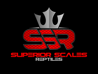
 fastsev
 done
done
 hole
hole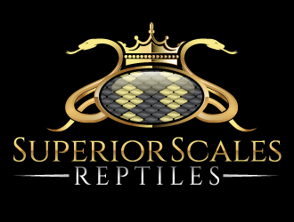
 scriotx
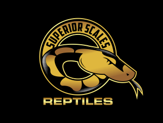
 Kruger
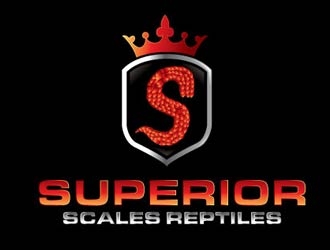
 shere
shere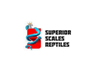
 SmartTaste
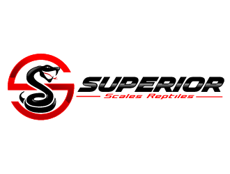
 THOR_
THOR_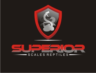
 naldart
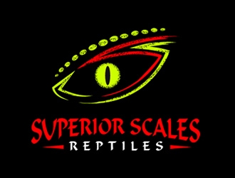
 Coolwanz
 bougalla005
 luckyprasetyo
 MagnetDesign
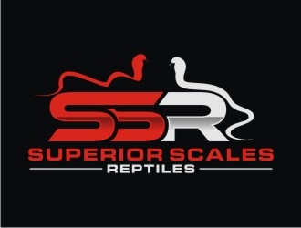
 bricton
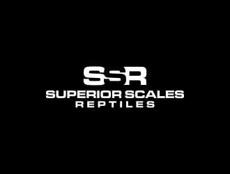
 larasati
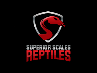
 Donadell
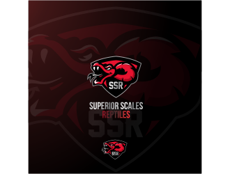
 shravya
 rief
rief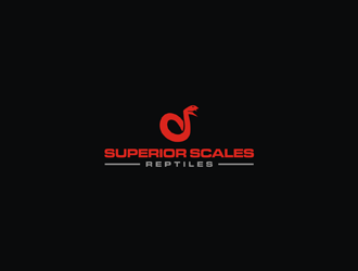
 EkoBooM