Molten-Labs a virtual research and development organization. We are a start-up, a small, nimble, flexible, frugal, Research and Development organisation, that will achieve its goals by using "knowledge economy" elements. We have a core group of experienced employees, who break apart problems for our "deep-knowledge" contractors to solve, and where appropriate, we farm out problems to be crowd solved. <br>Molten-Labs raison d'être is to provide "the best" technical research and development services. Our definition of being "the best" is two-fold, harnessing the "best" talent and utilizing the "best" processes to deliver an amazing product, in significantly shorter time than our competitors at a price that cannot be challenged. How we achieve those "bests" defines our business. <br>Because Molten-Labs is SO heavily collaborative, we treat our employee team-mates, our contractor team-mates, our client team-mates, our investor team-mates or even our competitors with a deep respect. Being an asshole is a fireable offence at Molten-Labs.<br>
Molten-Labs a virtual research and development organization. We are a start-up, a small, nimble, flexible, frugal, Research and Development organisation, that will achieve its goals by using "knowledge economy" elements. We have a core group of experienced employees, who break apart problems for our "deep-knowledge" contractors to solve, and where appropriate, we farm out problems to be crowd solved. <br>Molten-Labs raison d'être is to provide "the best" technical research and development services. Our definition of being "the best" is two-fold, harnessing the "best" talent and utilizing the "best" processes to deliver an amazing product, in significantly shorter time than our competitors at a price that cannot be challenged. How we achieve those "bests" defines our business. <br>Because Molten-Labs is SO heavily collaborative, we treat our employee team-mates, our contractor team-mates, our client team-mates, our investor team-mates or even our competitors with a deep respect. Being an asshole is a fireable offence at Molten-Labs.<br>
Instructions:
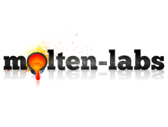
The term molten is supposed to denote heat and fluidity, and the liquid state of all modern materials, be they steel, silicon or alloy, before they solidify. The name was chosen to invoke that initial heat of discovery and the fluidity of an evolving idea.<br>The "look" that I want is for the logo to be like it has just been poured and is still very hot, glowing, liquid, but also having some parts of its surface cooled maybe forming a cracked hardened surface(but clearly still molten metal underneath). <br>I am looking for two visual elements in the logo: the words “Molten-Labs” (with a hyphen between the words) and some sort of ladle actually pouring molten metal out. I had thought that perhaps this poured metal is forming a droplet, which could also be like the stereotypical “idea light bulb”, but instead of the usual light bulb, it is a droplet of brilliant, liquid metal giving off light. Perhaps some type of hybrid between the light bulb and droplet, as they are somewhat similar shapes. This bright bulb / droplet could be the source of light that is actually illuminating the words “Molten-Labs”. <br>Also, perhaps the molten metal is splashing onto / into the letters of the words "molten-labs", or splashing in some other fashion, perhaps into its own "pool" of molten liquid. It should be clear that the poured molten metal (somehow) is describing ideas, thoughts, and creativity. This is an idea, but we are open to other thoughts.<br>To maximize the contrast, perhaps the background could be a dark grey, or some sort of industrial texture, with a reflective ground surface from which "Molten-Labs" logo is subtly reflected. <br>I am not against having the words “Molten-Labs” in lowercase, uppercase, or whatever font the designer thinks looks best, but there must be a hyphen between the words “molten” and “labs”.<br>While these are my current ideas, I am happy to accept new or novel ideas. Something completely different would definitely be considered.<br>
Preview
201611231836200.jpg
Preview
201611231837400.jpg
Preview
201611231840300.jpg
Client454167 years ago
Hi everyone,
So far there are some really interesting ideas, I do hope that you continue to try ...
Here is a little feedback:
1. Please find attached to a link for a video I had made for my Facebook site. I like the texture of the logo before it freezes ... that look of molten metal under a breaking crust.
2. Nobody is having the droplet pouring out of a ladle of molten metal (see my original photo post about the ladle). I really would love to see these drops coming from such a ladle. The ladle doesn't have to be photorealistic, it can be an abstract ladle.
3. I really, really like #7 by geomateo. Specifically, I like how they have turned the droplet into the lightbulb. That is a great idea! (but I don't like the ring around the droplet / bulb)
Thanks everyone, I can't wait to see what everyone comes up with! Please let me know if you have any questions ...
Client454167 years ago
Hi everyone.
There has been so much great work, I am very excited.
Here is a thought .. everyone is concentrating on the droplet of molten metal, which is great, but not everyone has that droplet coming out of the crucible. Please think about that.
One idea I had was that the "cracked crust of cooled metal" on the molten metal droplet might be in the shape of the light bulb.
This would have to be a VERY subtle effect, I want people to discover that. It would not have to be photorealistic, maybe abstract, but it would be there, and perhaps make people do a double-take.
Thanks again everyone, please keep up the good work!
Client454167 years ago
Hi everyone -
One idea that I just had was that the crucible pouring the molten metal drop could be BEHIND the lettering. This would allow the crucible and the droplet to be much larger.
This way crucible and droplet could then be roughly equal to the size of the letters, showing off the crucible and droplet more.
Thanks guys - this is great!
Paul
geomateo is selected as the contest finalist!7 years ago
samuraiXcreations is selected as the contest finalist!7 years ago
jaize is selected as the contest finalist!7 years ago
Client454167 years ago
Good morning everyone, back on-line
I want to thank everyone for their great work and congratulations (I think!) on being selected finalists.
I will be making my final decision in about 48 hours from now.
Good luck and thanks again for all your good work.
Paul
Client454167 years ago
Just an image to inspire. I would still like this to be a splash of molten-metal, not a cool liquid as shown here.
Thanks!
Client454167 years ago
Hi everyone
So I am making a few little changes. I need the logo to work on a white or a pale background.
I would like to throw into the mix the idea of a "splash" of molten-metal, as in the "simple splash" logo I just uploaded. I would love to see your individual take on that.
The splash could be a replacement for the droplet of molten metal.
I am also interested in seeing a little more "abstracted" logos, not quite so photorealistic...
I can't wait to see what you all upload, so far, it has been a great journey!!!
Design Concepts Completed7 years ago
Open design concept stage had ended with 1 submissions from 1 designers. Go to DESIGNS tab to view all submissions.

 jaize
jaize


So far there are some really interesting ideas, I do hope that you continue to try ...
Here is a little feedback:
1. Please find attached to a link for a video I had made for my Facebook site. I like the texture of the logo before it freezes ... that look of molten metal under a breaking crust.
https://www.facebook.com/moltenlabs/videos/1693146520997919/
2. Nobody is having the droplet pouring out of a ladle of molten metal (see my original photo post about the ladle). I really would love to see these drops coming from such a ladle. The ladle doesn't have to be photorealistic, it can be an abstract ladle.
3. I really, really like #7 by geomateo. Specifically, I like how they have turned the droplet into the lightbulb. That is a great idea! (but I don't like the ring around the droplet / bulb)
Thanks everyone, I can't wait to see what everyone comes up with! Please let me know if you have any questions ...