- $129
- BUDGET
- 1
- ENTRIES
BRIEF
DESIGNS (1)
- Logo Name:
- North Ridge Church
- Company Intro:
- Christian & Missionary Alliance church in Raleigh, NC. Website: www.northridgecma.org
- Instructions:
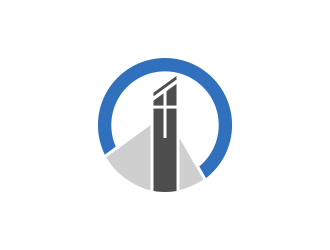
- The good news is, we already have a rough logo concept that puts us in the right ballpark (attached). We are looking for designers' input and expertise to clean it up, and to offer creative suggestions, enhancements, improvements, tweaks, or variations. Here are a few notes on the current concept: - The standard font scheme we use is from the Franklin Gothic family, with "North Ridge" in Demi-Condensed and "Church" in Book-Condensed. - The logo features the shape of our building in the negative space, and a subtle representation of the cross tower above our main entrance. It also has the overall look of a north-pointing compass - Blue/grey/charcoal/black is our main color scheme. We welcome your input, especially on the emblem. We would like to come out of the design phase with a cleaned up, scale-able, ready to use version of this logo, or a great version of it that we hadn't thought of. Thanks!
- NDesigners... It's been helpful to see some different approaches to the text, thanks for that. Ultimately, its the graphic I am mostly after. I can adjust the text in all kinds of different ways as needed, once I feel confident in the graphic. Feel free to just leave text out for now, unless you want to show it for context. Thanks!
- NCurrent favorite for development.
- NThis is our current favorite, but we're still very open to development, tweaks, suggestions to make it more appealing or more compelling.
Credit goes to BluePinkPanther for steering us in this direction. What we like about it is its combination of simplicity and tangible tie in to who we are. The cross tower depicted is the most recognizable feature of our property from the road. Personally I like how the angles in this design point to the cross, and the cross is central.
One aspect of this design I would consider a weakness is that a depiction of a building is not especially compelling, such as some representation of our love for the world, or love for our city, or dependence on the power of the Holy Spirit. That said, we fully recognize we can't necessarily "have it all" in a logo without cluttering it up, especially when preferring a minimalist approach.  Hey. Is everything ok?
- NHi there,
I'm sorry I had to put the project on hold for a little while. I was also able to run the ideas by several other key people. The design we like the most is still the one I posted marked, "Current Favorite for Development." I like the blue circle, the triangles, the broken connecting points, the cross with perpendicular lines, and the angular top to the tower with separated black cap.
If you have any other final suggestions, I'd be happy to see them. Otherwise, I see only two minor tweaks: a) the vertical line in the cross appears slightly off center to the right, and b) I think the color of the tower itself should be a shade lighter, it's a little too close to black. I don't mind the top cap being black though, that's a good accent.
If you don't mind taking care of those for me, we'll wrap this up. Thank you! - I will try to upload some other variations in few minutes so you can have better choice.
Open design concept stage had ended with 1 submissions from 1 designers. Go to DESIGNS tab to view all submissions.
#59 by bluepinkpanther_- NFinal concept with typography.
- NThe font used in the final concept with typography is Raleway


