The business focuses on fitness exercises without fitness machines that are commonly seen in gyms. Examples are bodyweight training, calisthenics, street workouts etc. Secondary focus is on having and maintaining a healthy lifestyle. Audience is mostly males, 18-44 years old, but logo should appeal to females that age as well.
The business focuses on fitness exercises without fitness machines that are commonly seen in gyms. Examples are bodyweight training, calisthenics, street workouts etc. Secondary focus is on having and maintaining a healthy lifestyle. Audience is mostly males, 18-44 years old, but logo should appeal to females that age as well.
Instructions:
Main colors black/red (for white background) and white/red (for black background). Logo should 'speak' trust, toughness and look solid. No bodybuilding or gym equipment images! Logo will be used as a brand and trademark, so it should not look like another fitness/health related brand. Also, we will use it for printing on merchandise as well, so it should not have more than 3 colors, including shades and gradients!<br><br>Update:<br>- Please make sure the number 72 can be clearly recognized.<br>- Instead of red, yellow is an option as well.<br>- Again: No bodybuilding or gym equipment images in the logo. <br>- Added some example images that are good for branding. Please use them as a guideline and do not simply replace the text with ' 72 reps' . <br>- Feel free to think outside the box, or simply like there is no box. Be creative! :)<br><br>Thank you for your efforts!
Reference Samples:
samuraiXcreations8 years ago
check design #11. thanks
samuraiXcreations8 years ago
check design#15. thanks
Contest relisted with guarantied prize of $99!8 years ago
#111 by mirceabaciu is selected as the contest finalist!8 years ago
#87 by PRN123 is selected as the contest finalist!8 years ago
#84 by rauldores is selected as the contest finalist!8 years ago
#81 by Mbelgedez is selected as the contest finalist!8 years ago
samuraiXcreations8 years ago
design #141 has a small imperfection the symbol is not well centered in the circle. sorry. i'll will submit that design again.
Design Concepts Completed8 years ago
Open design concept stage had ended with 1 submissions from 1 designers. Go to DESIGNS tab to view all submissions.

 check design #11. thanks
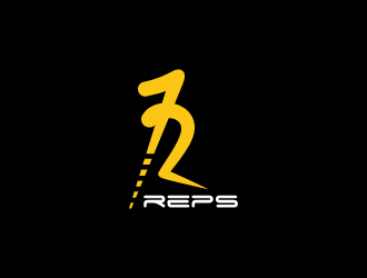
 Mbelgedez