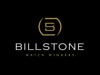
BillStone Watch Winders is a high end watch winder brand which help to run expensive automatic watches like Panerai, Rolex, and Patek Philippe. These watches which will stop running after a few days if they are not worn or manually wound.
Our products cost around USD 1,000.
Our typical customer persona is: Male, 30-50, 0.1% top income earner, have an expensive automatic watch (>USD 3,000). Our customers are mostly based in the Middle East, United States, and Indonesia.
We sell our products online through our website and marketplaces, and offline through one of our seven stores.
See more at houseofwinders.com and billstonewinders.com.
Instructions:
Update 8 Jun 2020: Our product's watch holder that looks like an "O" shape and on oval shape. Try to integrate this watch holder shape into our logo. By the way, the watch will rotate, so maybe you can add a movement gesture into the design as well
Hello Designers =)
We have been using a simple text-based logo since 2011. We would like a new logo that is more professionally done.
Here are the requirements for the logo:
- Appeals to the luxury shopper
- Professional Looking
- Easy to read or interpret
- Goes well on white background or black background
- The logo or part of the logo can be applied on our product and packaging (leather stamping, silkscreen, laser cnc on metal) without the use of color and still retain its meaning
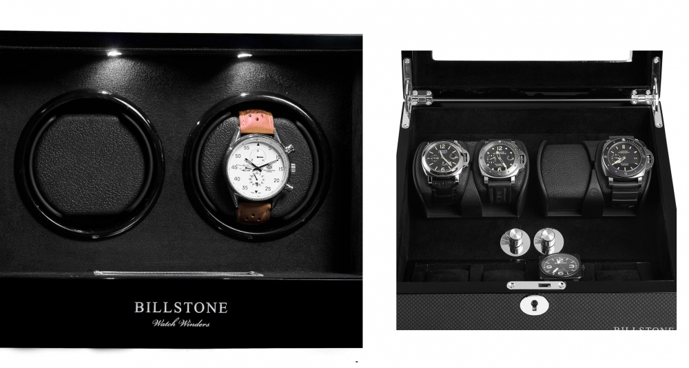
- Logo should not have too many thin lines or curves otherwise it will be hard to apply the logo to our product. The logo on our product is actually made of metal foil like the attached picture.
Below are what I do not want from the logo:
- Too colorful
- Too complex
- Cartoonish
Our watch holder. Please make the symbol look similar to it or at least have a connection to the shape
C
Client729826 years ago
Dear Designers, please make sure there is a symbol text logo. The symbol should have the following element:
- shows motion
- look like our watch holder (see attached picture)
ndaru is selected as the contest finalist!6 years ago
PRN123 is selected as the contest finalist!6 years ago
C
Client729826 years ago
For ndaru: can you make the symbol like this
C
Client729826 years ago
For ndaru: Please add a line in the middle so it doesn't look like a "3". Thank you
Design Concepts Completed6 years ago
Open design concept stage had ended with 323 submissions from 51 designers. Go to DESIGNS tab to view all submissions.

 PRN123
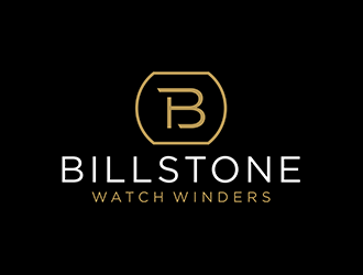
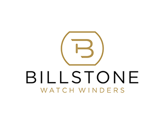
 ndaru
ndaru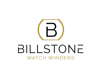
 kunejo
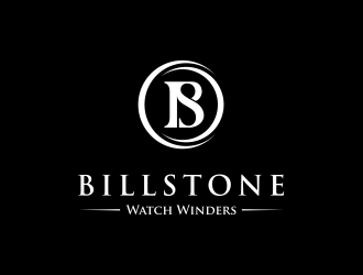
 yunda
yunda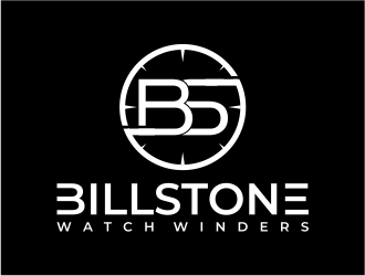
 mutafailan
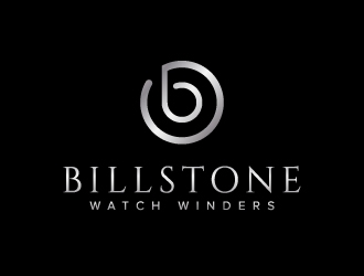
 jaize
jaize
 keylogo
 pambudi
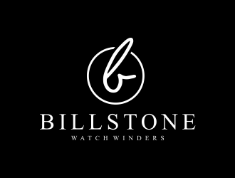
 Msinur
 done
done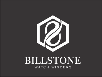
 up2date
 restuti
 ekitessar
 bismillah
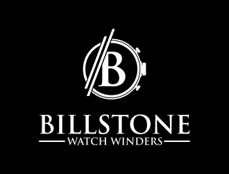
 Purwoko21
 logitec
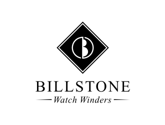
 asyqh
asyqh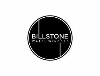
 christabel
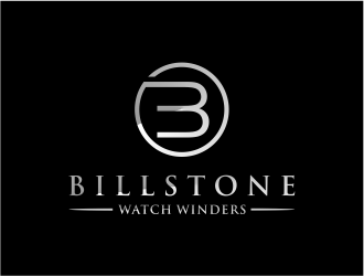
 cintoko
 maspion
 fastsev
 vinve
vinve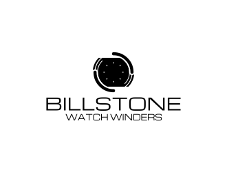
 monster96
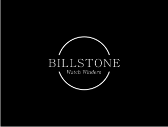
 Adundas
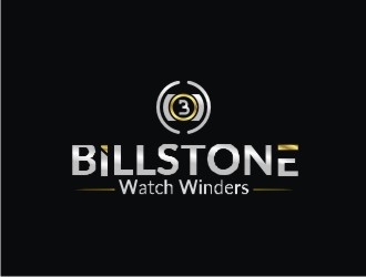
 Ulid
Ulid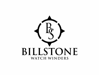
 InitialD
 Landung
 AamirKhan
 BintangDesign
 hopee
hopee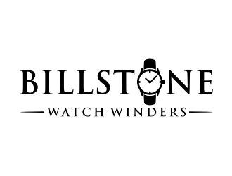
 puthreeone
 sndezzo
 amar_mboiss
 agil
agil
 andayani*
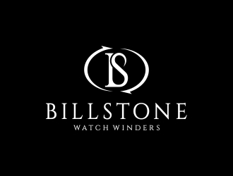
 CreativeKiller
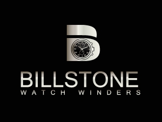
 drifelm
 scolessi
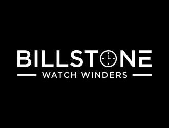
 p0peye
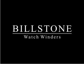
 KQ5
KQ5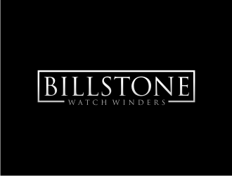
 Franky.
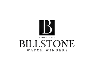
 yans
yans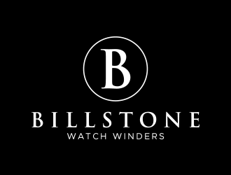
 lexipej
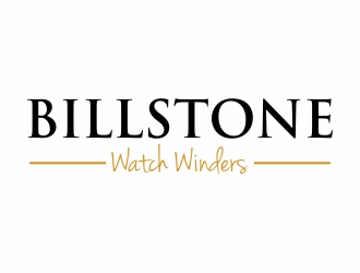
 eagerly
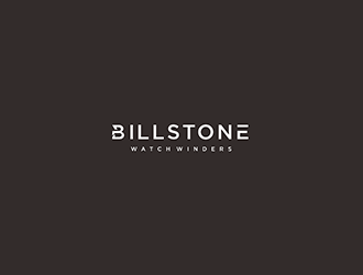
 Diponegoro_
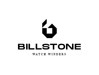
 graphica
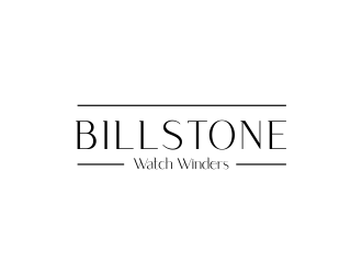
 checx
checx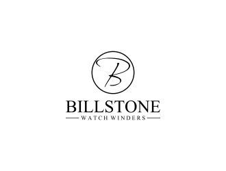
 RIANW
RIANW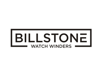
 rief
rief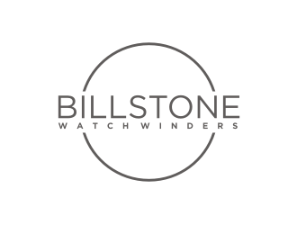
 Artomoro
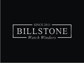
 mbamboex