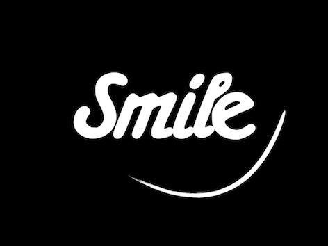
Make my concept look and feel more real. Clean it up and Bring it to life!
(Secret: Im a sucker for negative space logos/images)
Is it lacking depth?
Is it eye catching enough?
Is there a better font or a better way to situate this font?
needs a timeless color scheme?
Universally appropriate for all population?(Making clothing for children)
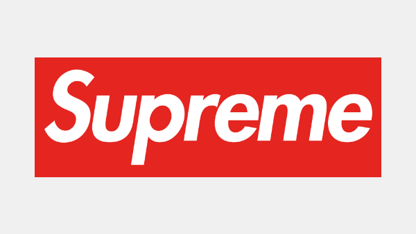
A good example of the direction: "Supreme streetwear"(attached below)
Im looking to take the next step forward.
Id prefer designers to treat this as more of a professional peer review than a revamp or total overhaul,
BUT if you can see the intention and feel that you can execute the visual better feel free to submit your idea/logo/concept in for judging. Thank You!
Try not to copy supreme and steer clear from resembling Amazon.
P.s. I can only give feedback to designers who are submitting new concepts.
Preview
Supremelogo11582238841.png
Preview
SmileTest1582237068.png
Preview
amazonlogo400x3001582248025.png
Reference Samples:
Design Concepts Completed6 years ago
Open design concept stage had ended with 207 submissions from 60 designers. Go to DESIGNS tab to view all submissions.
Mirza is selected as the contest finalist!6 years ago
restuti is selected as the contest finalist!6 years ago
Coolwanz is selected as the contest finalist!6 years ago
C
Client708226 years ago
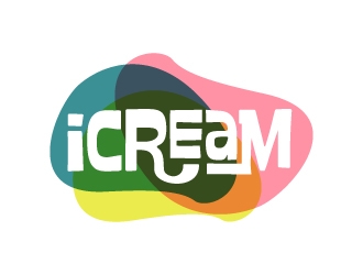
Here is the Logo we are planning to move forward with. Notice the minor spacing changes between each letter. The objective is the same as before.
- Clean this logo up. Any imperfections you see?
- Make it look and/or feel more real...
- Does it need some shading, outlining, or gradient?
- An iconic or timeless color choice? For the entire logo or maybe just the smile.


 restutiDesign Hidden
 MirzaDesign Hidden
 crazherDesign Hidden
 shadowfaxDesign Hidden
 GreenlightDesign Hidden
 jaizeDesign Hidden
 asyqhDesign Hidden
 sanuDesign Hidden
 hwkompDesign Hidden
 jonggolDesign Hidden
 auraDesign Hidden
 superbrandDesign Hidden
 bougalla005Design Hidden
 luckyprasetyoDesign Hidden
 zakdesign700Design Hidden
 MarianneDesign Hidden
 MahreinDesign Hidden
 CreativemindsDesign Hidden
 GemahRipahDesign Hidden
 johanaDesign Hidden
 Purwoko21Design Hidden
 nurul_rizkonDesign Hidden
 jafarDesign Hidden
 NurmaliaDesign Hidden
 riefDesign Hidden
 brictonDesign Hidden
 scolessiDesign Hidden
 akilis13Design Hidden
 aldesignDesign Hidden
 usashiDesign Hidden
 albyDesign Hidden
 AamirKhanDesign Hidden
 AYATADesign Hidden
 FirmanGibranDesign Hidden
 rukiDesign Hidden
 InayaDesign Hidden
 CoolwanzDesign Hidden
 Alfatih05Design Hidden
 ManishKoliDesign Hidden
 oke2angconceptDesign Hidden
 CreativeKillerDesign Hidden
 checxDesign Hidden
 kakikukejuDesign Hidden
 DakonDesign Hidden
 SusantiDesign Hidden
 YONKDesign Hidden
 yansDesign Hidden
 BeyenDesign Hidden
 ndaruDesign Hidden
 dibyoDesign Hidden
 R-artDesign Hidden
 naldartDesign Hidden
 RIANWDesign Hidden
 MsinurDesign Hidden
 mbamboexDesign Hidden
 creator_studiosDesign Hidden
 maserikDesign Hidden
 DevianDesign Hidden
 logitec
 sitizen