Athletic organization looking to provide skill training to athletes looking to reach the next level in their sport. Also looking to develop competitive leagues and tournaments to provide opportunities for athletes to use those skills.
Athletic organization looking to provide skill training to athletes looking to reach the next level in their sport. Also looking to develop competitive leagues and tournaments to provide opportunities for athletes to use those skills.
Instructions:
I like aggressive, dramatic lines like in the Tony Hollums art, but with a clean, precise finish. I have always had a preference for symmetry, but rather than precise symmetry, I just prefer a solid balanced feel. I do not want a character, but the violent vibe of the characters in the images i selected is something I like. I like dark dramatic look from the colors, I like dark gray, navy and black, and if done well, steeltown gold as a hint or an accent. I like the font papyrus, but if it was blended with a little bit of a cursive touch.
Reference Samples:
K
kellybarcol4 years ago
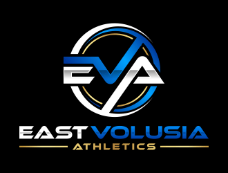
Hi gang, please look at the sample logos we choose as examples. We want that V in Volusia to be ripping through logo some how. I believe in ya.
K
kellybarcol4 years ago
The large V as the central figure (#15) is a good change in direction. I would like to develop the EVA with the larger V in a papyrus-ish, but even more dramatic. And then the smaller E and A on each side in a different font (the font for East in #3 is interesting). Also, I really like the way that circle border from hopee works. Once the EVA shapes up and develops, I like the inclusion of that kind of border, I would be interested in seeing a triangle as an option.
K
kellybarcol4 years ago
This is a very rough sketch of what we are looking for. Want the V to be the focal point jumping out of a more triangular shape
K
kellybarcol4 years ago
K
kellybarcol4 years ago
I created another sketch, the PDF file just attached, and that's the base that I'd really like to get to. I like to get to. On either side of the V I'd like to have the E and A fit in with a font that contrasts with the V.
torresace is selected as the contest finalist!4 years ago
cintoko is selected as the contest finalist!4 years ago
popi101 is selected as the contest finalist!4 years ago
Design Concepts Completed4 years ago
Open design concept stage had ended with 72 submissions from 17 designers. Go to DESIGNS tab to view all submissions.
 ubai popi
 cintoko
 torresace
 bunda_shaquilla
 qqdesigns
 jaize
jaize
 DreamLogoDesign
 Franky.
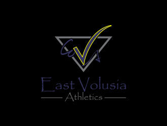
 oke2angconcept
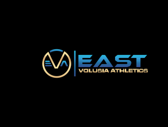
 hopee
hopee
 Nurmalia
 bricton
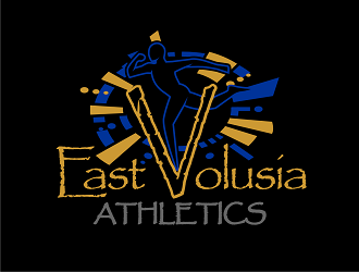
 haze
haze
 Rizqy
Rizqy
 p0peye
 nurul_rizkon
 jancok