The customers current logo is at www.redbayboats.com
You can see that it is really poor and we are looking for cleaner and more modern version.
The colours and text must remain the same ("Redbay Boats" and "StormForce Ribs") but I would like a more contemporary combination of fonts.
The one very important items is the boat icon you can see. It is a creative representation of the front of the boats they produce and this representation is very well known as their boat design style. This must be included in a creative way BUT it must look similar to the one in the current logo. NOT like standard boat front.
You can see any of their boats at www.redbayboats.com and you will see that although they have many boat models, most of them use the same style of front of the boat. They create commercial and leisure boats so the style of the logo must fit their products. Strong, fast, modern.
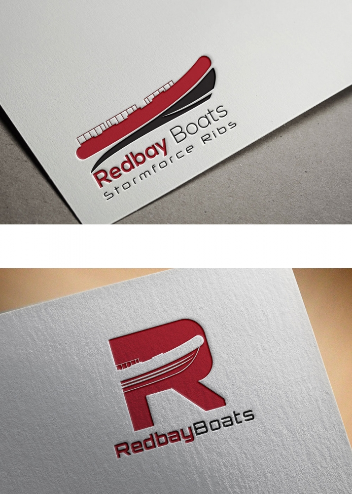
I attach 2 very poor examples based on some simple ideas.
The top one has bad font choice and the boat icon is too detailed with the railings. Its not stylistic enough but it is a good layout.
The bottom one was an idea to add the boat icon into the letter "R" but again really poorly done.
Preview
redbay1580124220.jpg
Design Concepts Completed6 years ago
Open design concept stage had ended with 63 submissions from 22 designers. Go to DESIGNS tab to view all submissions.
 berkahnenenDesign Hidden
 torresaceDesign Hidden
 cintokoDesign Hidden
 GreenlightDesign Hidden
 kunejoDesign Hidden
 KDesignsDesign Hidden
 MUSANGDesign Hidden
 ElibenDesign Hidden
 ingeproDesign Hidden
 akhiDesign Hidden
 PanaraDesign Hidden
 AamirKhanDesign Hidden
 fastsevDesign Hidden
 GwerthDesign Hidden
 kurniaDesign Hidden
 juliawan90Design Hidden
 sitizenDesign Hidden
 RizqyDesign Hidden
 logitecDesign Hidden
 ammadDesign Hidden
 luckyprasetyo
 checx
checx