A website with useful advice and tips to sleep and nap better.
Instructions:
Hi,
I would like a simple design that communicates on the same level as the website reader. It's about a real-life person who wants to share his experiences about napping and sleeping. It's not a doctor's site that advises on illnesses like insomnia (although that might be discussed as part of other topics).
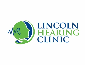
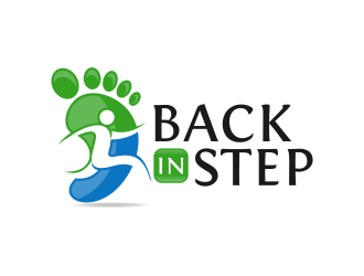
Try to bring in a face/head, to give it a more human aspect, rather than an abstract design. Faces always attract more attention. It doesn't need to be like a real face, just as long as the "only abstract" idea isn't there. A drawing of a young woman with her head on a pillow, similar to the "back-in-step" logo would look great. The "Lincoln" head is still too abstract as there are no eyes. It needs a more human feel.
Please choose the fonts carefully and let me know which ones you used. Let these be light but not too playful.
I definitely don't want anything cartoon-ish. That would undermine the seriousness.
the website is called napadviser.com, but I prefer not to use the ".com" in the logo.
I choose the word "napping" over "sleeping" only because of the URL availability. The website is rather about sleeping than napping. So there's no need to emphasis on the word "napping".
Thank you and good luck
Reference Samples:
kunejo is selected as the contest finalist!6 years ago
emyjeckson is selected as the contest finalist!6 years ago
J0s3Ph is selected as the contest finalist!6 years ago
Design Concepts Completed6 years ago
Open design concept stage had ended with 51 submissions from 20 designers. Go to DESIGNS tab to view all submissions.


 kunejo
 J0s3Ph
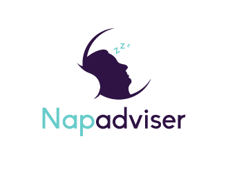
 grea8design
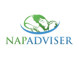
 Eliben
 hole
hole
 AB212
AB212
 serprimero
 RatuCempaka
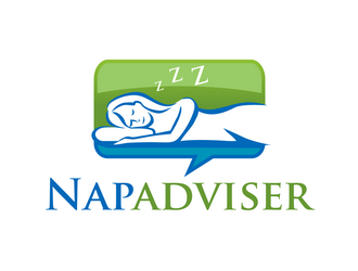
 haze
haze
 emyjeckson
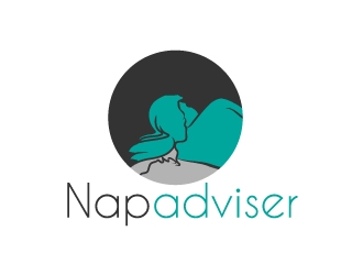
 zenith
 cahyobragas
 jetzu
jetzu
 WoAdek
 czars
czars
 bricton
 dewipadi
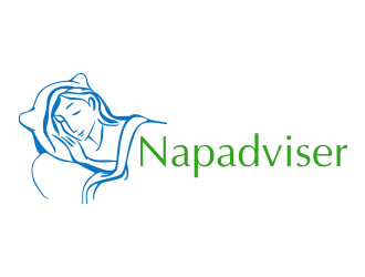
 aldesign
 ammad
ammad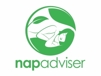
 Eko_Kurniawan