Dirty Harry makes natural and reliable skincare products that men love because they are no fuss and beneficial to their skin - with a bit of humour, honesty and wit added in. <br><br>The products are primarily face moisturizers, face scrubs and aftershave balms.<br><br>The target market is males aged 25-44 years old who use skincare on a regular basis and are driven by key features of skincare products (natural ingredients, good for sensitive skin, light and refreshing to use, really simple).<br><br>The brand has the following personality (think of it as a person): <br>Manly, masculine, honest, to the point, helpful, witty, easy going, responsive, reliable, funny<br><br>Brand experiences men have:<br>• Product smells awesome, Feels awesome<br>• Goes on smooth<br>• Low irritation and helps with sensitive skin<br>* Great customer service<br>* Unlike any other skincare brand
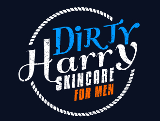
Dirty Harry (main title) Skincare for Men (tag line)
Company Intro:
Dirty Harry makes natural and reliable skincare products that men love because they are no fuss and beneficial to their skin - with a bit of humour, honesty and wit added in. <br><br>The products are primarily face moisturizers, face scrubs and aftershave balms.<br><br>The target market is males aged 25-44 years old who use skincare on a regular basis and are driven by key features of skincare products (natural ingredients, good for sensitive skin, light and refreshing to use, really simple).<br><br>The brand has the following personality (think of it as a person): <br>Manly, masculine, honest, to the point, helpful, witty, easy going, responsive, reliable, funny<br><br>Brand experiences men have:<br>• Product smells awesome, Feels awesome<br>• Goes on smooth<br>• Low irritation and helps with sensitive skin<br>* Great customer service<br>* Unlike any other skincare brand
Instructions:
The idea of the logo is to create a bit of a character behind the brand. Give it a personality while keeping it focused at the same time. <br><br>Even though Dirty Harry is a popular movie, please do not use any Clint Eastwood references of iconography. You can use the "enforcer" type tag that he represents but no direct references please.<br><br>Here are some words to explore for symbols or icons: <br>skin, husk, protection, simple, refreshing, strong, manly, paint, good looks<br> - along with the personality traits listed in the brand description above. <br><br>I like the use of typography in logos and selected many that are similar to what I have in mind. Creative use of fonts and stylized words will be appreciated. Symbols are not so important but if you think of any to compliment then that would be great. The logo needs to be able to look unique and really interesting when on a product. <br><br>Images to have in mind:<br>Sports and action<br>Rugged landscapes and terrain<br><br>Fonts:<br>Slab Serif <br>Hard-edged serifs<br>Tall thin, condensed styles<br>Thick Strokes<br><br>Colors<br>Preferences are blue (royal or navy), charcoal and other saturated colors like dark green or red. <br>Don't use them all together but pick one or two and use them complimentary in different shades (like some of the sample logos do).<br><br>Also, please have in mind how the image would look in both landscape and square/portrait form. The logo will appear on the website header as well as the main component of the products themselves. I have attached and example of the type of product the logo would feature on (forget the colors it uses).<br><br><br>THEMES/ IDEAS TO AVOID<br>• Anything soft or feminine<br>• Anything that’s too obvious it is for men (like images of men or male icons/symbols)<br>• Nothing so vague that it’s not related to the products (flexible on this though)
Preview
2016030807022140554.jpg
Preview
2016030807025140554.jpg
Preview
2016030807030540554.jpg
Reference Samples:
T
tnellis10 years ago
I also love geometric shapes, so anything that uses this kind of iconography would be awesome.
If i'm giving you TOO much information, just go with what you know and feel, I understand.
T
tnellis10 years ago
So far the quality of entries has been really really good.
ivory is selected as the contest finalist!10 years ago
karjen is selected as the contest finalist!10 years ago
Janie is selected as the contest finalist!10 years ago
Design Concepts Completed10 years ago
Open design concept stage had ended with 1 submissions from 1 designers. Go to DESIGNS tab to view all submissions.

 ivory
ivory


If i'm giving you TOO much information, just go with what you know and feel, I understand.