For World Class, state of the art cosmetic dentistry in South Africa you can pay up to 50% less than in the UK, US, Canada, Australia and other countries. So whilst saving money having your cosmetic dental work done, why not enjoy a little break in the African Savannah, bronzing on South Africa’s fantastic beaches or travel up the Garden Route via Stellenbosch’s stunning wine farms. <br><br>So we offer people that want to have cosmetic dental work done the opportunity to have it done by world-class dentists at half the price they would pay in any other first world country, and whilst they are in South Africa and they have some spending money (due to the savings on their dental) we will organize the rest of the holiday for them, this could be a trip to the famous Kruger National Park, or the cape town wine routes, or many other travel opportunities. So essentially we are a travel company but we look for the person that needs dental work.
For World Class, state of the art cosmetic dentistry in South Africa you can pay up to 50% less than in the UK, US, Canada, Australia and other countries. So whilst saving money having your cosmetic dental work done, why not enjoy a little break in the African Savannah, bronzing on South Africa’s fantastic beaches or travel up the Garden Route via Stellenbosch’s stunning wine farms. <br><br>So we offer people that want to have cosmetic dental work done the opportunity to have it done by world-class dentists at half the price they would pay in any other first world country, and whilst they are in South Africa and they have some spending money (due to the savings on their dental) we will organize the rest of the holiday for them, this could be a trip to the famous Kruger National Park, or the cape town wine routes, or many other travel opportunities. So essentially we are a travel company but we look for the person that needs dental work.
Instructions:
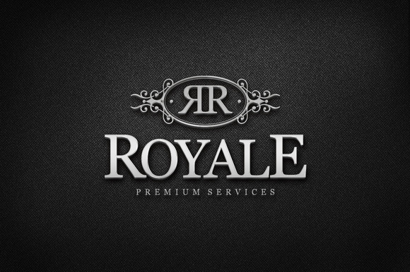
I would like to see if we can incorporate two SS in a circle, the S's for Smile and for Safari <br>My color scheme for my website will be either white on brown or visa versa, silver on brown or visa versa, gold on brown or vise versa the classy look. See my last attachedment, "ROYALE" that kind of look.<br>I am pretty open for discussion other than that, but the look i am going for on my website will be classy, feel free to play around with the name Smile on Safari in terms of fonts thickness of letters and colors.<br>Not sure if this makes sense but i would need the logo and name on see through background for my website, as its gonna be on a changing photos. The interchanging Photos on the website will be of beautiful safari photos of animals and photos of girls and guys with beautiful teeth.<br>The photos i have attached below are meerly samples, i want you to go crazy and create something classy with 2xSS and the words SmileOnSafari
Preview
201511121731270.jpg
Preview
2015111221083737866.jpg
Preview
201511121733460.jpg
A
aj8 years ago
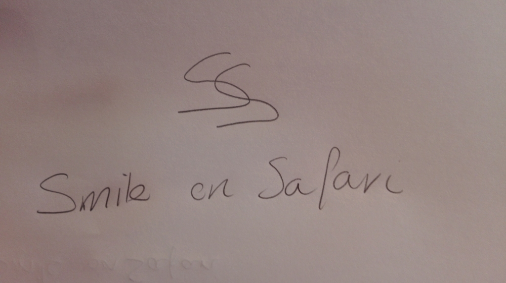
Hi Everyone, it would appear to me that the circle and the frills around the two SS wont work, please see the drawing i made attached, and try something similar, he font also has to change please do a more classic font with the new look, thank you.
A
aj8 years ago
Hi all, this is more the look that i am looking for, please play around with this idea
A
aj8 years ago
This font Rykos
A
aj8 years ago
Hi All.
Only an hour left.
My favorite logo now is #15 but i would like two changes.
1.The SS need to be slightly thicker (keep the same font as #15) Move SS closer towards each other
2. Make the word "on" one font size smaller
Good luck all.
#15 by rykos is selected as the contest finalist!8 years ago
Design Concepts Completed8 years ago
Open design concept stage had ended with 1 submissions from 1 designers. Go to DESIGNS tab to view all submissions.
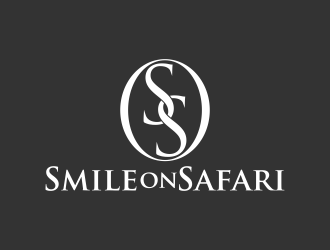
 rykos
rykos