"Be the better dad."
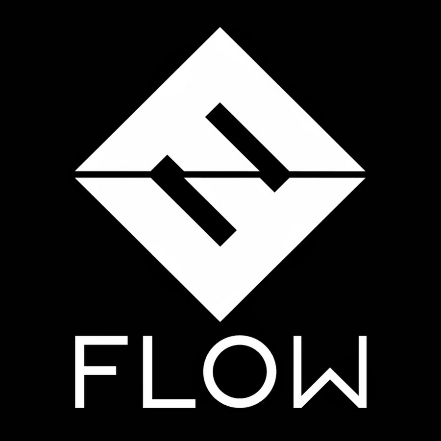
Father Fitness is a personal development site for fathers.
Instructions:
I like strong, solid, and dependable. That's why I went with Navy Blue for the first draft, but I am open to other colors.
I'd especially like to see some geometric combinations of 'FF.'
Preview
201501300911555461.jpg
Preview
201501300913415461.jpg
Preview
201501300915125461.png
C
caelanmac9 years ago
Awesome fonts: are great!
Awesome icons: are great!
Awesome fonts and icons that reflect one another: they win!
There is SO MUCH good design in this competition, and I'm only 24 hours through, as of this writing.
I'm seriously impressed, everyone. Thank you for bringing so much talent here.
Since I'm lucky enough to be choosy, amongst all this talent, I'll clarify: the prize for this contest won't go to the one with the best font, or to the one with the best icon.
The prize will go to the one that successfully integrates the icon and the font together.
That's fit.
karjen9 years ago
#65pls
Ultimatum is selected as the contest finalist!9 years ago
ingepro is selected as the contest finalist!9 years ago
Design Concepts Completed9 years ago
Open design concept stage had ended with 1 submissions from 1 designers. Go to DESIGNS tab to view all submissions.
 #65pls
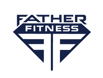
 Ultimatum

Awesome icons: are great!
Awesome fonts and icons that reflect one another: they win!
There is SO MUCH good design in this competition, and I'm only 24 hours through, as of this writing.
I'm seriously impressed, everyone. Thank you for bringing so much talent here.
Since I'm lucky enough to be choosy, amongst all this talent, I'll clarify: the prize for this contest won't go to the one with the best font, or to the one with the best icon.
The prize will go to the one that successfully integrates the icon and the font together.
That's fit.