***3 x Illustrations/flat icons to "lift" web page design***
I want three illustrations to brighten up a new website teaching TIME MANAGEMENT, at http://heymalc.net .
The 3 illustrations/icons are to illustrate the following 3 ideas:
1. Be in complete control – while you stay relaxed!
2. Double your productivity in thirty days
3. Use the ever popular (and free) Evernote to help you get things done
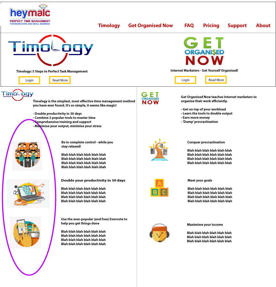
See where they'll appear on MOCKUP.jpg, attached to the project. They are highlighted using a purple oval.
**See the attached Word file for copies of the screenshots. 48 doesn't seem to be showing them currently ...)**
The images will be used at the size of approximately 200 pixels.
**STYLE AND FEEL
*Colours
I realise there are a lot of colours on MOCKUP.jpg - because it has 3 x logos on it. The main logo to tune in with the colours of, is the Timology logo, as that will be the main brand going forward.
(Once I have the illustrations, I'll have the web page designed for me at "48".)
Beyond tuning in with the Timology logo, use other colours as you think.
I do like colour: good use of colour will help win the contest. Use of pastel shades is quite common now and I like many of these shades, so pastels could help win the contest. (Eg the WPLMS theme's standard install uses a lot of pastel - see 2 paragraphs below.)
*What I like
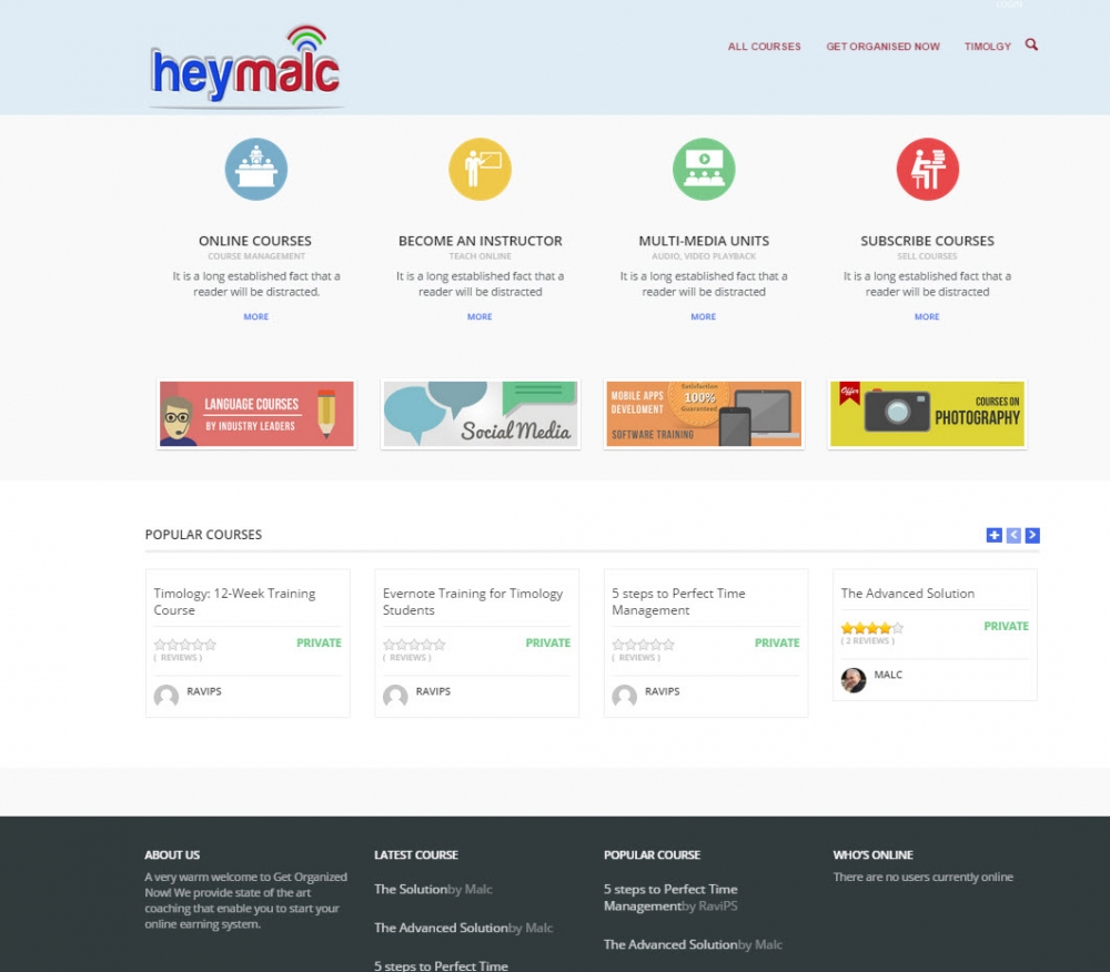
The icons and banners on the current heymalc.net page have something of the look and feel I would like. A screenshot is attached STYLE-FEEL-1.jpg . (They are the icons and banners which come bundled with the WPLMS WordPress theme installed there.)
**See the attached Word file for copies of the screenshots. 48 doesn't seem to be showing them currently ...)**
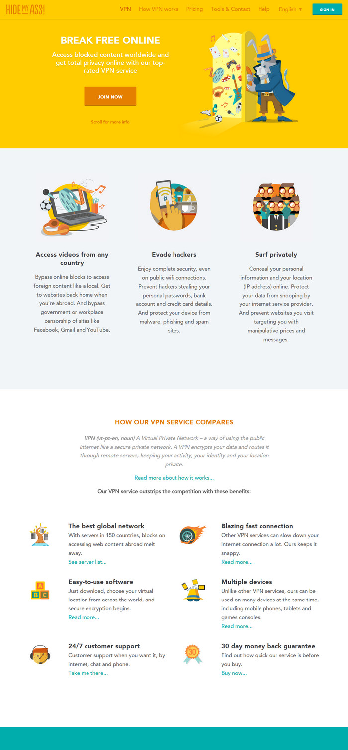
I also like the look and feel of the illustrations used on the Hidemyass website: http://hidemyass.com . A screenshot is attached STYLE-FEEL-2.jpg This site has a modern feel to it, and it is using a theme similar to the one used at http://heymalc.net.
*Brand Values
Timology brand values, which I'll be looking for in your illustrations, are:
- Modern
- Clean
- Cutting edge
- Efficient
- No-nonsense
- Warm, friendly, approachable
**Other thoughts
I'd like 'modern', definitely not 'retro'.
A 'schematic' feel, not cartoon, or realistic. I want images which are similar to the "flat icon" feel.
Fairly simple, not too busy.
Thank you
Malc
**See the attached Word file for copies of the screenshots. 48 doesn't seem to be showing them currently ...)**
3 x Illustrations/flat icons to "lift" web page design
Company Intro:
***3 x Illustrations/flat icons to "lift" web page design***
I want three illustrations to brighten up a new website teaching TIME MANAGEMENT, at http://heymalc.net .
The 3 illustrations/icons are to illustrate the following 3 ideas:
1. Be in complete control – while you stay relaxed!
2. Double your productivity in thirty days
3. Use the ever popular (and free) Evernote to help you get things done
See where they'll appear on MOCKUP.jpg, attached to the project. They are highlighted using a purple oval.
**See the attached Word file for copies of the screenshots. 48 doesn't seem to be showing them currently ...)**
The images will be used at the size of approximately 200 pixels.
**STYLE AND FEEL
*Colours
I realise there are a lot of colours on MOCKUP.jpg - because it has 3 x logos on it. The main logo to tune in with the colours of, is the Timology logo, as that will be the main brand going forward.
(Once I have the illustrations, I'll have the web page designed for me at "48".)
Beyond tuning in with the Timology logo, use other colours as you think.
I do like colour: good use of colour will help win the contest. Use of pastel shades is quite common now and I like many of these shades, so pastels could help win the contest. (Eg the WPLMS theme's standard install uses a lot of pastel - see 2 paragraphs below.)
*What I like
The icons and banners on the current heymalc.net page have something of the look and feel I would like. A screenshot is attached STYLE-FEEL-1.jpg . (They are the icons and banners which come bundled with the WPLMS WordPress theme installed there.)
**See the attached Word file for copies of the screenshots. 48 doesn't seem to be showing them currently ...)**
I also like the look and feel of the illustrations used on the Hidemyass website: http://hidemyass.com . A screenshot is attached STYLE-FEEL-2.jpg This site has a modern feel to it, and it is using a theme similar to the one used at http://heymalc.net.
*Brand Values
Timology brand values, which I'll be looking for in your illustrations, are:
- Modern
- Clean
- Cutting edge
- Efficient
- No-nonsense
- Warm, friendly, approachable
**Other thoughts
I'd like 'modern', definitely not 'retro'.
A 'schematic' feel, not cartoon, or realistic. I want images which are similar to the "flat icon" feel.
Fairly simple, not too busy.
Thank you
Malc
**See the attached Word file for copies of the screenshots. 48 doesn't seem to be showing them currently ...)**
Instructions:
N/A
Preview
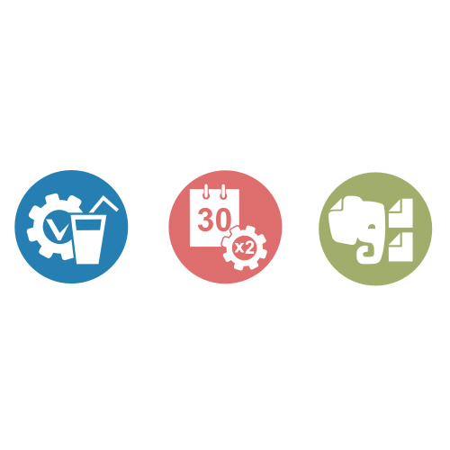
2015011122520220500.jpg
Preview
2015011122523520500.jpg
Preview
2015011122522120500.jpg
Reference Samples:
FoalArt9 years ago
Where MOCKUP.jpg ?
H
heymalc9 years ago
The specification containing images too.
H
heymalc9 years ago
MOCKUP.jpg
H
heymalc9 years ago
STYLE-FEEL-1.jpg
H
heymalc9 years ago
STYLE-FEEL-2.jpg
Design Concepts Completed9 years ago
Open design concept stage had ended with 1 submissions from 1 designers. Go to DESIGNS tab to view all submissions.
 Where MOCKUP.jpg ?