Gold Standard Auctions is an auction house that deals primarily in gold and coins, though we’re now expanding our inventory to include other valuable and rare collector’s items (fine jewelry, collectible guitars, antique clocks, etc . .. ). We buy most of our inventory from trade shows currently, but are expanding to begin sourcing inventory directly from individuals looking to consign or sell their valuables via online platforms. We sell our inventory primarily through other platforms, like Highbid, LiveAuctioneer, etc . .. , which host live, online auctions.
OUR AUDIENCE:
For us, the people who consign or sell to us are as valuable a target audience as the people who buy from us. Because 99% of our inventory is collector's items, meaning none of it is purchased new from a wholesaler, we are constantly looking for ways to find more inventory. For that reason, it is equally important for us to consider what our logo conveys to those who sell to us (or consign with us) as it is to consider what our logo conveys to our buyers.
So, in designing our logo we really have two audiences in-mind: 1) the audience that buys from us and 2) the audience that sells to us or consigns with us.
With both of those two audiences in mind, here’s what we’re looking to convey with our logo: Authenticity, Luxury, Trustworthiness, Money (for lack of a better word).
WHAT OUR LOGO NEEDS TO CONVEY:
Our logo needs to convey trustworthiness, authenticity, luxury and imply that we’ll pay the most for the items we are acquiring and that the items we're selling are highly valuable.
Authenticity & Trustworthiness:
A tremendous concern among people that are buying from us is authenticity— they want to feel confident that the item they’re buying isn’t a replica or fake. They need to also feel like we’re reputable and that when they spend thousands of dollars with us, that we’ll deliver the product and service that they expect when making a purchase of that amount.
It’s important that people both trust us to handle the valuable items that they’re selling to us or through us (via consignment). They must feel confident that we’ll handle and track these items with care and that they can trust us to pay them. So, we need a logo that conveys that we are trustworthy and that our items are authentic.
Luxury:
We deal only in high-end collectible products. Our audience base, both on the buying and selling side, are typically high wealth individuals. On both sides, our target audiences want to feel like they’re dealing with a company that is a luxury, high-end brand.
Money:
Finally, it’s important that the people who sell to us (or consign items with us) feel that they are getting the highest possible amount of money for their items. One of the reasons we want to incorporate green into our logo is to encourage our target audience's association between money and our brand (aka- we pay the most money for their valuables). We can’t do it in a way that cheapens the brand, however, so it’s a very delicate balance.
Instructions:
LOGO DESIGN:
$20 GOLD COIN:
Bearing in mind the above characteristics that we want our logo to convey, we also need a particular design aspect to be incorporated:
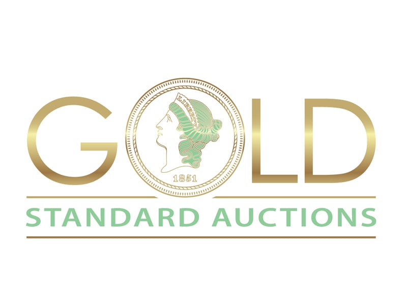
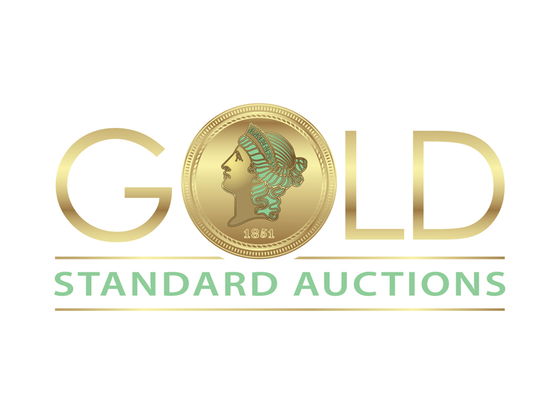
Our CEO has used a $20 gold piece in place of the “O” in the “Gold Standard Auctions” logo and would like to continue doing so. We know it can sometimes be tricky to incorporate too detailed an icon into a logo, so we were thinking a good example of how to do that well might be the Versace logo, as they also have a highly detailed round icon that could look similar to a coin face. We’re open to ideas. I don’t know that has to necessarily be identifiable as a $20 gold piece, but it likely needs to be detailed enough that it can’t just be any coin (like a penny, for example)
COLORS: The current logo being used is black and gold. However, everyone in our industry is using black and gold, so we’d like to add a third color - green. I’ve included some screen shots of some social media post mockups that show the tone of green we want to use — somewhere in the shade of “money green”. Regarding the gold and the black, we’re open to a range of hues, as long as the gold looks gold and not yellow. We'd like the gold color to have a metallic hue in the color versions of the logo.
FONT: We think a font that’s clean and high-end— like Versace or Channel -- would be a good choice, but we're open to ideas. We want to be careful to strike a balance between using something clean and high-end and something that looks too much like a financial institution or law firm.
ICON: As mentioned above, our CEO would like a $20 Gold piece to be incorporated into the “o” in “Gold” as the company’s logo. I would imagine that would also need to serve as our icon, but we’re open to ideas that incorporate that.
ATTACHMENTS:
I've attached to this email some of the logo examples picked out by our executive team. I've also attached a picture of a $20 gold piece and another gold coin design to review. There's also 3 social media post mock-ups that show the color green we were thinking we would use--- though again, we're open to other hues of green.
Preview
Screenshot 2023-05-09 at 12.50.35 PM.png
Preview
Screenshot 2023-05-09 at 12.50.46 PM.png
Preview
Screenshot 2023-05-09 at 12.50.24 PM.png
Preview
Screenshot 2023-05-09 at 12.50.00 PM.png
Preview
Screenshot 2023-05-09 at 12.51.17 PM.png
Preview
Screenshot 2023-05-09 at 12.55.37 PM.png
Preview
Screenshot 2023-05-09 at 12.58.21 PM.png
Preview
Screenshot 2023-05-09 at 1.19.48 PM.png
Reference Samples:
DreamLogoDesign selected as finalist!3 years ago
sigorip selected as finalist!3 years ago
Design Concepts Completed3 years ago
Open design concept stage had ended with 65 submissions from 20 designers. Go to DESIGNS tab to view all submissions.


 DreamLogoDesign
 sigorip
 zonpipo1
 jaize
jaize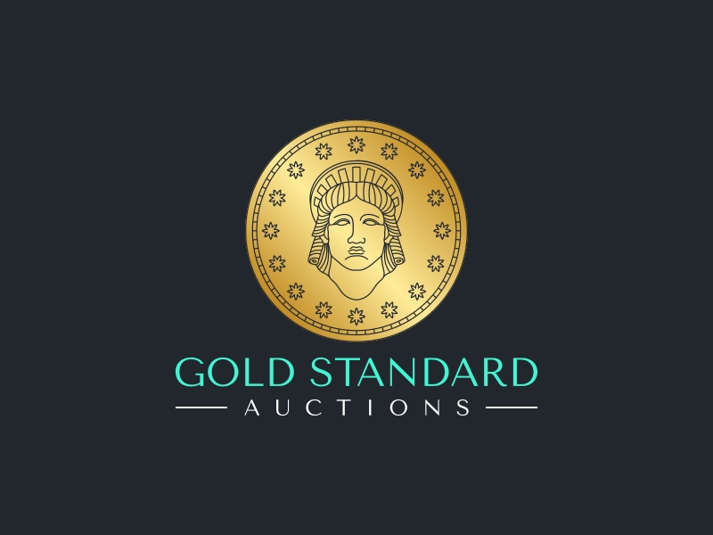
 Fauzan jam'an
 cocote
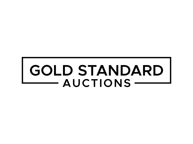
 Asani Chie
 ragnar
 bigboss
 Koushik
 cikiyunn
 Logoziner
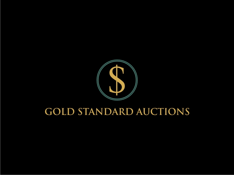
 GemahRipah
 ammad
ammad
 agil
agil
 FuArt
FuArt Artomoro
 keylogo
 Susanti
 Franky.