PHYTOWAY makes Dietary Supplements (for diabetes, hypertension, hair loss, joint health, Menopause etc), vitamins and daily supplies such as omega-3, biotin complex and hair loss shampoo designed by experts (pharmacists and professors). Our target customer is between ages 30s to 60s of all demographics. They are undergoing physical changes due to aging or actually experiencing signs of disease. In particular, the latter people are very desperate for the efficacy of our products and have loyalty to our brand.
PHYTOWAY makes Dietary Supplements (for diabetes, hypertension, hair loss, joint health, Menopause etc), vitamins and daily supplies such as omega-3, biotin complex and hair loss shampoo designed by experts (pharmacists and professors). Our target customer is between ages 30s to 60s of all demographics. They are undergoing physical changes due to aging or actually experiencing signs of disease. In particular, the latter people are very desperate for the efficacy of our products and have loyalty to our brand.
Instructions:
★★ A detailed illustration drawn with a pen not a vector image, with black and white not a gold color! - Refer to the image 01 ★★
1. It is a pen illustration type symbol. - Refer to the image 01.
2. It is a three-dimensional structure in which several circles overlap.
- Several circles can be combined into one circle - Refer to the image 05.
3. The circle is not simply composed of lines, but the thickness should be expressed like a ring.
- Letters or numbers can be imprinted on the sides of each circle. - Refer to the image 02.
- When imprinting letters on the rim, 'PHYTOWAY' or 'MAKE TIME YOURS' is recommended, and when imprinting numbers, Roman numerals are recommended.
4. It is a structure in which at least three circles overlap(including the circle on the outside), and the number of circles must not exceed four.
5. It needs to be balanced.
6. (optional)We prefer that there is no central axis among , but if the role of the central axis is important, I hope it gives a penetrating feeling, and I hope that the central axis is not a simple axis but a meaningful symbol. - Refer to the image 06.
We explore life cycles and lifestyles to protect people's health. So people hope to regain the initiative of time. So we chose a circle as a symbol. In addition, we aim for complex functionality as a result of our inquiry. That's why I asked for a shape in which several circles are overlapped. I think it would be good to understand these backgrounds and put the contents.
Preview
01.jpg
Preview
02.jpg
Preview
03.jpg
Preview
04.jpg
Preview
05.jpg
Preview
06.jpg
Contest Relisted5 years ago
il-in selected as finalist!5 years ago
DreamLogoDesign selected as finalist!5 years ago
Design Concepts Completed5 years ago
Open design concept stage had ended with 27 submissions from 10 designers. Go to DESIGNS tab to view all submissions.
 DreamLogoDesign
 il-in
il-in
 zoko
zoko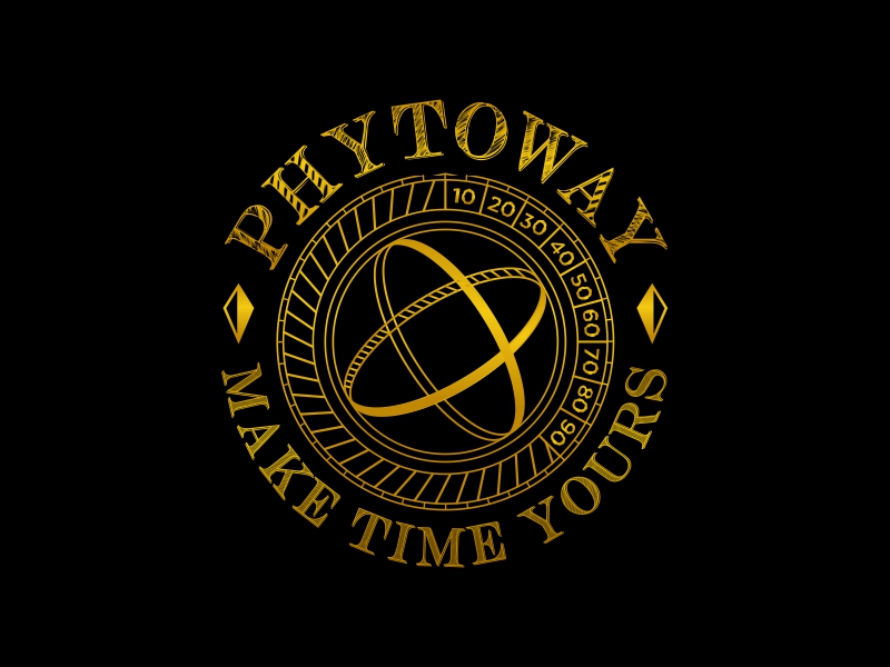
 MonkDesign
 keylogo
 Artomoro
 restuti
 sodimejo
 Kirito


