- $129
- BUDGET
- 99
- ENTRIES
BRIEF
DESIGNS (99)
- Logo Name:
- Leaves of Life lettering over top the flower of life(Sacred Geometry) symbol.
- Company Intro:
- We grow quality organic microgreens, and our target audience would be the health driven community, restaurants, food carts, local grocers, and farmers markets.
- Instructions:
- I was originally thinking "Leaves of Life" would be abbreviated, and the "o" would be "The Flower of Life" with some of it's peddles disconnecting and falling, forming little individual microgreens that collect in a nice little pile just below. I am open to all ideas, colors, and designs that are similar to my description in some way, as well as the sample logos I selected. If it helps, I mainly produce mustard, sunflower, and radish microgreens. Sunflower is most likely most similar to the flower of life pedals. Which does not necessarily need to be the way I suggested. Good Luck, and Thank You! *(Design must Contain "The Flower of Life" in it.)*
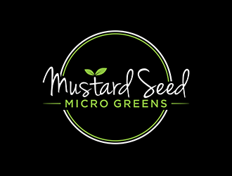
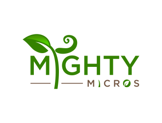
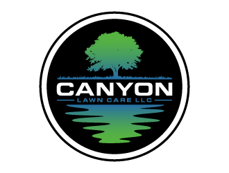
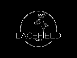
Reference Samples:


Open design concept stage had ended with 99 submissions from 13 designers. Go to DESIGNS tab to view all submissions.


