This logo is for a brand new, high end, luxury neighborhood/housing development on 2.5+ acre lots in Minnesota located about 20 minutes south of Minneapolis/St. Paul. There will be over 100 homesites when it's complete. It will be one of the most luxurious neighborhoods in the south metro. Each home package will start around $1.2M and go up from there. The land developer is the original land owner who farmed the land for many, many years so it needs a "nod" to rustic but also must be refined for the luxury market. We're in Minnesota, not Texas...so rustic-ness doesn't translate the same here even though the land developer loves it. The target audience is people / families / couples who are executives, business owners, and rich people in general. :-) They will vary from younger established families to semi (or fully) retired couples.
This logo is for a brand new, high end, luxury neighborhood/housing development on 2.5+ acre lots in Minnesota located about 20 minutes south of Minneapolis/St. Paul. There will be over 100 homesites when it's complete. It will be one of the most luxurious neighborhoods in the south metro. Each home package will start around $1.2M and go up from there. The land developer is the original land owner who farmed the land for many, many years so it needs a "nod" to rustic but also must be refined for the luxury market. We're in Minnesota, not Texas...so rustic-ness doesn't translate the same here even though the land developer loves it. The target audience is people / families / couples who are executives, business owners, and rich people in general. :-) They will vary from younger established families to semi (or fully) retired couples.
Instructions:
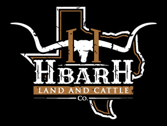
The first logo ("The Ranch of Credit River Current Logo") is what they're currently using...and what the land developer really likes and helped to design. "The Ranch of Credit River Inspiration Logo" is what inspired them from the start. We are getting pushback from the builders because the logo is too cheesy, rustic and cheap looking. But it may have some features that could be repurposed. The rest of the logos attached are ones that I thought looked nice and are more the direction we're looking. The developer like the horns, but they need to be a specific type of horn if you go that route (like the first logo). I think it's a longhorn steer? I think the font needs to be more modern. It needs to be able to translate to signage and an entrance monument if possible. Oh, the developer LOVES the color orange, so if that could be incorporated it would make him happy. :-) I can't wait to see what you come up with!!


 agusDesign Hidden
 sodimejoDesign Hidden
 MardhiDesign Hidden
 ian69Design Hidden
 PMGDesign Hidden
 KaySaDesign Hidden
 betapramudyaDesign Hidden
 aRByDesign Hidden
 keylogoDesign Hidden
 Sami Ur RabDesign Hidden
 ErasedinkDesign Hidden
 kunejoDesign Hidden
 ElonStarkDesign Hidden
 KiritoDesign Hidden
 pionsignDesign Hidden
 KDesignsDesign Hidden
 auraDesign Hidden
 jaizeDesign Hidden
 igor1408Design Hidden
 MagnetDesignDesign Hidden
 GwerthDesign Hidden
 sargiono nonoDesign Hidden
 blessingsDesign Hidden
 GalfineDesign Hidden
 LucidSketchDesign Hidden
 fawadykDesign Hidden
 cocoDesign Hidden
 onetmDesign Hidden
 Pintu DasDesign Hidden
 funsdesignsDesign Hidden
 arteryDesign Hidden
 FloValDesign Hidden
 cikiyunnDesign Hidden
 Asani ChieDesign Hidden
 bluespixDesign Hidden
 LogoInventDesign Hidden
 ArtomoroDesign Hidden
 EkoBooMDesign Hidden
 puthreeoneDesign Hidden
 dgawandDesign Hidden
 yansDesign Hidden
 SuvenduDesign Hidden
 AdundasDesign Hidden
 ora_creativeDesign Hidden
 mukleyRxDesign Hidden
 DiDdzinDesign Hidden
 cybilDesign Hidden
 CreativemindsDesign Hidden
 Purwoko21Design Hidden
 MonkDesignDesign Hidden
 johanaDesign Hidden
 cintokoDesign Hidden
 RIANWDesign Hidden
 GodvibesDesign Hidden
 rokenrolDesign Hidden
 GreenlightDesign Hidden
 banaspatiDesign Hidden
 ArRizquDesign Hidden
 enilnoDesign Hidden
 KrugerDesign Hidden
 ingeproDesign Hidden
 oke2angconceptDesign Hidden
 Alfatih05Design Hidden
 andayani*Design Hidden
 YONKDesign Hidden
 SheillaDesign Hidden
 p0peyeDesign Hidden
 rizuki


