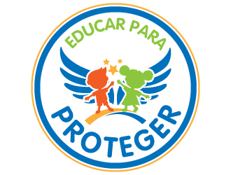
I work with children therapeutically teaching them to get in touch and get to know their emotions to acquire emotional intelligence and learn how prevent abuse situations (sexual, emotional and verbal abuse). The name "Educar para Proteger" means "Educate to Protect".
I work with children therapeutically teaching them to get in touch and get to know their emotions to acquire emotional intelligence and learn how prevent abuse situations (sexual, emotional and verbal abuse). The name "Educar para Proteger" means "Educate to Protect".
Instructions:
The main figure that I thought is that looks like a blue wing with a child inside. I would use that but make a few changes: I like green, pink and blue colors, in that order. We can work with one color or more. I would like to put a silhouette of 2 kids, one white boy and a black girl inside this "wing". I would like that "Educar para" (Educate for) is on top, and "Proteger" (Protect) is below, giving more view to the word "Proteger", because is the main idea.
Preview
IMG81421602958438.jpg
Preview
IMG81611602958697.jpg
Reference Samples:
V
vicente.carnero4 years ago
Im seeing the logos and the children do not seem joyful. Im seeing that now. I would think that a more playful and joyful children would be better. Im leaving on this picture some ideas, if you could help me on that.
V
vicente.carnero4 years ago
New insight
V
vicente.carnero4 years ago
New insight. You could put another kind of wing, another kind of children. But the main idea is that the wings are a protection and not wings of the children. more joyful, more playful, would be wonderful. could you give me some new insights please?
jaize is selected as the contest finalist!4 years ago
ingepro is selected as the contest finalist!4 years ago
AamirKhan is selected as the contest finalist!4 years ago
Design Concepts Completed4 years ago
Open design concept stage had ended with 92 submissions from 11 designers. Go to DESIGNS tab to view all submissions.


 jaize
jaize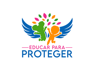
 ingepro
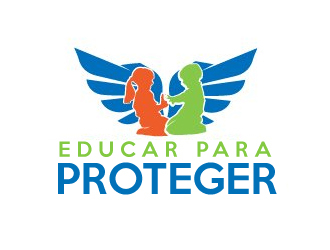
 AamirKhan
 PrimalGraphics
 JessicaLopes
 aryamaity
 done
done
 mbamboex
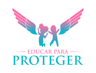
 javaz
javaz
 YONK
YONK
 p0peye