
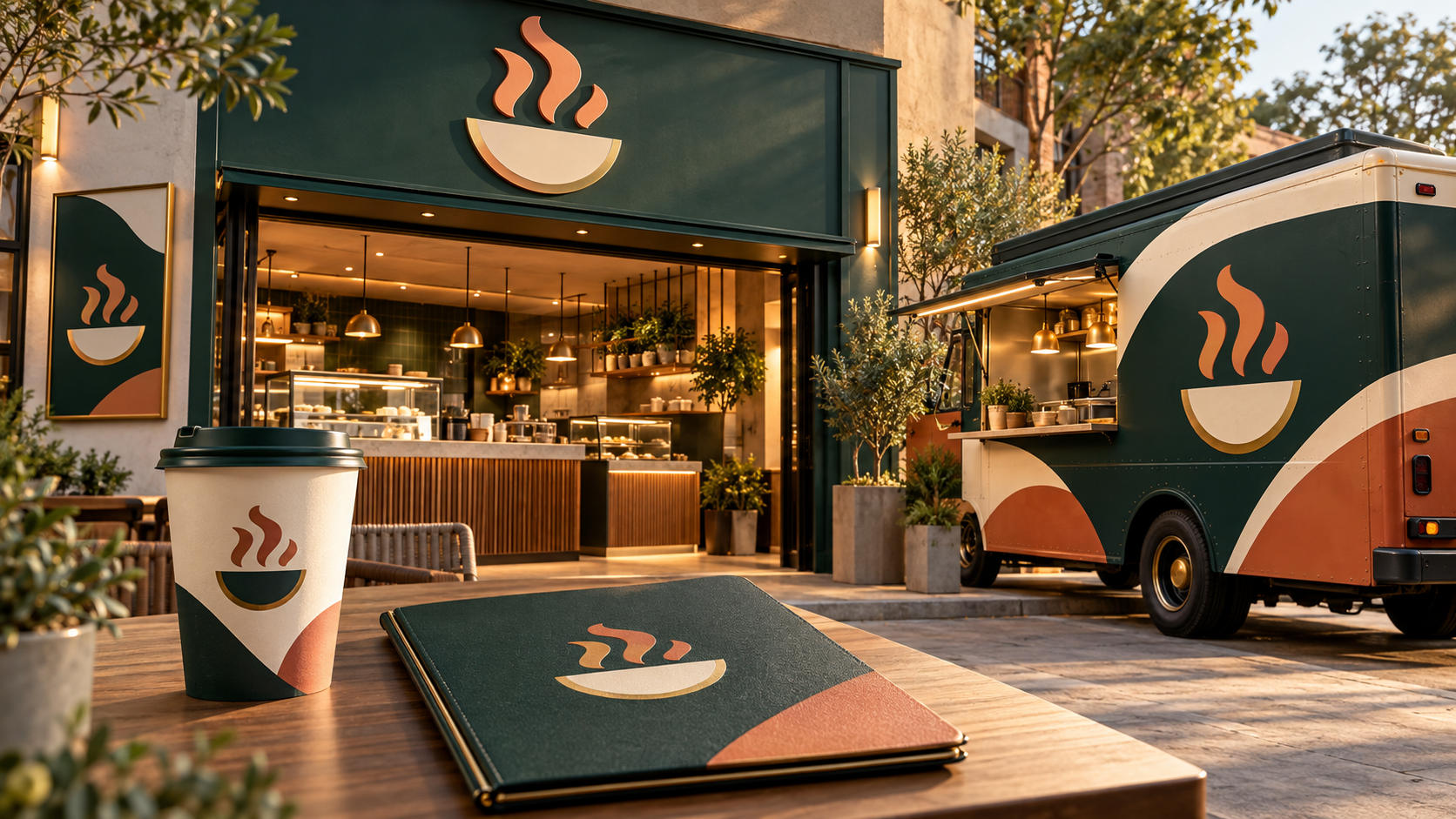
Updated October 2026. A restaurant logo has to make a promise before a guest reads the menu. It can suggest a quick lunch, a long dinner, a neighborhood gathering place, a specialty coffee, or a carefully designed tasting experience. The strongest restaurant identities also work after the sign is turned off: on a food-delivery profile, a takeaway cup, a menu cover, a loyalty card, and a small social avatar.
These 30 restaurant logo ideas cover cafés, food trucks, bakeries, bars, family restaurants, and neighborhood favorites. Use them as creative starting points, then choose the structure, type, colors, and applications that fit your actual concept. The 48hourslogo restaurant logo gallery offers more category examples to compare before you write a brief.
Start with the guest experience
A logo should match the experience you are building. A quick-service counter, a refined dining room, a lively food truck, and a quiet coffee shop may all serve food, but customers expect different signals from each. Decide whether the brand should feel warm, energetic, refined, playful, local, experimental, or practical. Then let the visual language support that promise.
Food imagery can be useful, but it is not required. A restaurant does not need to show a fork, chef hat, plate, or ingredient to feel like a restaurant. An ownable wordmark, a simple abstract shape, or a subtle reference to the setting can be easier to remember and more flexible across applications. NYC’s logo design guidelines emphasize simple, unique, recognizable marks that work at different sizes and in black and white; those are useful tests for any hospitality brand.
30 restaurant logo ideas for different concepts
1. Name-led marks for recognition
1. A confident café wordmark. Use relaxed spacing and a readable typeface so the name works on a storefront, cup sleeve, and mobile ordering page.
2. A compact restaurant monogram. Interlock the first letters of a longer name into a mark for napkins, social profiles, and a small app icon.
3. A stacked name and descriptor. Put the restaurant name first and add a small line such as “coffee · bakery” or “kitchen · bar” where category clarity matters.
4. A wide neighborhood nameplate. A horizontal lockup can sit naturally above a storefront door or across a food truck panel.
5. A hand-drawn signature wordmark. Use a controlled, legible script for a founder-led bakery or chef concept, with a simple companion version for small sizes.
2. Café and bakery directions
6. An abstract cup and sunrise. A half-circle with one rising shape can suggest morning ritual without drawing a literal mug.
7. A grain-inspired pattern. Use two or three broad lines inspired by a wheat stalk, pastry fold, or bread score for a bakery identity that can repeat on packaging.
8. A quiet coffee bean geometry. Reduce the bean to a distinctive split oval or negative-space curve and avoid tiny engraved details.
9. A neighborhood window mark. A simple window or awning shape can make a local café feel welcoming while leaving the name prominent.
10. A pastry stamp. Create a compact round seal with one recognizable shape for paper bags, boxes, and loyalty cards.
3. Food truck and quick-service ideas
11. A bold food truck badge. Use a large silhouette and high contrast so the logo reads when the truck is parked at a busy event.
12. A route or location line. A curved line ending at a point can suggest movement and pop-up service without becoming a map illustration.
13. A playful mascot silhouette. A character can be memorable for a family concept, but keep the shape simple enough for a small profile image.
14. An ingredient monogram. Combine a local ingredient or specialty with one initial rather than filling the badge with a complete menu.
15. A modular menu mark. Build the identity from two or three bold blocks so the same shapes can frame different menu panels and social posts.
4. Refined dining and bar directions
16. A restrained serif wordmark. Elegant letterforms and generous spacing can signal a considered dining experience when the typography remains readable.
17. A geometric place marker. A simple arch, doorway, or architectural contour can reference the setting without using a generic plate.
18. A monoline emblem. One continuous line can create a sophisticated mark for menus, wine lists, and a small storefront plaque.
19. A subtle glass or bottle cue. Reduce the shape to one clean outline for a bar or wine-focused concept; avoid drawing every detail.
20. A typographic seal. A circular arrangement of name and year can feel established, but prepare a simpler wordmark for digital use.
5. Cuisine and community ideas
21. A regional landscape abstraction. A coastline, mountain, market street, or horizon line can express place when it genuinely connects to the restaurant’s story.
22. A shared-table symbol. Use a few balanced shapes around a center to suggest gathering without drawing a crowded scene.
23. A spice or botanical gesture. A single leaf, pod, or curved stem can support a cuisine direction while leaving room for the name.
24. A family-name crest simplified. Use a modern outline and one central shape rather than a detailed heraldic illustration that becomes unreadable.
25. A market-stall mark. A simple awning or crate form can suit a neighborhood produce counter, deli, or weekend food concept.
6. Flexible identity systems
26. A primary logo with a food icon. Keep the full name in the main lockup and use the icon alone only where customers already know the brand.
27. A pattern from the logo shape. Turn one curve, block, or leaf into a repeatable pattern for menus, walls, packaging, and social backgrounds.
28. A one-color stamp version. Make a solid version for paper bags, receipt headers, rubber stamps, and low-cost printing.
29. A compact social avatar. Build a square crop that holds together without tiny wording, so the restaurant is recognizable in delivery and social apps.
30. A seasonal accent system. Keep the core mark stable and use approved accent colors or illustrations for events and seasonal menus.
Choose colors that match the pace and setting
Color can make a café feel calm, a food truck feel energetic, or a dining room feel refined. Deep green and cream can feel grounded; terracotta and charcoal can feel warm and crafted; black, white, and a restrained metallic accent can feel formal. Bright color can be useful for fast service or a playful family concept. The choice should support the experience and stay legible against the storefront, packaging, and photography you will actually use.
Build a one-color version at the same time as the primary palette. It will help on receipts, stamps, photocopies, and single-ink packaging. Check the contrast between the logo and its background, and avoid using a light mark over a busy food photograph without a clear field behind it.
Design the logo for the first five touchpoints
List the places guests will see the identity during the first month. For a café, that may be the exterior sign, cup, menu board, loyalty card, and social avatar. For a food truck, it may be the truck side, service window, menu panel, staff shirt, and ordering page. For a restaurant, it may be the door sign, menu cover, reservation profile, receipt, and takeaway packaging.
Test the finalists in those exact spaces. A detailed emblem may be beautiful on a menu cover and too small for a mobile profile. A lively display typeface may attract attention on a sign and become difficult to read on a printed menu. Ask for horizontal, stacked, compact, light-background, dark-background, and one-color versions where the applications need them.
Give your designer a useful restaurant brief
Describe the concept in plain language: what you serve, who you want to attract, the price position you intend to occupy, the atmosphere, the location, and what customers should feel. Explain whether the restaurant is dine-in, takeaway, delivery-led, seasonal, mobile, or a mix. Include the surfaces that matter first, such as a sign, food truck, menu, packaging, or social profile.
Separate non-negotiables from early preferences. The name, required wording, physical sign size, and existing colors may be fixed. A request for a fork, plate, or specific font may be only a first idea. The copy-and-paste logo design brief can help you give enough context while leaving room for the designer to find a stronger visual solution.
Review the mark before you print menus
Make the logo small, large, black, white, and grayscale. View it from the sidewalk, then on a phone. Check whether the name is clear beside a menu item or booking button. Ask someone unfamiliar with the concept what kind of place it seems to be and what they noticed first. Feedback should identify a business problem, such as “the name disappears on the truck,” rather than simply collecting personal color preferences.
A useful final review also asks whether the mark is distinct beside nearby restaurants. You want a visual language that feels appropriate to hospitality and still belongs to your business. The eight tests for an overly complicated logo are helpful when a concept looks good in a presentation but feels crowded in production.
Choose the idea guests can remember
A successful restaurant logo creates a clear first impression and gives the wider identity something stable to build around. Choose one visual idea, let the name remain readable, and test the mark on the sign, menu, cup, truck, and screen where it will live. With the right versions and a consistent system, the same identity can welcome a guest at the door, guide an online order, and remain recognizable long after the meal.