
Updated October 2026. A cleaning business logo has a practical job: make a stranger feel comfortable inviting your company into a home, office, rental, or facility. It needs to feel fresh and capable without looking generic, childish, or so delicate that it disappears on a van, uniform, or invoice.
The right direction depends on the work you do. A solo housekeeper serving busy families may need warmth and reassurance. A commercial cleaning company may need structure and operational confidence. A specialty business—move-out cleaning, vacation rentals, eco-focused service, or post-construction cleanup—can use its niche to create a more memorable idea. The 30 directions below are starting points to adapt, not templates to copy.
Start with the trust question
Before exploring symbols, decide what a first-time customer should feel in the first two seconds: calm, relief, energy, precision, hospitality, or professionalism. Then consider the places where the logo will appear. A profile picture, a booking page, a shirt, a vehicle, a door hanger, and a cleaning caddy all make different demands.
Keep the core mark simple enough for those surfaces. One memorable visual idea plus a clear business name normally travels farther than a mop, bucket, spray bottle, house, stars, leaves, bubbles, and smiling character all packed into the same logo. The details can live in supporting graphics; the logo needs to be recognized quickly.
30 cleaning business logo ideas
1. Clean wordmarks for a professional first impression
1. Airy modern sans serif: Use clean, open lettering for a contemporary residential or commercial service. 2. Rounded wordmark: Softer terminals can feel friendly and approachable without becoming cartoonish. 3. Confident condensed type: A compact, taller name works well on vehicle doors and vertical social layouts. 4. Underline sweep: Add one simple curve beneath the name to suggest motion or a finished surface. 5. Initials plus descriptor: Use a short monogram with “Cleaning Services” in plain supporting type.
A wordmark is often the strongest choice when the business name is distinctive. It lets the name do the remembering and avoids leaning on the same sparkle symbol as every local competitor. If the name is long, create both a full horizontal version and a compact initials mark for small spaces.
2. Fresh but restrained symbol ideas
6. Single four-point sparkle: Use one crisp sparkle as an accent, not a field of stars. 7. Abstract water droplet: Build a drop from simple geometry for a polished, versatile icon. 8. Curved leaf and shine: Pair one leaf with a small glint for a gentle, nature-led direction. 9. Folded microfiber shape: Turn a soft, angular fold into a distinctive abstract mark. 10. Circular orbit: Use one clean circular sweep to suggest an all-around service. 11. Open window form: Create a minimal frame and diagonal glint for glass or general cleaning. 12. Negative-space check: Hide a checkmark inside a rounded shape to suggest completion.
The best symbols make sense after the name is known, but they do not have to literally illustrate the work. A recognizable abstract form gives you more room to grow into related services than a highly detailed broom does. Test it as a one-color icon before committing to gradients or fine lines.
3. Residential cleaning directions
13. Welcoming doorway: Use a simple open-door shape that suggests returning to a cared-for home. 14. Sunlit window: Combine a small window grid with one warm ray for a brighter-home mood. 15. House shape with a calm curve: Keep the house outline minimal and let the curve carry the personality. 16. Tidy nest concept: Use gentle, nested shapes to communicate care and routine. 17. Monogram inside a home frame: An initial can make a familiar residential symbol feel owned. 18. Linen-inspired pattern: A small woven pattern can work as a supporting graphic for a premium housekeeping service.
Residential clients are often buying time, predictability, and comfort as much as a clean room. A warm palette, readable name, and uncluttered layout usually communicate that more effectively than aggressive “power clean” visuals. Be careful with overly cute mascots unless the brand is intentionally family-focused and they fit the tone of your customer base.
4. Commercial cleaning directions
19. Structured grid: Use a precise set of squares or panels for offices and facilities. 20. Building-to-shine transition: Let a minimal building silhouette lead into one clean glint. 21. Shield-like completion mark: A softened shield can signal dependable process without looking like security branding. 22. Layered floor planes: Use two or three horizontal planes to suggest large spaces and consistency. 23. Route-line icon: A simple continuous path can reference scheduled service across multiple locations. 24. Bold initials in a square: This reads clearly on supplies, uniforms, and equipment labels.
Commercial buyers usually need to see order and reliability. That does not require a corporate blue logo by default, but it does benefit from strong hierarchy. Put the company name first. If a service descriptor is needed, set it clearly beneath the name rather than forcing it into a complex symbol.
5. Specialty and local-service directions
25. Turnover key plus sparkle: A compact option for vacation-rental or move-out specialists. 26. Citrus slice accent: A fresh direction for a cheerful residential brand, used sparingly. 27. Rugged reset mark: A strong before-and-after shape for post-construction cleanup. 28. Pet-friendly paw and shine: A small secondary badge for services built around pet-owning households. 29. Local horizon: Abstract a regional mountain, coast, or city line into a simple icon. 30. Eco-minded leaf orbit: A nature-led direction for a business that can clearly support its environmental messaging.
A specialty is a useful source of differentiation, but it should be real. Do not use a luxury visual system if your offer is rapid, no-frills turnover cleaning. Do not make “green” the entire identity simply because the color is popular. If you promote a specific product or environmental claim, make sure the service can support it; the EPA’s Safer Choice label information explains that the label applies to qualifying chemical products, not a general promise made by every cleaning business.
Choose colors that work in real life
Blue, teal, green, white, and citrus accents are common in this category because they can suggest freshness and order. The question is not whether a color is “right” for cleaning; it is whether the combination feels specific to your business and stays readable. Deep navy and soft mint can feel premium and calm. Cobalt with bright yellow can feel energetic and local. Charcoal with a restrained aqua accent can suit an office-focused service.
Check contrast before falling in love with a palette. Pale aqua text on white may look delicate online but fail on a vehicle. A bright accent should support the name, not replace it. Make sure the logo also has an all-black version and a reversed white version for dark uniforms and social graphics.
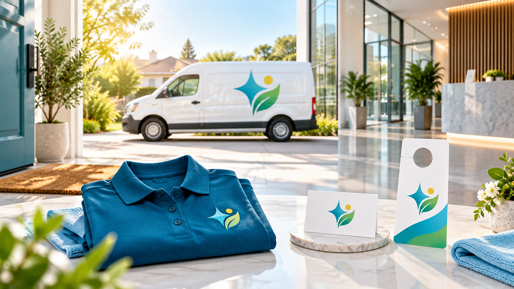
The van, uniform, and profile test
Every finalist logo should pass three quick tests. First, place it on a white or dark service van and stand back. Is the business name readable before the icon? Second, put the smallest version on a shirt chest or cap. Does the mark become a blob? Third, shrink it to a circular social avatar. Can you still tell it apart from other cleaning services in the feed?
The test is especially important for businesses that rely on recurring service. A customer may see the uniform or vehicle several times before they remember the name. Clear repetition builds recognition better than a complicated illustration that only works at presentation size.
Write a clearer cleaning-logo brief
Tell designers what work you do, who chooses the service, your service area, typical job type, and how the logo will be used. Explain the mood with plain words: “warm and calm,” “precise and commercial,” or “fresh but not childish.” Include dislikes as well: “no cartoon characters,” “no spray-bottle icons,” or “avoid pale text.” The more useful context you provide, the less likely every concept is to look the same.
You can explore cleaning-service logo ideas and project options before writing the brief, then use the 48hourslogo FAQ to understand the contest process. For inspiration on making a service brand visible on physical surfaces, see our guide to logos for trucks, signs, and uniforms.
Finally, choose the direction that feels most believable for the service you actually deliver. A good cleaning logo does not need to say everything. It needs to make your name easy to trust, easy to remember, and easy to recognize wherever the next customer finds you.