we are an ultimate frisbee league. Please do not put the word frisbee in the design. Read below to see that we want a 2020 design because it is our 20th anniversary and it is 2020. The name does not need to be so prominent.
we are an ultimate frisbee league. Please do not put the word frisbee in the design. Read below to see that we want a 2020 design because it is our 20th anniversary and it is 2020. The name does not need to be so prominent.
Instructions:
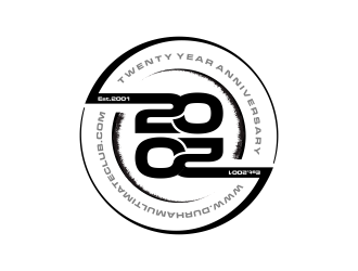
Since the design will go on the disc ("frisbee") the design should be circular. I like the creative use of negative space. This is our 20th year and it is 2020 so I would like it designed around this theme. Our name/website does not have to be prominent but should appear somewhere. www.durhamultimateclub.com. I have included the logo we are currently using for tshirts. This does not need to be used. There was a competition on this platform for a 2020 logo and many of those are good starts for the disc design. Please also use only 1 or 2 colours and remember that the colour of the disc will add another colour to your design.
Preview
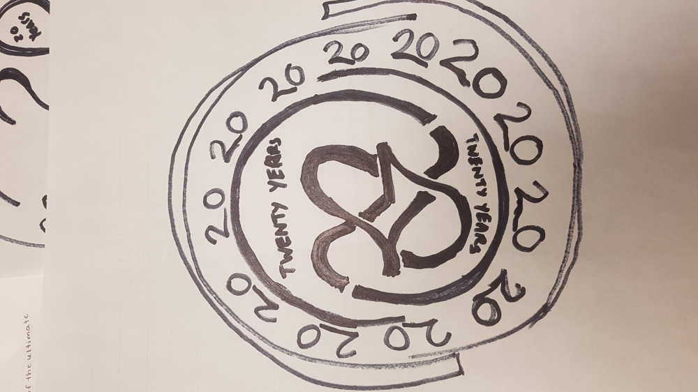
2020022523271570889.jpg
Preview
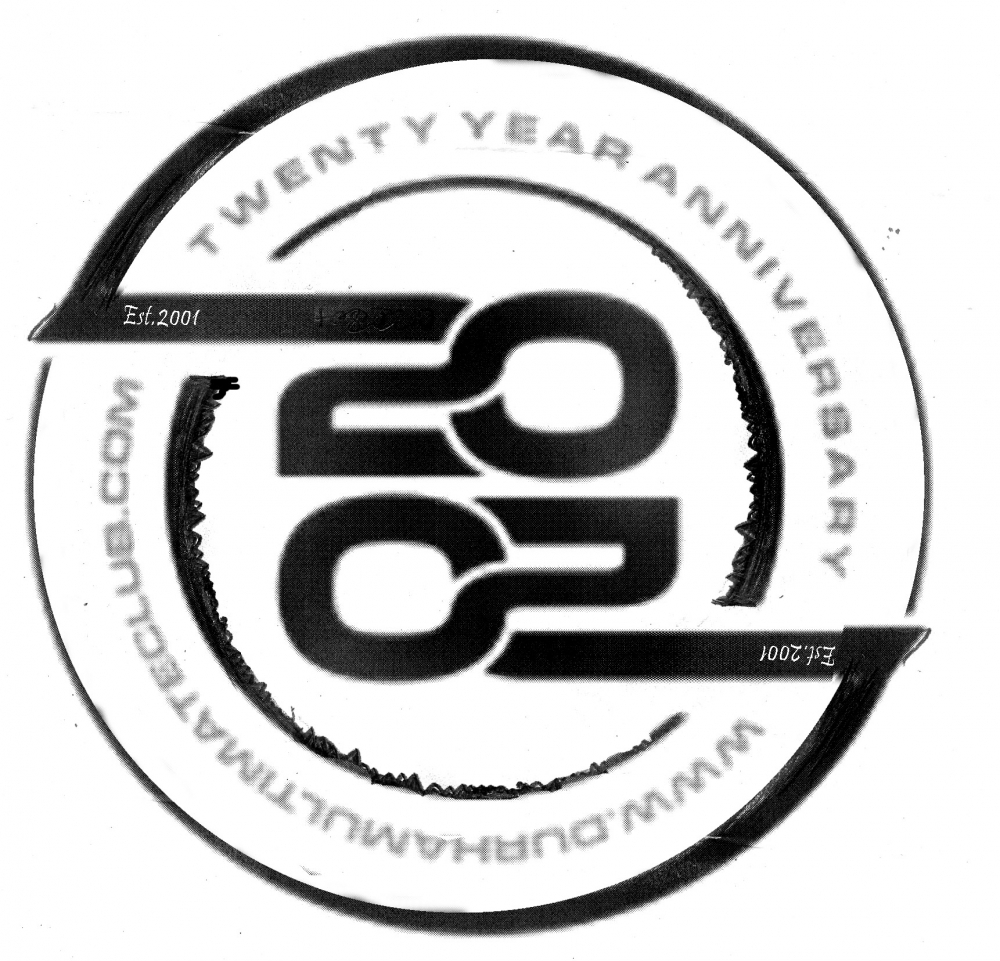
2020022821372170889.jpg
Reference Samples:
C
Client708896 years ago
Please remember that I want a 2020 theme because it is also our 20th anniversary.
C
Client708896 years ago
C
Client708896 years ago
the 20s should be a central theme since it is our 20th anniversary and it is 2020. There was a competition on this site for 2020 logos and many looked like good starting points.
C
Client708896 years ago
Here is a link to this websites 2020 competition. Lots of inspiration can be found there
https://www.48hourslogo.com/project.php?id=82382
C
Client708896 years ago
the one I drew was really er9e design #69 that won the competition. Feel free to change the orientation of the 20s, and add more 20s. I only included the image as inspiration. Not all designs have to be similar to that one.
C
Client708896 years ago
Generally too much of the design is being used up by the name Durham ultimate club. The name can be rather small and hidden along a line or something. The central design should be the 20s. A third 20 could be worked into the design somehow. Or the 20s in the middle can be hidden by lines that come out and swirl around the 20s. Can anyone come up with something that looks kind of celtic knot.
scolessi is selected as the contest finalist!6 years ago
CreativeMinds is selected as the contest finalist!6 years ago
alby is selected as the contest finalist!6 years ago
Design Concepts Completed6 years ago
Open design concept stage had ended with 134 submissions from 26 designers. Go to DESIGNS tab to view all submissions.

 scolessi
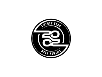
 alby
alby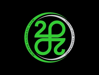
 Creativeminds
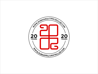
 bunda_shaquilla
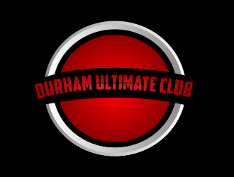
 Greenlight
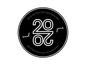
 torresace
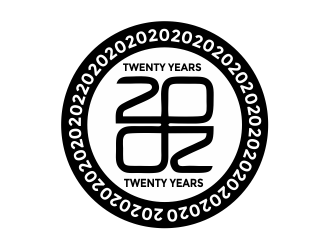
 Girly
Girly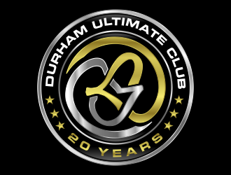
 akhi
akhi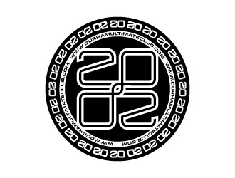
 daywalker
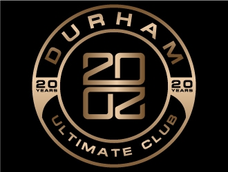
 MUSANG
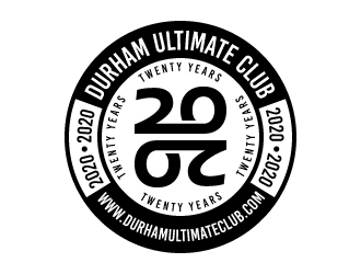
 LogOExperT
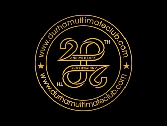
 superbrand
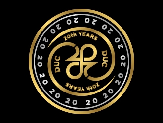
 pambudi
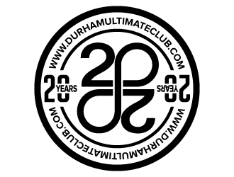
 jaize
jaize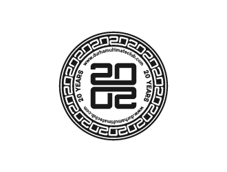
 fastsev
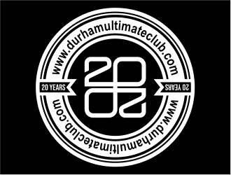
 cintoko
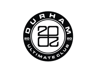
 mbamboex
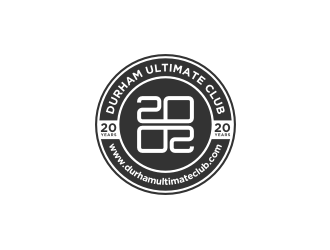
 Gravity
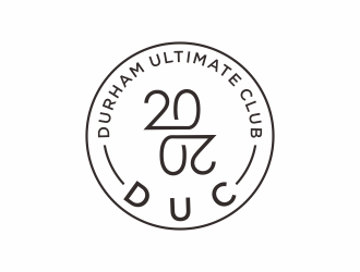
 checx
checx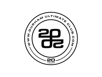
 thegoldensmaug
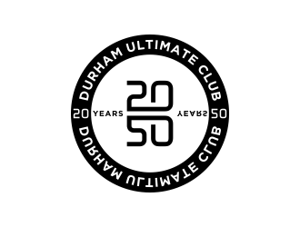
 salis17
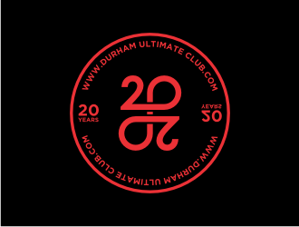
 hopee
hopee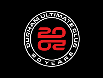
 nurul_rizkon
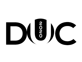
 bougalla005
 haidar
 p0peye