Others(Wall Poster)Hiya,
We would like to design another inside office wall poster with same size 1.5m wide, 2.1m length.
See below the copy that will go with the attached image and logo
***************copy******************
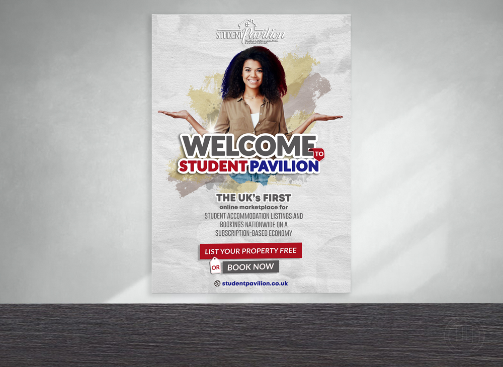
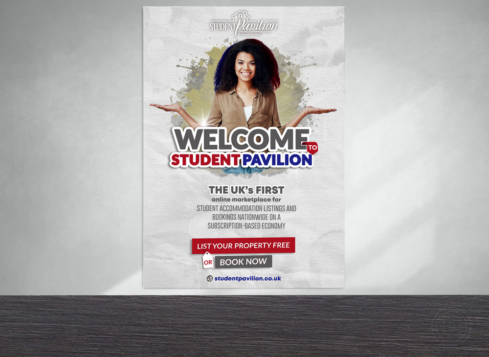
Welcome to Student Pavilion, the UK’s first online marketplace for student accommodation listings and bookings nationwide on a subscription-based economy
List your Property FREE | Book Now
studentpavilion.co.uk --- Update: 2021-02-04 18:31:26 ---the design needs to be in portrait mode and not landscape--- Update: 2021-02-06 06:42:27 ---******Extra instructions to help******
We need an excellent yet corporate top of the range wow graphic design like the poster i shared or better. Any design below this standard won't be looked at.
The lady in the image portrays a welcoming demeanor which should go with our catch text and should be larger than other text "Welcome to Student Pavilion". You could have the next catch text as "the UK’s first" or "the UK’s first online marketplace for" and the next normal line could be "student accommodation listings and bookings nationwide" and the last catch text been "subscription-based economy". call to action text at the bottom should be easy to see as well "list your property free" and "book now". The catch text and call to action should be see clearly even from afar
I welcome simple clean ideas on text styling also ideally the lady's both hands should be showing although i welcome showing just one is the design is super and can reflect that she is welcoming someone. No colour rioting or kids art please, needs to be clean classy and corporate to complement the other sample design we have in our office. thanks very much
Preview
2021020402120738460.jpg
C
client7771235 years ago
see sample poster
Godvibes is selected as the contest finalist!5 years ago
PrimalGraphics is selected as the contest finalist!5 years ago
C
client7771235 years ago
#87 by Ulid
the blue and red brush addition makes
the poster come alive but this area
circled red is a bit dark, its becoming
dark and/or with black spots. I think its because of the extra blue brush touch added over it so
pls reduce the touch of blue or reduce the
black coloured spots so it looks a
bit balanced like on the left hand
side. thanks
C
client7771235 years ago
#90 by Ulid
options for "or" tag
C
client7771235 years ago
pls remove the dark line in the place circled red
C
client7771235 years ago
I would like to see the red circled coloured background on #106 design. Same instruction in #97.
Design Concepts Completed5 years ago
Open design concept stage had ended with 113 submissions from 13 designers. Go to DESIGNS tab to view all submissions.
 Ulid
Ulid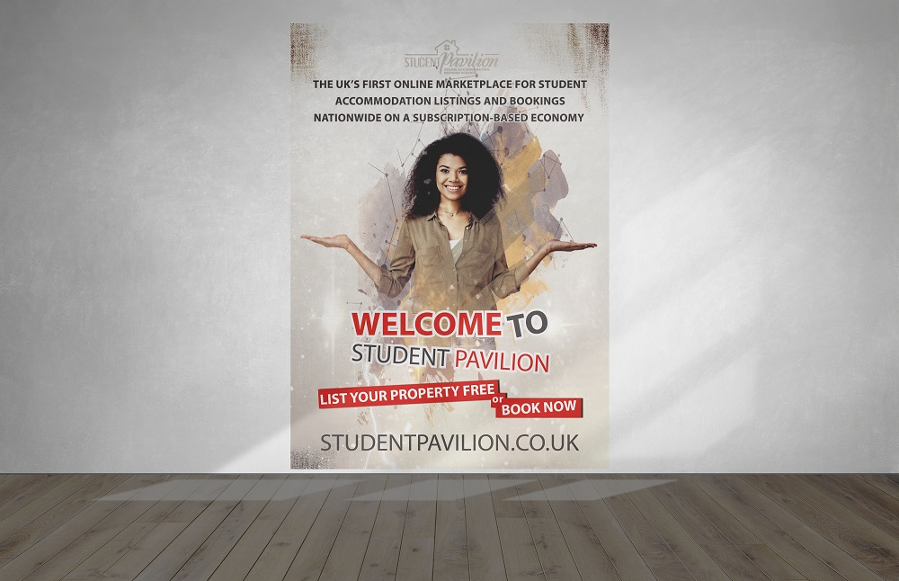
 bulatITA
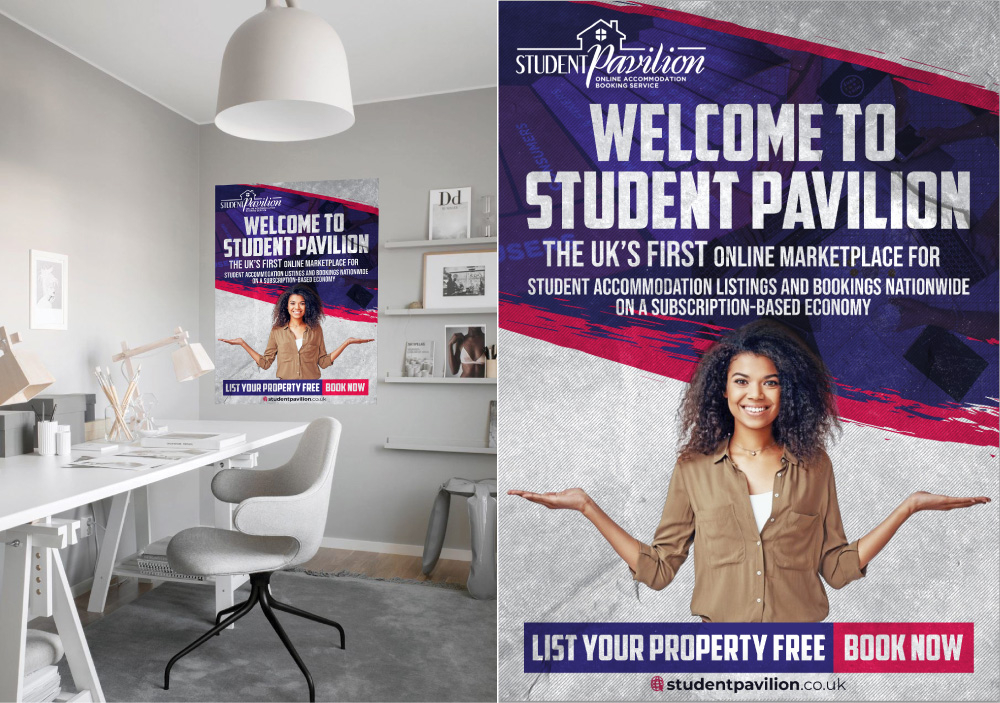
 Godvibes
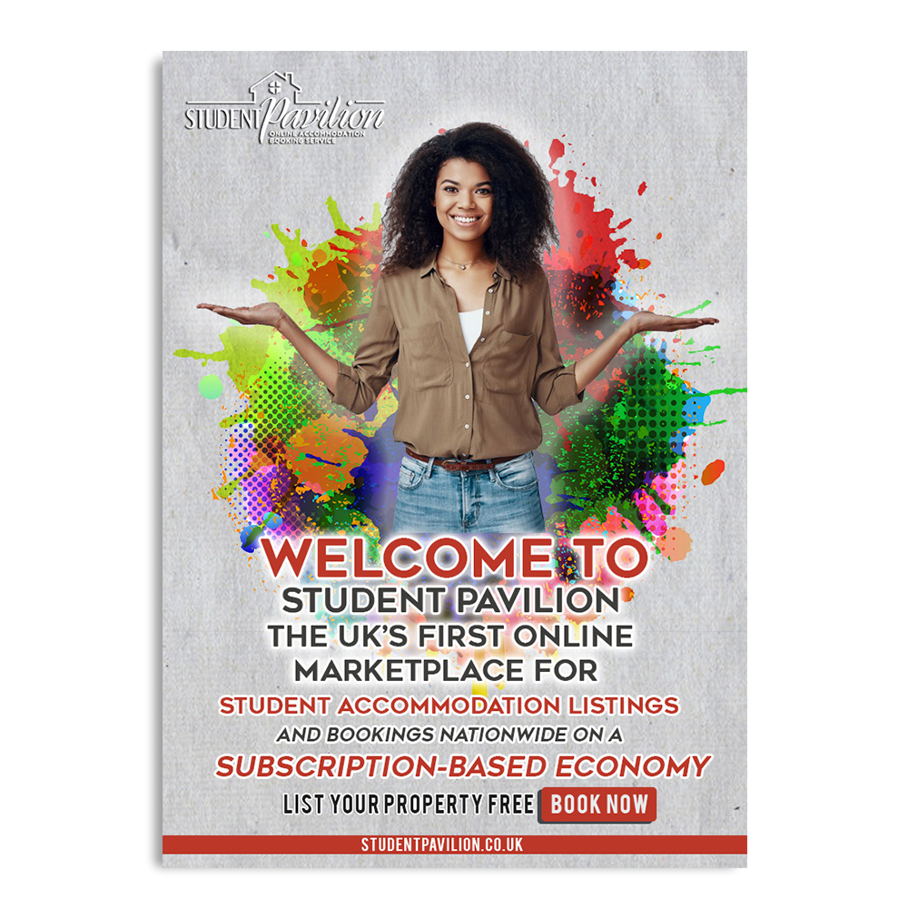
 PrimalGraphics
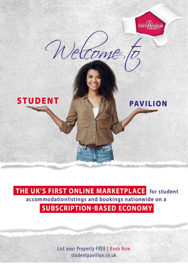
 Sofia Shakir
 Dhieko
 dgawand
 achang
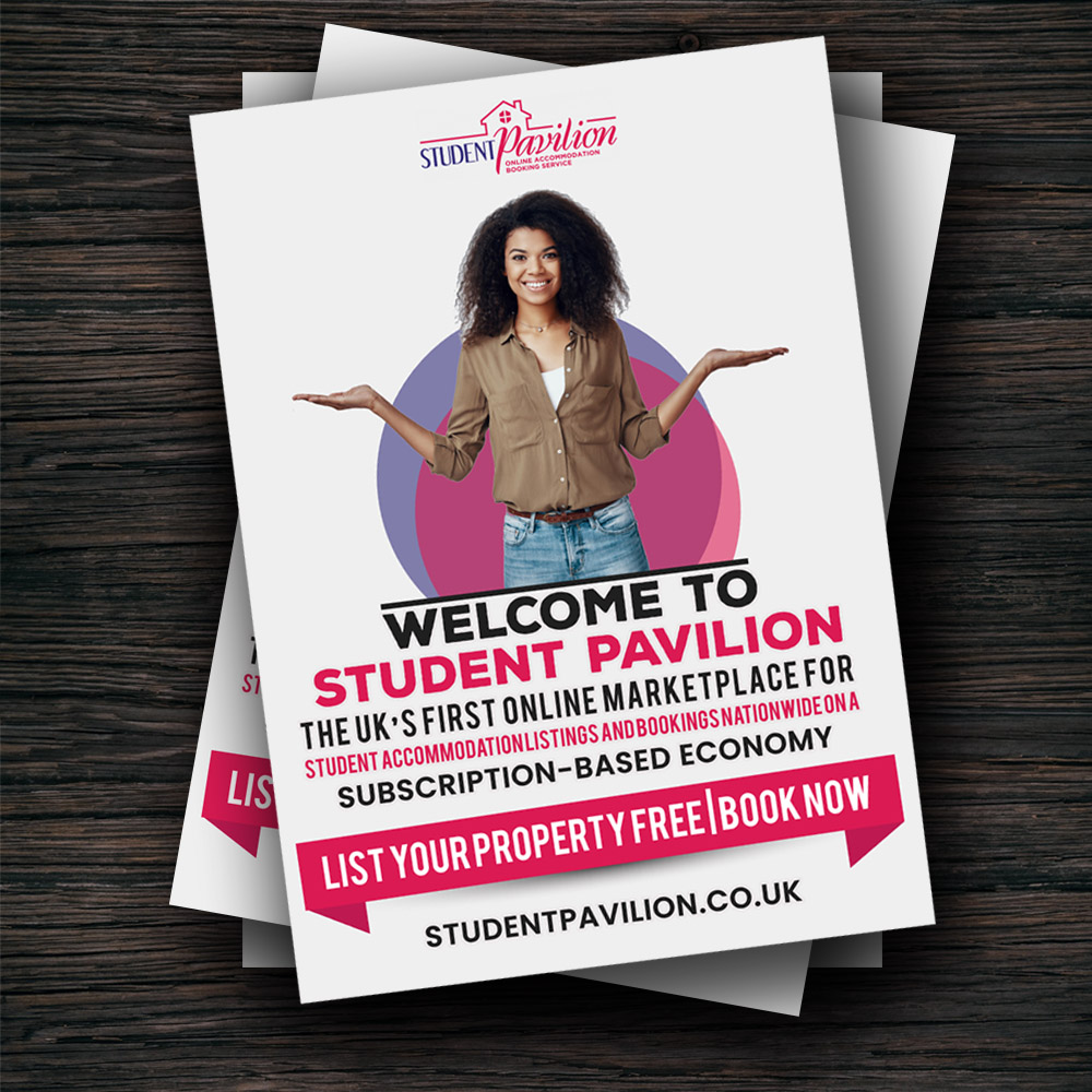
 AB212
AB212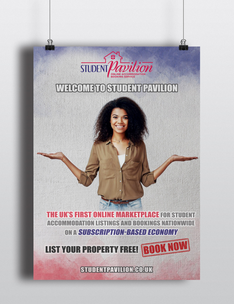
 Ibrahim

 ardistic
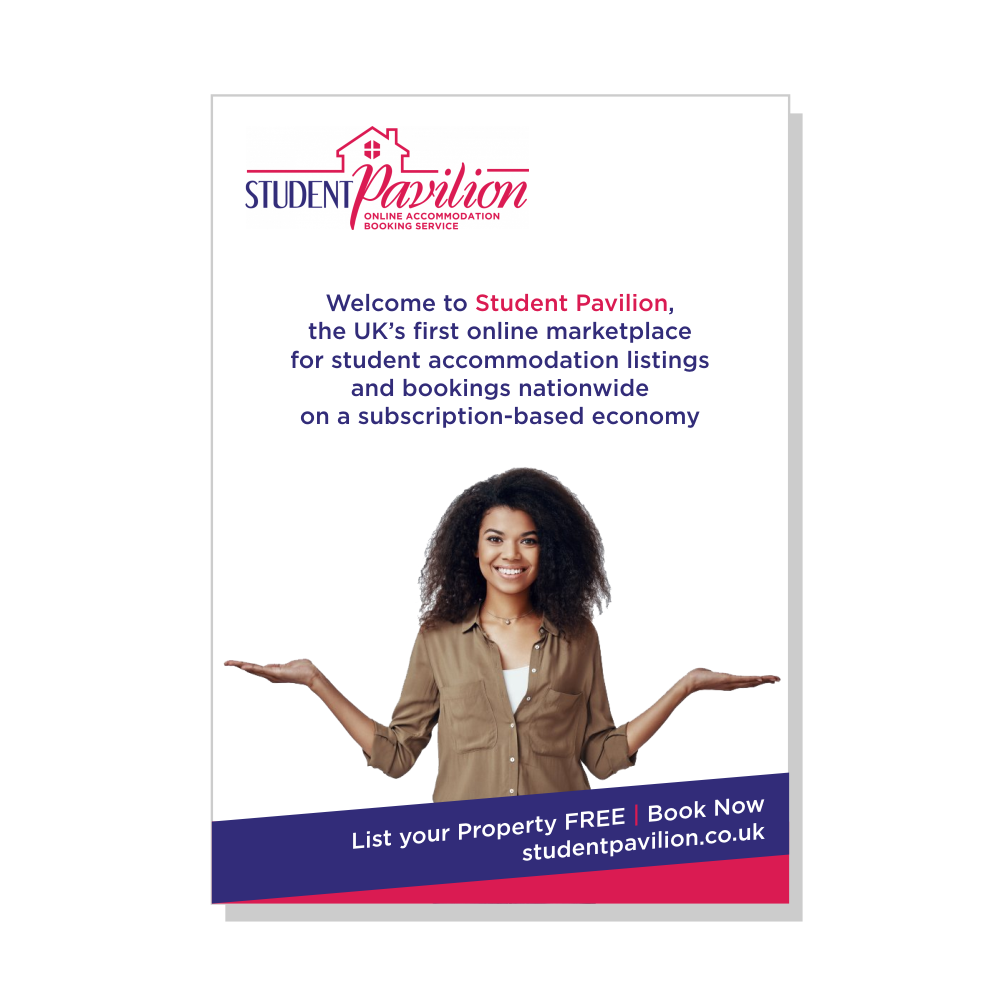
 GemahRipah