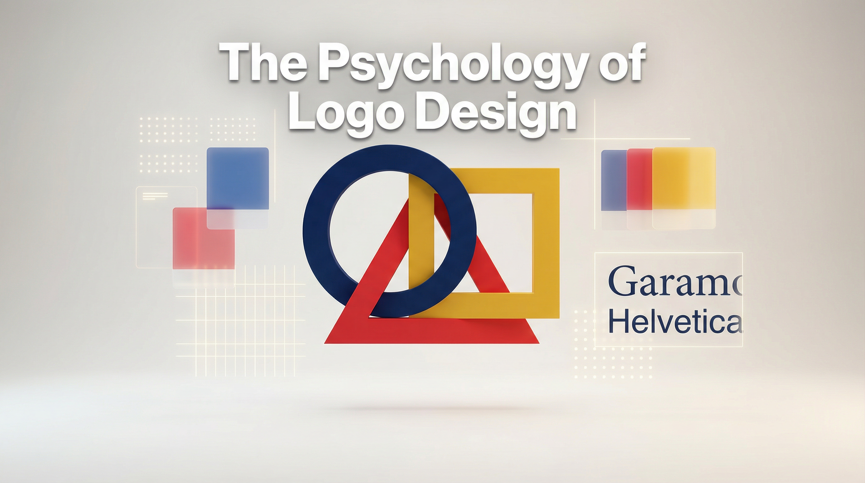
In the highly competitive world of business, a logo is much more than just a pretty graphic. It is the visual cornerstone of a brand's identity, acting as a silent ambassador that communicates values, personality, and promises to consumers before a single word is read. But what makes a logo truly effective? The answer lies deep within the human mind. The psychology of logo design explores how specific visual elements—namely colors, shapes, and typography—trigger subconscious emotional responses and shape how a brand is perceived.
The Power of Color Psychology
Color is often the first thing we notice and the last thing we forget. It has a profound impact on our emotions and decision-making processes. When designing a logo, selecting the right color palette is crucial because different hues evoke distinct psychological associations.
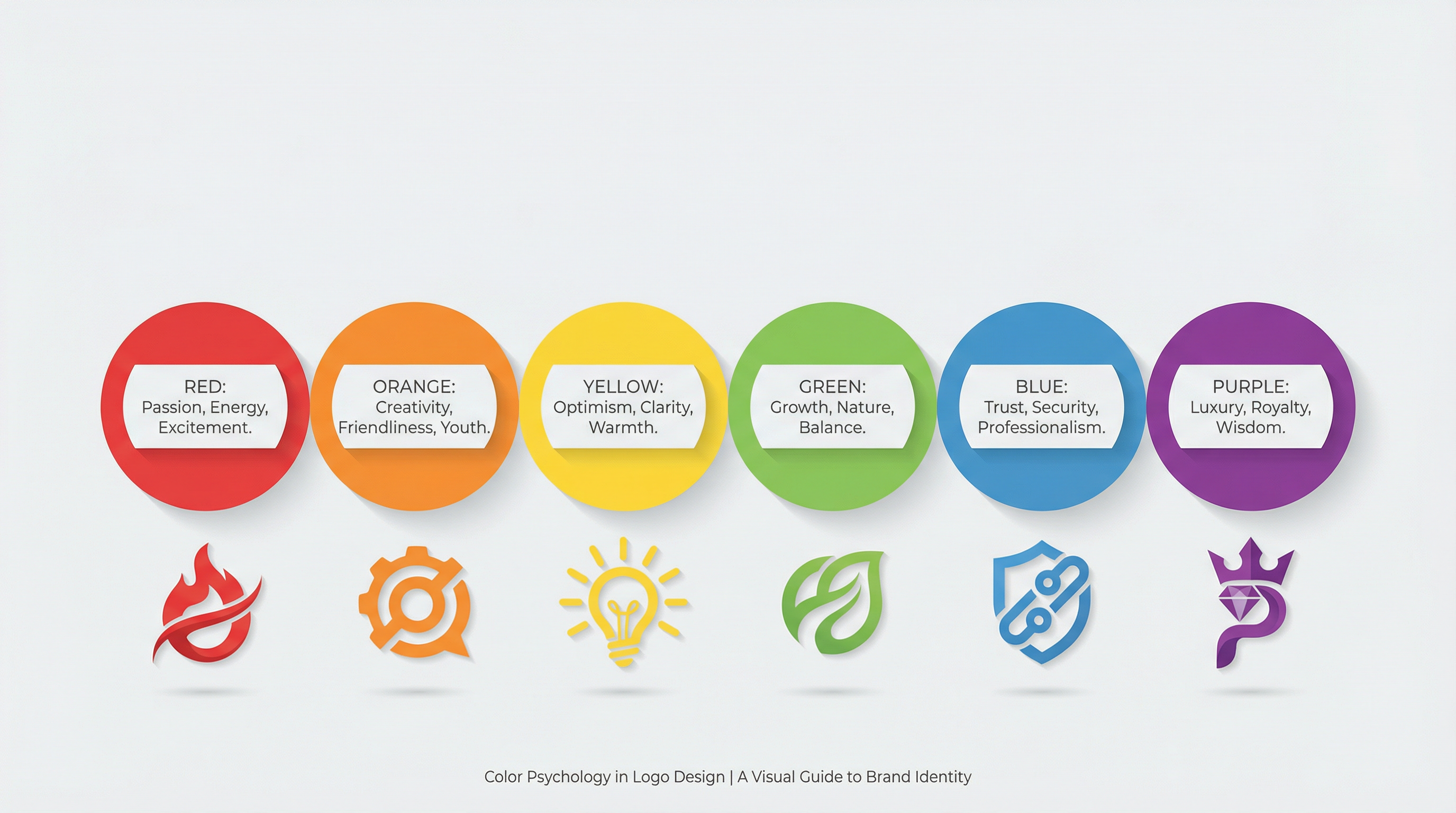 For instance, Red is a high-energy color associated with passion, excitement, and urgency. It stimulates appetite and grabs attention, which is why it is frequently used by fast-food chains and entertainment brands. On the other hand, Blue conveys trust, security, and professionalism. It is the color of the sky and the ocean, evoking a sense of calm and reliability, making it the go-to choice for financial institutions, tech companies, and healthcare providers.
Yellow radiates optimism, warmth, and clarity, often used to grab the attention of window shoppers. Green is intrinsically linked to nature, growth, and health, making it ideal for eco-friendly brands or financial services emphasizing wealth. Understanding these associations allows designers to strategically align a brand's visual identity with its core message.
The Subconscious Impact of Shapes
Just as colors speak to our emotions, shapes communicate directly to our subconscious. The human brain is hardwired to recognize and assign meaning to geometric forms, and these associations play a significant role in how a logo is interpreted.
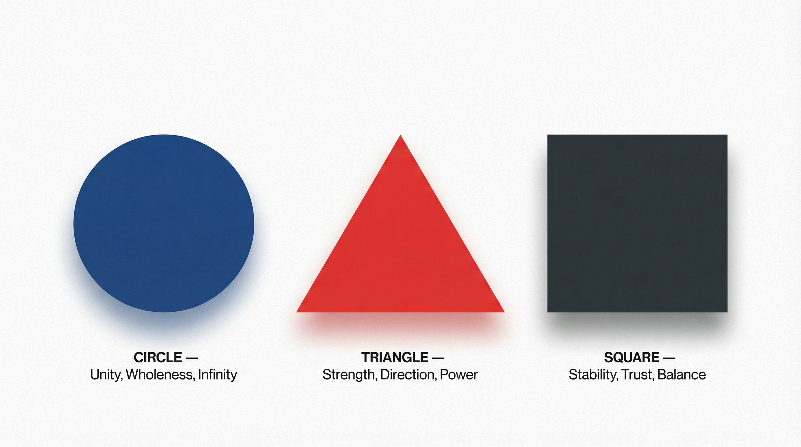 Circles, Ovals, and Ellipses represent unity, wholeness, and infinity. Because they lack sharp edges, they feel softer, more approachable, and inclusive. Brands that want to project a sense of community, friendship, or global reach often utilize circular motifs.
Squares and Rectangles, with their straight lines and right angles, suggest stability, balance, and reliability. They are grounded and solid, making them perfect for businesses that want to emphasize trust, security, and structure, such as banks or construction companies.
Triangles are dynamic and energetic. Depending on their orientation, they can represent direction, power, and forward momentum. A triangle pointing upwards suggests growth and success, often used in tech or sports logos to convey innovation and action.
Typography: The Voice of the Brand
If color is the emotion and shape is the structure, typography is the voice of a logo. The style of the letters used in a wordmark or accompanying a symbol can drastically alter the brand's perceived personality.
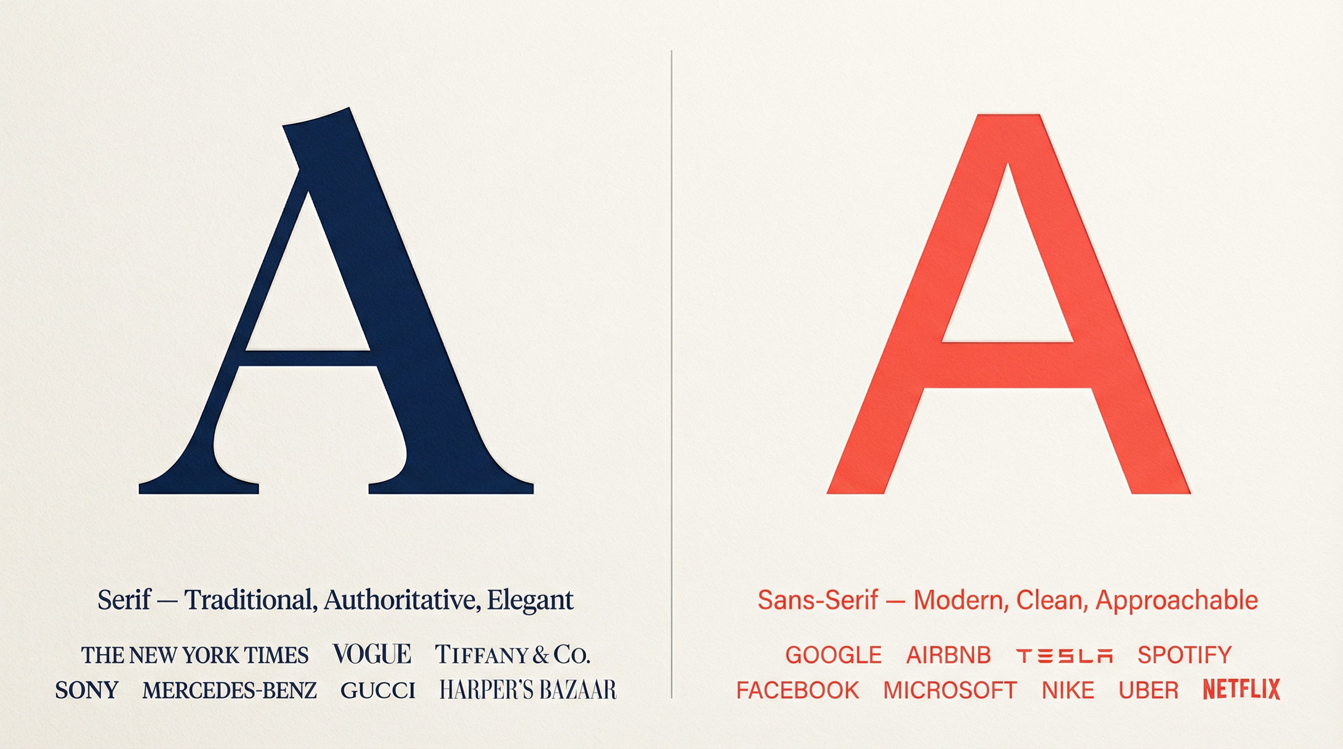 Serif Fonts (fonts with small decorative strokes at the ends of letters) exude tradition, authority, and elegance. They are classic and refined, often chosen by luxury brands, academic institutions, and established publications to convey heritage and trustworthiness.
Sans-Serif Fonts (fonts without those decorative strokes) are clean, modern, and approachable. They reflect simplicity and forward-thinking, making them incredibly popular among tech startups and contemporary lifestyle brands that want to appear accessible and innovative.
Script Fonts mimic handwriting and offer a sense of elegance, creativity, or personal touch. They can range from formal calligraphy to casual signatures, often used by brands that want to feel bespoke, artistic, or deeply personal.
Conclusion
A successful logo is a masterclass in visual psychology. By carefully orchestrating colors, shapes, and typography, designers can craft a visual identity that not only looks aesthetically pleasing but also resonates deeply with the target audience on a subconscious level. Whether you are building a new brand from scratch or rebranding an existing one, understanding the psychological weight of these design elements is the key to creating a logo that truly speaks volumes.