When launching a logo contest on 48hourslogo, most clients focus on style, typography, or symbols. But one of the most powerful—and often underestimated—elements of logo design is color.
Color isn’t just decoration. It’s communication.
Before a customer reads your tagline or understands your product, they’ve already formed a perception of your brand based on color alone. Studies have shown that up to 90% of snap judgments about products can be based on color.
That means when you launch a logo contest, your color direction can dramatically influence:
- The type of designs you receive
- The emotional tone of submissions
- How designers interpret your brand
- The final success of your logo
In this guide, we’ll break down the psychology of color in logo design—and more importantly, how to apply it strategically when running a logo contest on 48hourslogo.
Why Color Matters More in a Logo Contest
In traditional design processes, a single designer guides your brand visuals. But in a logo contest, you’re crowdsourcing creativity from dozens (or even hundreds) of designers.
That creates both opportunity and risk.
Opportunity:
You’ll get a wide variety of creative interpretations.
Risk:
Without clear direction, your submissions may be inconsistent, unfocused, or misaligned with your brand.
Color is one of the fastest ways to guide designers without limiting creativity.
Instead of saying:
“I want a modern logo”
You can say:
“I want a modern logo with deep blue and minimal accent colors”
This instantly narrows interpretation and improves design quality.
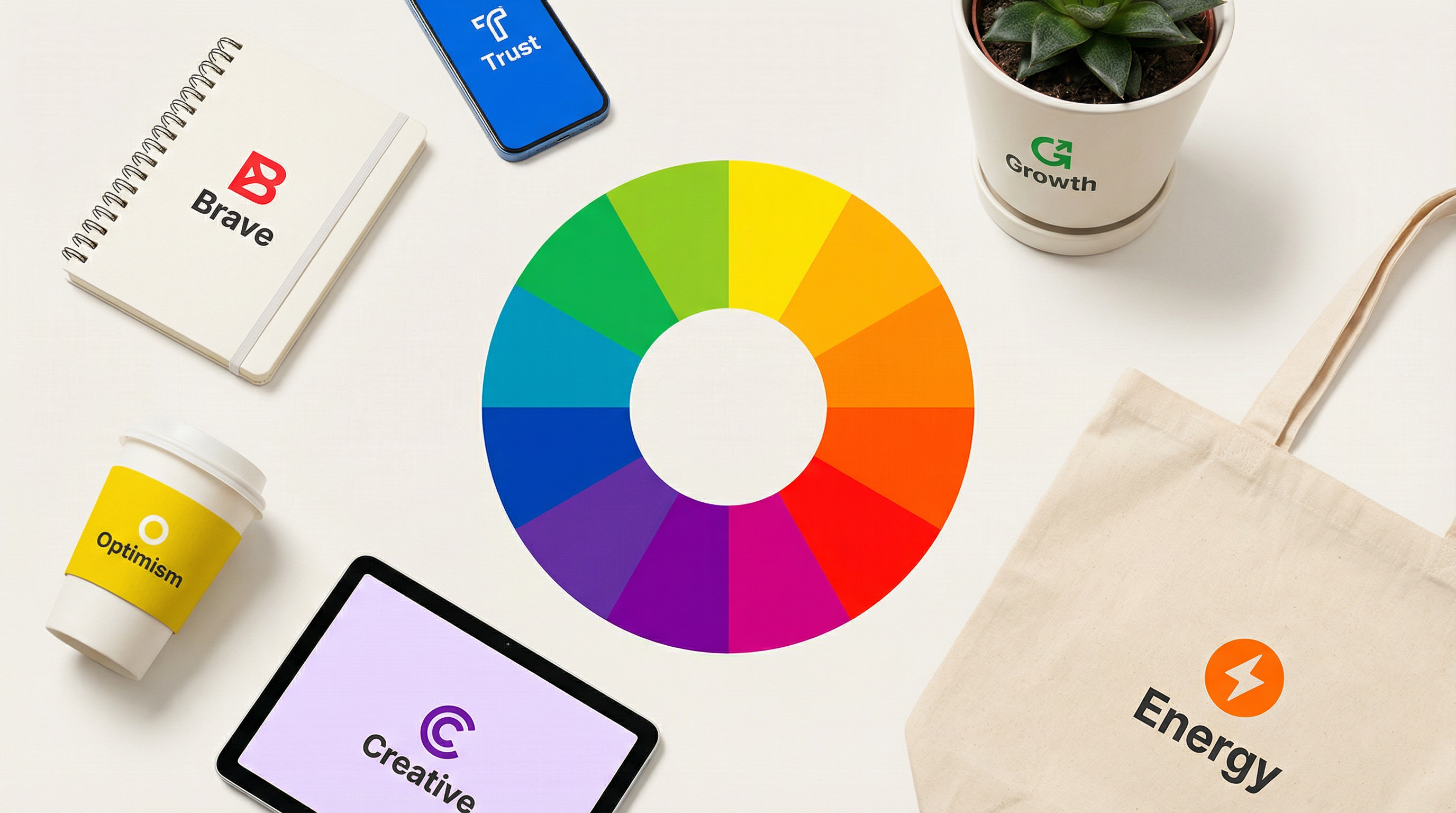
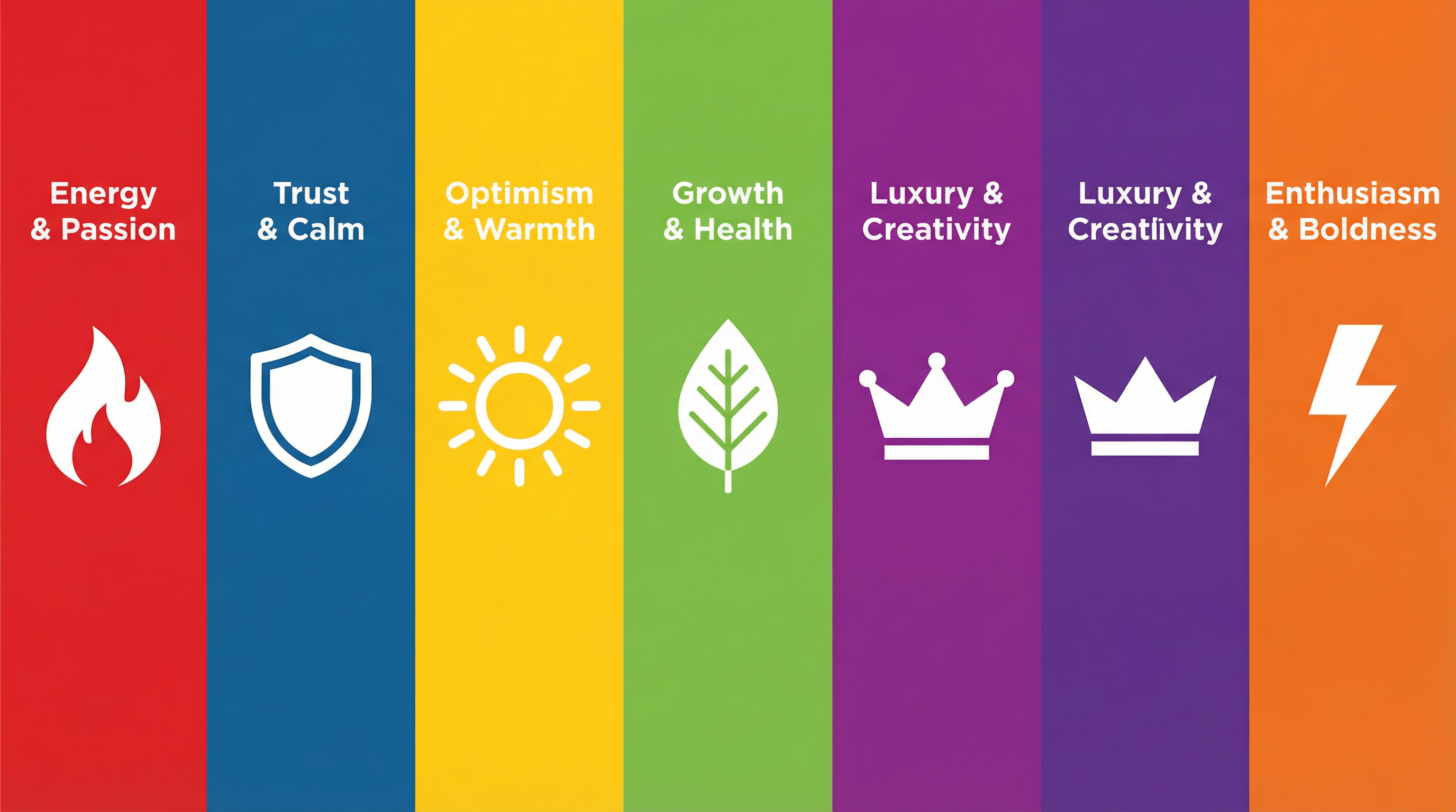
The Emotional Language of Colors
Let’s break down the major colors and what they communicate—so you can choose intentionally when launching your contest.
🔵 Blue — Trust, Stability, Professionalism
Blue is one of the most popular colors in logo design—and for good reason.
It communicates:
- Trust
- Reliability
- Security
- Intelligence
That’s why so many tech, finance, and SaaS companies lean heavily on blue.
When to use blue in your contest:
- You’re building a SaaS or tech platform
- You want to appear professional and dependable
- You need to establish credibility quickly
Contest tip:
If you choose blue, specify the tone:
- Light blue → friendly, approachable
- Dark blue → corporate, authoritative
Otherwise, designers may interpret it very differently.
🔴 Red — Energy, Passion, Urgency
Red is bold, emotional, and attention-grabbing.
It represents:
- Excitement
- Power
- Urgency
- Action
It’s commonly used in industries where emotion and speed matter.
When to use red:
- Food & beverage brands
- Entertainment or gaming
- Sales-driven or promotional businesses
Contest tip:
Red can easily overpower a design. Encourage designers to use it as:
- A primary bold color, or
- A controlled accent
🟢 Green — Growth, Nature, Health
Green is strongly associated with:
- Nature
- Sustainability
- Health
- Financial growth
It’s a versatile color that works across multiple industries.
When to use green:
- Eco-friendly or sustainable brands
- Health and wellness businesses
- Finance (especially investment or growth-focused brands)
Contest tip:
Different shades send different signals:
- Bright green → energy, freshness
- Dark green → wealth, stability
🟡 Yellow — Optimism, Warmth, Attention
Yellow is cheerful and eye-catching.
It represents:
- Happiness
- Positivity
- Creativity
- Youthfulness
When to use yellow:
- Brands targeting younger audiences
- Creative industries
- Friendly, casual businesses
Contest tip:
Yellow can be hard to read, especially on white backgrounds. Ask designers to:
- Combine it with darker contrast colors
- Use it as an accent rather than the main color
🟣 Purple — Creativity, Luxury, Innovation
Purple sits between blue and red, combining stability and energy.
It represents:
- Creativity
- Imagination
- Luxury
- Spirituality
When to use purple:
- Creative agencies
- Beauty and wellness brands
- Premium or luxury positioning
Contest tip:
Purple is less commonly used, which can help your brand stand out—but only if executed well.
⚫ Black — Sophistication, Power, Minimalism
Black is timeless and versatile.
It communicates:
- Elegance
- Authority
- Simplicity
When to use black:
- Luxury brands
- Fashion or design-focused companies
- Minimalist brand identities
Contest tip:
Always request black-and-white versions of your logo in the contest. A strong logo should work without color.
⚪ White — Simplicity, Cleanliness, Space
White is often overlooked because it’s a “non-color,” but it plays a critical role in design.
It represents:
- Cleanliness
- Simplicity
- Minimalism
Contest tip:
Encourage designers to use white space effectively. A cluttered logo reduces impact, regardless of color.
🟠 Orange — Energy, Friendliness, Affordability
Orange combines the energy of red and the warmth of yellow.
It communicates:
- Enthusiasm
- Creativity
- Approachability
When to use orange:
- Startups
- Consumer-friendly brands
- Budget-friendly or accessible services
How Color Choices Shape Your Contest Results
Here’s something most clients don’t realize:
👉 The colors you mention in your brief directly influence the type of designers who participate.
For example:
- A black-and-white brief attracts minimalist designers
- A colorful brief attracts expressive, illustrative designers
- A luxury palette attracts high-end branding specialists
So color isn’t just about the final logo—it shapes the entire creative direction of your contest.
Should You Specify Colors or Leave It Open?
This is one of the most common questions when launching a logo contest.
Option 1: Specify colors
Best when:
- You already have a brand vision
- You want consistent submissions
- You need faster decision-making
Pros:
- More aligned designs
- Easier to compare entries
Cons:
- Less creative exploration
Option 2: Keep it open
Best when:
- You’re unsure about your brand identity
- You want to explore multiple directions
Pros:
- More variety
- Unexpected creative ideas
Cons:
- Harder to evaluate
- More noise in submissions
Best practice: Hybrid approach
Instead of strict rules, give directional guidance:
“Prefer blue or green tones, but open to creative suggestions.”
This balances structure and creativity.
How to Write Color Instructions in Your Contest Brief
Here’s how to give designers clear, actionable guidance:
❌ Weak instruction:
“Use nice colors”
✅ Strong instruction:
“We prefer a modern palette with dark blue as the primary color, with optional accent colors like teal or light gray. Avoid overly bright or neon colors.”
Include these elements:
- Primary color(s)
- Accent color(s)
- Colors to avoid
- Tone (bright, muted, pastel, bold, etc.)
Real Contest Strategy: Using Color to Stand Out
One overlooked strategy is using color to differentiate from competitors.
Before launching your contest:
- Look at your competitors’ logos
- Identify dominant color patterns
- Choose a contrasting direction
Example:
If all competitors use blue → consider:
- Purple (innovation)
- Orange (energy)
- Black (premium positioning)
This gives your brand instant visual distinction.
Color Combinations That Work Well in Logo Contests
Some combinations consistently perform well:
1. Blue + White
Clean, trustworthy, modern
→ Great for SaaS and tech
2. Black + Gold
Luxury, premium, elegant
→ Great for high-end brands
3. Green + Gray
Balanced, natural, professional
→ Great for finance or eco brands
4. Red + Black
Bold, powerful, high contrast
→ Great for sports or entertainment
Common Mistakes to Avoid
1. Choosing too many colors
More colors ≠ better design
Keep it simple (2–3 colors max)
2. Ignoring scalability
Your logo must work:
- On a website
- On social media
- On business cards
- In black & white
3. Following trends blindly
Trendy colors can quickly become outdated. Focus on brand alignment instead.
4. Not considering cultural meaning
Colors can have different meanings globally. For example:
- Red = luck in some cultures, danger in others
Final Thoughts: Color Is Strategy, Not Decoration
When you launch a logo contest on 48hourslogo, you’re not just asking for designs—you’re setting a creative direction.
Color is one of the most powerful tools you have to guide that direction.
The right color choice can:
- Attract better designers
- Improve submission quality
- Clarify your brand identity
- Help your logo stand out instantly
The wrong choice—or lack of direction—can lead to confusion, inconsistent results, and longer decision cycles.
Action Checklist Before You Launch Your Contest
Before you hit “Start Contest,” ask yourself:
- What emotion should my brand convey?
- Who is my target audience?
- What colors do my competitors use?
- Do I want to blend in or stand out?
- Should I guide designers or explore options?
A well-defined color strategy doesn’t limit creativity—it focuses it.
And in a logo contest environment, that focus is the difference between average results and exceptional ones.
If you’re ready to turn your brand vision into reality, start your logo contest on 48hourslogo—and let color work for you, not against you.