When it comes to branding a premium pet food company, getting the logo right isn't optional—it's foundational.
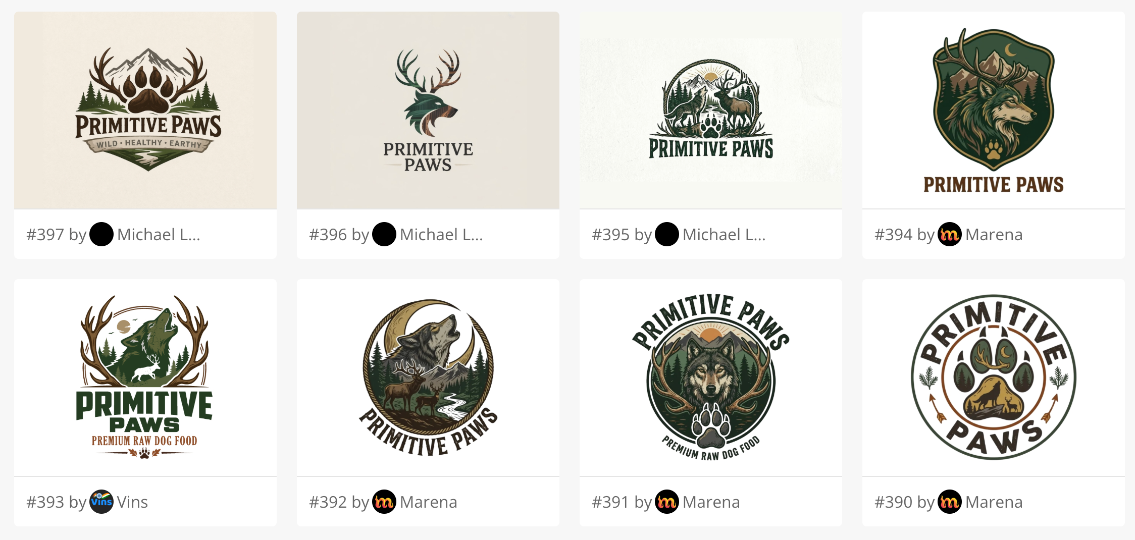
The Primitive Paws contest on 48hourslogo is a great example of how a well-structured design contest can translate a brand vision into a highly effective visual identity.
But what really makes this contest interesting isn't just the final logo—it's why the process worked so well for the client's needs.
1. The Client Had a Clear (and Difficult) Brief
Primitive Paws isn't a typical pet food brand. The client needed a logo that communicates:
- Raw, ancestral diet (elk, deer, wild sourcing)
- Natural and premium positioning
- Trust and quality for health-conscious dog owners
This is a tricky combination.
Most pet logos lean toward:
- Cute and playful (cartoon dogs)
- Or generic and corporate
But this brand required something different: "Wild, but still trustworthy".
That nuance is exactly where many single-designer projects fall short.
2. Volume of Concepts = Exploration of the Idea Space
This contest generated hundreds of submissions from dozens of professional designers.
That matters because:
- Each designer interprets "primitive" differently
- Some lean toward wolf symbolism
- Others toward hunting or wilderness
- Others toward premium typography
Instead of betting on one designer's interpretation, the client got a full exploration of the brand's visual territory.
This is especially valuable for new brands that are still refining positioning.
3. Iteration Through Feedback (Not Just Submission)
What made this contest effective wasn't just quantity—it was interaction.
In platforms like 48hourslogo:
- The client can rate designs
- Leave feedback
- Request revisions
This creates a feedback loop:
- Designers submit initial concepts
- Client signals preferences (e.g., "more natural", "less aggressive")
- Designers refine direction
- Final designs converge toward the ideal vision
This is closer to market testing than traditional design.
4. The Winning Direction Matched the Brand Strategy
The final logo works because it aligns tightly with the client's business goals:
✔ Communicates "Raw & Ancestral"
- Wolf / wild animal cues
- Natural, instinct-driven imagery
✔ Signals Premium Quality
- Clean composition
- Balanced typography
- Not overly cartoonish
✔ Appeals to the Right Customer
- Health-conscious dog owners
- People who buy organic / raw products
- Customers who value authenticity
The logo doesn't try to appeal to everyone—it targets the right niche.
5. Avoiding Common Pet Brand Mistakes
Many pet food logos fail because they:
- Look too "cheap" (clipart-style animals)
- Feel overly playful (wrong for premium products)
- Lack differentiation
This contest avoided those pitfalls because:
- Poor directions naturally got filtered out
- Stronger concepts rose through ratings and feedback
- Designers competed to refine quality
Competition drives quality upward.
6. Speed + Optionality = Better Decisions
Traditional branding process:
- Hire 1 designer
- Wait weeks
- Get 2–3 concepts
Contest model:
- Dozens of concepts within days
- Immediate comparison across styles
- Faster decision-making
For a startup or new product launch, this is huge. The client didn't just get a logo—they got confidence in the choice.
7. Why This Contest Model Fits Modern Brands
For brands like Primitive Paws, the contest model works particularly well because:
- Positioning is still evolving
- Visual direction isn't fully locked in
- Speed matters (launch timelines)
Crowdsourcing solves all three: Exploration, Validation, and Execution.
Final Takeaway
The Primitive Paws contest worked because it combined:
- A clear, strategic brief
- High design diversity (many designers)
- Active client feedback loops
- Competitive refinement of ideas
The result is not just a good-looking logo—it's a logo that fits the business, the audience, and the product philosophy. That's the real goal of branding.