I think I would like a combination of the attached Melton Motorsports logo and the Alex Thomas logo. I like the motorsports, flashy look of Melton and the more professional, business appearance of the Alex Thomas logo. I like the shiny/reflective colors of the letters in Melton and Rive. The Melton font is about right but without the notches...all caps I think.
I have attached the JR Motorsports and Michael Waltrip logos to show the more modern trend in motorsports logos. The logo above the Michael Watrip logo is actually meant to simulate a "W" for Waltrip. I am not opposed to considering the initials CM in some sort of stylistic way included in the logo...maybe behind the wording....? We could look at incorporating a checkered flag somehow but in a modern sort of way as the checkered flag is somewhat old school when it comes to motorsports logos.
I will need it reversible....a file with a black background, and one with a white background (colors reverse?). Also, it will need to be a logo that can be embroidered.
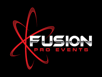
I added the Fusion logo as it has a modern design.
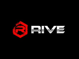
I added the Rive logo to show some colors (brightness) that I like.
I added the Bobby Runyan logo to show the brighter colors we might try as well as it has a modern, progressive styling we might want to try use as an example with our CM initials....just curious how something similar to this would look.
Preview
201412100201020.jpg
Preview
201412100201390.png
Preview
2014121002544530632.png
Reference Samples:
T
TM129 years ago
Not bad guys, great start! Maybe let's try without the checkered flag. That maybe looks a little generic. Maybe something more progressive and different like the JR Motorsports and Michael waltrip Racing logos.........
T
TM129 years ago
Good submissions so far guys, the #5 and #6 are getting pretty close...modern, sleek, professional, business like, yet sporty.
T
TM129 years ago
I encourage ALL designers to submit designs!
T
TM129 years ago
I really like all 4 of the logos you have submitted. I wonder if we can see what they look like with maybe a little brighter/lighter colors? I added the Rive logo to the examples to show some colors (brightness) that I like. Very good so far everyone!
T
TM129 years ago
I added the Bobby Runyan logo since it and the Rive logo show the brighter colors we might try.
Also, the Bobby Runyan logo has a modern, progressive styling we might want to try use as an example with our CM initials....just curious how something similar to this would look.
T
TM129 years ago
Very nice logos so far. I would like to see one that is kind of a duplicate of the Bobby Runyan logo if someone could create something similare to that.
ingepro is selected as the contest finalist!9 years ago
moomoo is selected as the contest finalist!9 years ago
rykos is selected as the contest finalist!9 years ago
Design Concepts Completed9 years ago
Open design concept stage had ended with 1 submissions from 1 designers. Go to DESIGNS tab to view all submissions.


 moomoo

