The Last Resort is a Reiki based therapeutic center. The owner like blues and purples as a starting point for her color palette. She is heavily into crystals and celestial objects (sun, moon, stars). Her business is to help people improve their energy flow.
The Last Resort is a Reiki based therapeutic center. The owner like blues and purples as a starting point for her color palette. She is heavily into crystals and celestial objects (sun, moon, stars). Her business is to help people improve their energy flow.
Instructions:
The sketch she gave us is a very rough idea and should be considered as only a starting point. The arrows are connecting her business to heaven and earth. There is a caring heart at the center, fueled by a deep sense of spirituality, represented by the cross. The tick marks are meant to evoke the sense of energy that flows through the body. We will be looking for a mix of options that just refine this concept as well as some that understand the point and take it in a different graphic interpretation.
Preview
2014090901404928775.jpg
urbanoc10 years ago
Thanks for the entries, folks, I will be sharing these with my client to see which she is most interested in pursuing. I will be in touch after the weekend. Have a wonderful day! And thanks again for all the work!
Design Concepts Completed10 years ago
Open design concept stage had ended with 1 submissions from 1 designers. Go to DESIGNS tab to view all submissions.
 Thanks for the entries, folks, I will be sharing these with my client to see which she is most interested in pursuing. I will be in touch after the weekend. Have a wonderful day! And thanks again for all the work!
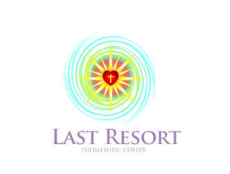
 avatar