A higher end real estate development and investment firm.
Instructions:
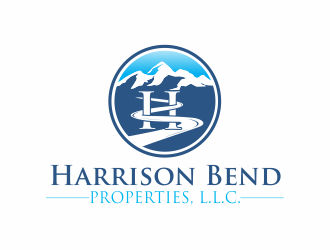
Harrison Bend Properties, L.L.C. is a Tennessee based real estate and real state investment firm. Harrison is the last name of the owners and bend comes from the bend in the Tennessee River that was adjacent to the dairy farm where the owner grew up. They seem to want the "bend" in the river to be part of the logo. I think the logo needs to be rustic elegance if you know what I mean by that. Look forward to seeing what the designers come up with!
Reference Samples:
C
Client610825 years ago
Designers,
Harrison Bend, LLC is based in the state of Tennessee. Too many of the submitted logos are using a mountain motif that looks like Colorado or the western United States. The landscape in Tennessee is more of rolling hills, not high peaked mountains. I think tone down the high mountain peaks and several have promise.
Thanks designers!
C
Client610825 years ago
C
Client610825 years ago
Designers,
Nothing hits me in the face as the winner yet and I need to make a decision fairly quickly. What about incorporating the HB letters for Harrison Bend into one, with the B looking like the river portion of the logo that the owner wants?
Harrison Bend Properties, L.L.C. text still needs to be incorporated underneath the icon.
Get creative folks! ! !
sanworks is selected as the contest finalist!5 years ago
daywalker is selected as the contest finalist!5 years ago
up2date is selected as the contest finalist!5 years ago
Design Concepts Completed5 years ago
Open design concept stage had ended with 118 submissions from 33 designers. Go to DESIGNS tab to view all submissions.


 up2date
 sanworks
 daywalker
 excelentlogo
 jhunior
 jaize
jaize
 BeDesign
 done
done
 Project48
 berewira
 Greenlight
 akhi
akhi
 serprimero
 REDCROW
 invento
 Marianne
 bricton
 justin_ezra
 dibyo
dibyo
 cintoko
 jetzu
jetzu
 ROSHTEIN
 ElonStark
 cikiyunn
 Franky.
 R-art
R-art
 MonkDesign
 N3V4
N3V4
 oke2angconcept
 salis17
 RIANW
RIANW
 Eko_Kurniawan