- $100
- CUSTOM
- 41
- ENTRIES
BRIEF
DESIGNS (41)
- Design Name:
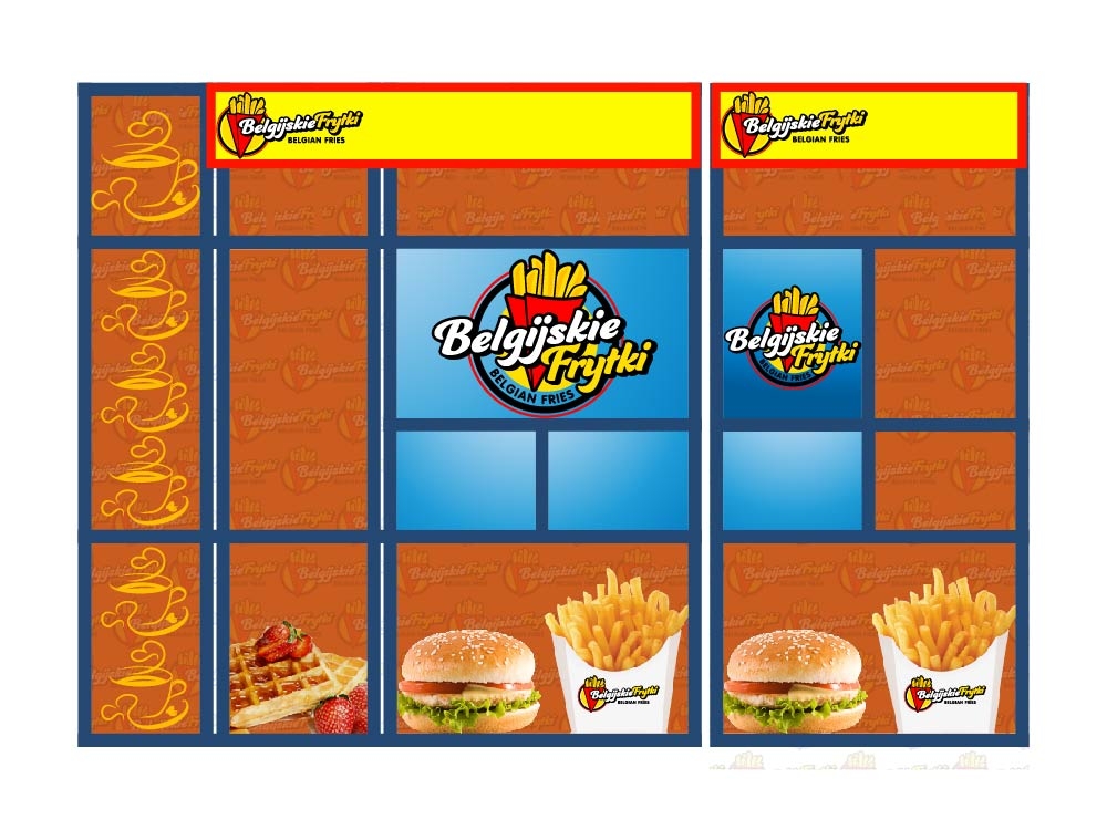
- Belgijskie Frytki
- Instructions:
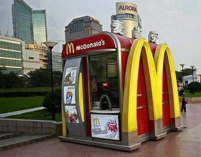
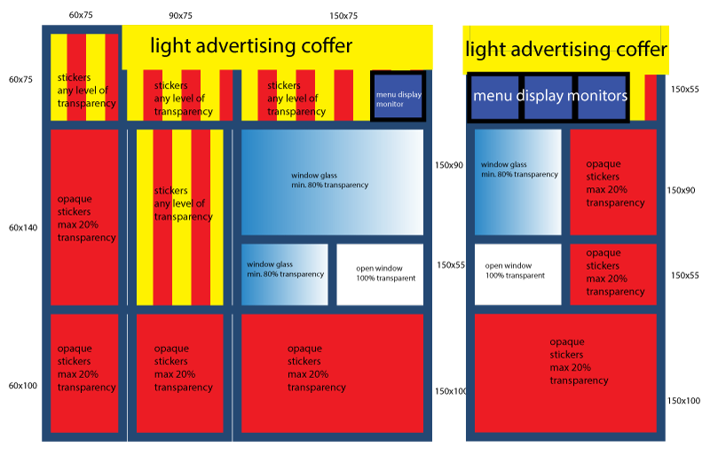
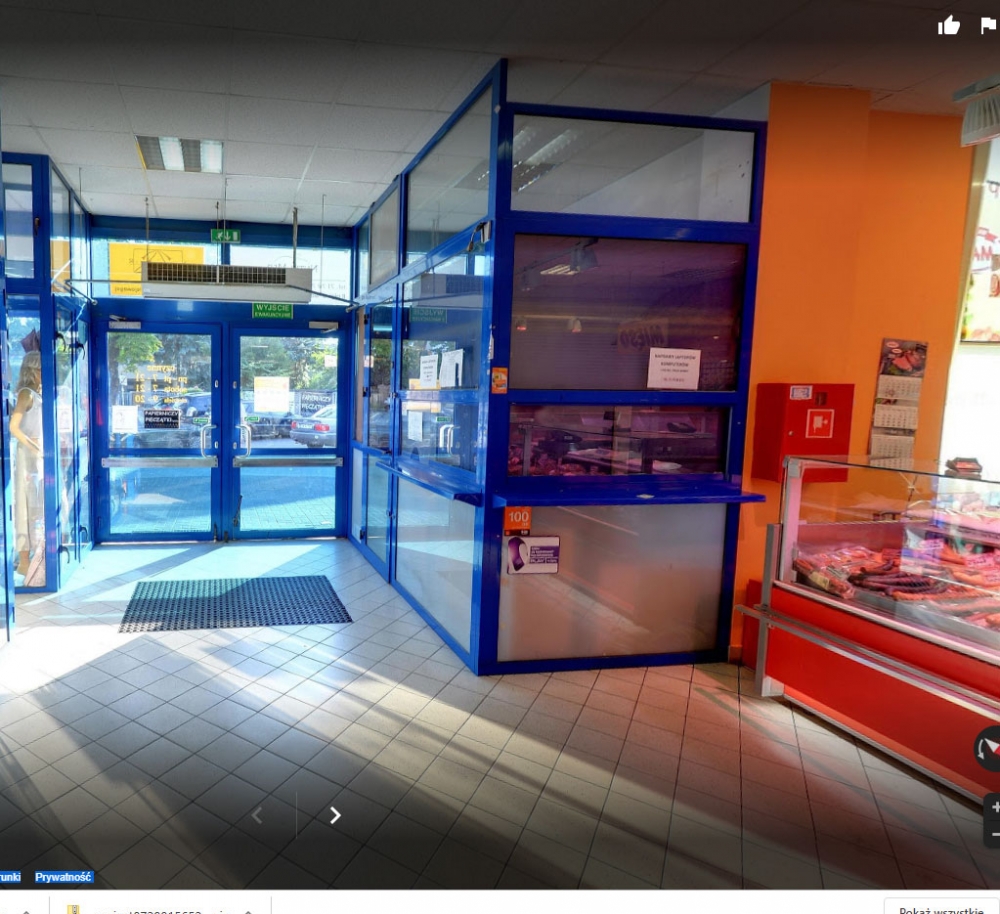
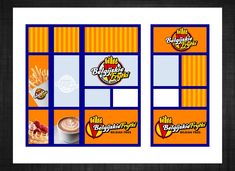
- Others(Take away fast food kiosk wrap)Dear designers. I need a wrapping design of local Belgian Fries takaway shop. We will sell Belgian fries, burgers, waffles, coffee. I need a design of wrapping to be placed on the shopping windows of the kiosk. First I would like to introduce you how the kiosk looks like, what is the location and what I want do achieve by the wrapping. The kiosk is located in local supermarket, near to main entrance, so majority of people pass through near the kiosk. Kiosk i placed in the corner, with two walls to be sticked. One side is near to entrance and the other side (shorter) facing to the supermarket. The food will be served from small window in corner of the kiosk. The shorter wall shall attract people from longer distance with advertising of our product. (facing to supermarket) Technology of wrapping / sticking. I want only the windows to be sticked with the graphics. It is up to you if you want to split the designs to each window, or to make it look like a whole design, regardless of the frames. There will be two light advertising coffers on the corner of the kiosk, just near to the ceiling, and 4 monitors to display menu and attract with food pictures. find attached: 1. The logo in square and in rectangle design 2. The real view of the kiosk 3. Design of the smallest McDonalds in the world which I really like 4. Design of some local restaurant which I also like And google 360 view of the kiosk link https://www.google.com/maps/uv?hl=pl&pb=!1s0x470fc2356478b1e3:0x42f27fac6002bb13!2m22!2m2!1i80!2i80!3m1!2i20!16m16!1b1!2m2!1m1!1e1!2m2!1m1!1e3!2m2!1m1!1e5!2m2!1m1!1e4!2m2!1m1!1e6!3m1!7e115!4shttps://lh5.googleusercontent.com/p/AF1QipNsHFhEzHdknKScCjXdlmfi98_sra5PcgnSfBL2=w267-h160-k-no!5sch krzyki - Szukaj w Google!15sCAI&imagekey=!1e10!2sAF1QipMr22i-M_c1QDqY455G1mLT8YAXdP0-SSfrqOfm&sa=X&ved=2ahUKEwit1ZW-oPXjAhWItYsKHXxnC6MQoiowDXoECAkQBg The slogan font is insaniburger.--- Update: 2019-08-17 08:13:26 ---The placement of menu monitors may be changed - it is just a suggestion
- Cwhy nobody is here?
- CNowy what?
- Cwe have the long lit coffers
 It's starting to look like my design. I think at least out of respect, you could have selected both designers in the finals.
- it would be nice to say what you like and what you don't. it would be easier and faster to get the right design. maybe rate the works ...
 Any updates? Thank you
- CHi, we are debating on the design. Generally we decided to choose a simple design. Not much food pictures. With rather big logo. The Orange is nice.
Open design concept stage had ended with 41 submissions from 2 designers. Go to DESIGNS tab to view all submissions.
#41 by LogOExperT