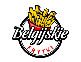
"Belgijskie Frytki" means "Belgian Fries". We are local kiosks selling belgian fries, waffles and coffe.
Belgian fries are french-fries with delicious dressing of our choice (like mayonnaise, ketchup, optional topping like parmesan)
"Belgijskie Frytki" means "Belgian Fries". We are local kiosks selling belgian fries, waffles and coffe.
Belgian fries are french-fries with delicious dressing of our choice (like mayonnaise, ketchup, optional topping like parmesan)
Instructions:
Dear Designers, we announce a design contest: a logo for a small gastronomy brand selling Belgian fries
The name of our brand is: Belgian Fries
We sell: delicious Belgian fries with dressing, additionally belgian waffles and coffee
The graphic design will be used: on the website, fanpage fb, on advertising panels and on the website of the premises
We want to: attract attention to the attractiveness of fries served with a delicious choice of dressing made according to your own recipe.based on mayonnaise or ketchup.
Preferred colors: yellow, red, , black, navy blue
Preferred style: cheerful, eye-catching, the logo must be distinguishable and characteristic also in small size and in one color.
Additional remarks:
1. Belgian fries are distinguished by the fact that we serve a delicious dressings and additives such as parmesan ...
2. we are distinguished by the good quality of the most popular snack -fries and location in a given district of the city. An example of an Advertising slogan is
"the best fries in Brooklyn"
"the best fries in Tenderloin"
Reference Samples:
jaize is selected as the contest finalist!5 years ago
Suvendu is selected as the contest finalist!5 years ago
C
Client660825 years ago
what now?
Suvendu5 years ago
Now it's time for the final revision and then winner selection
C
Client660825 years ago
example of a horizontal banner layout
C
Client660825 years ago
Would you mind to show how the logo will look like in horizontal layout. I plan to use a led coffer which is about 35 high and 200cm long.
Thank you for your patience.
Wojciech
C
Client660825 years ago
This is how the whole kiosk looks like
There are two shopping windows one 3m long and one 1.5 m long.
I also need a design for the windows ...
C
Client660825 years ago
And this is google 360 reality view
https://www.google.pl/maps/place/Centrum Handlowe Krzyki/@51.0749807,17.0043753,3a,87.2y,240.32h,70.49t/data=!3m7!1e1!3m5!1sAF1QipMr22i-M_c1QDqY455G1mLT8YAXdP0-SSfrqOfm!2e10!3e11!7i10000!8i5000!4m5!3m4!1s0x470fc2356478b1e3:0x42f27fac6002bb13!8m2!3d51.074836!4d17.004389
Design Concepts Completed5 years ago
Open design concept stage had ended with 62 submissions from 16 designers. Go to DESIGNS tab to view all submissions.


 Now it's time for the final revision and then winner selection
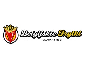
 JessicaLopes
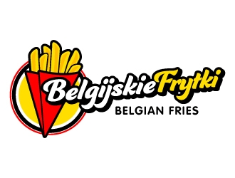
 jaize
jaize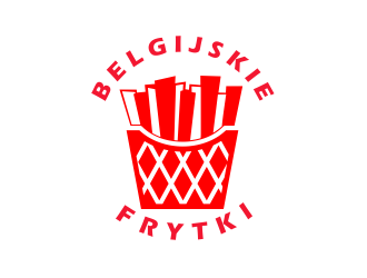
 Dhieko
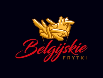
 MUSANG
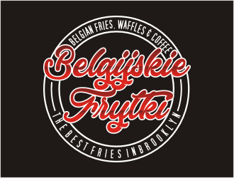
 bunda_shaquilla
 sokha
sokha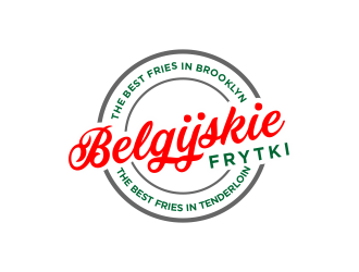
 akhi
akhi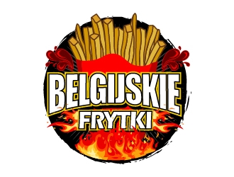
 mmyousuf
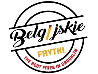
 MonkDesign
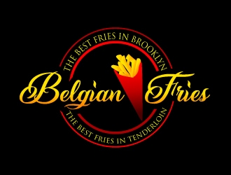
 uttam
uttam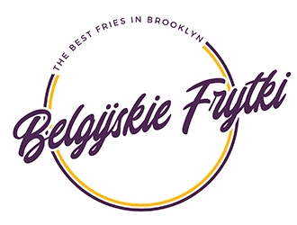
 PrimalGraphics
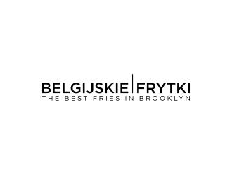
 p0peye
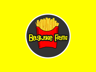
 noval48
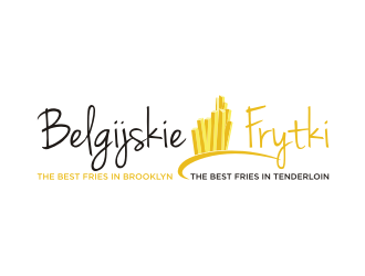
 ohtani15
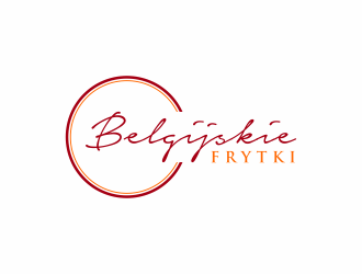
 ammad
ammad