This is a non-serious annual sporting event that I run with my extended family each year. The event is called "Mattlympics" and we have a variety of non-athletic events that everyone competes in (similar to a child's school sports day, but for adults). Every year, I have a new logo designed for the event and that's exactly what I'm looking for here.
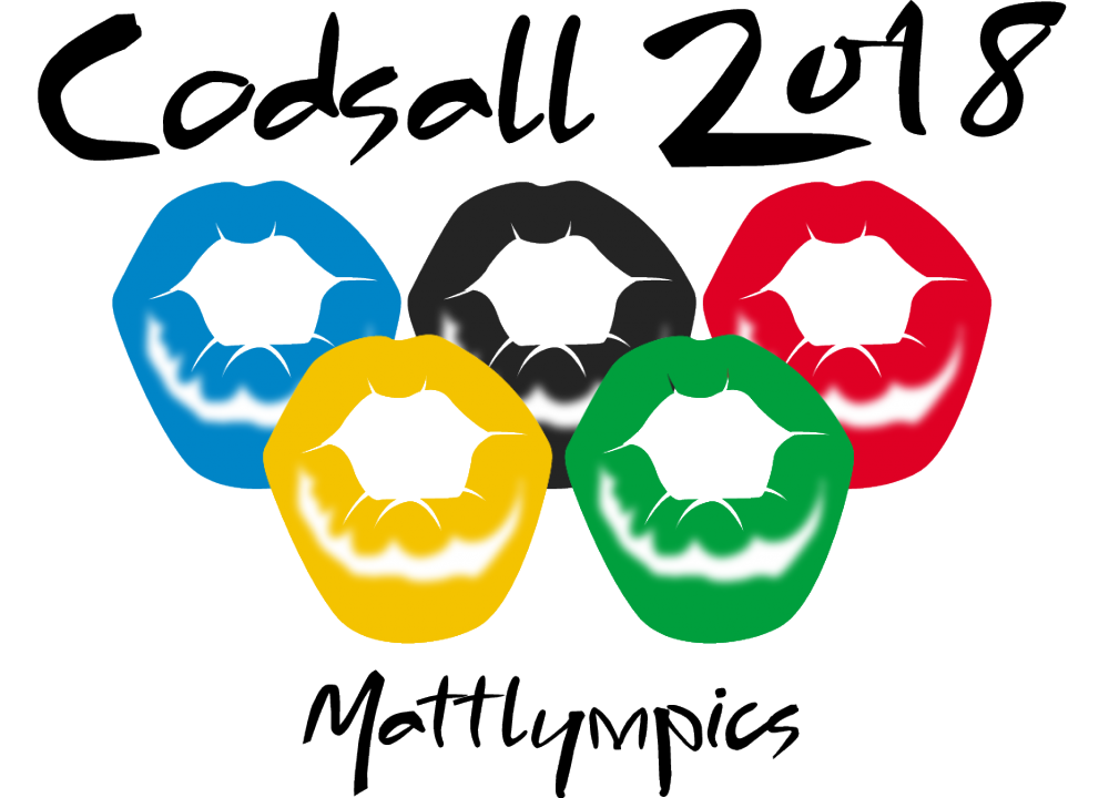
The logo should mimic an "Olympics" theme. Here is last year's logo: https://www.48hourslogo.com/48hourslogo_data/2018/06/22/74387_1529659795.gif
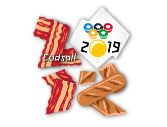
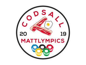
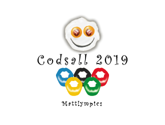
For this year's logo, I'd like to retain the existing design of the rings (made to look like pursed lips) but the text will be a different font - the text should read "Codsall 2019" (this is the location of the event) and then it should have the text "Mattlympics" somewhere.
For this year's logo I'm hoping to have some kind of symbol as the main focus of the logo, similar to the layout of the following Olympic logos (symbol at the top, text below with the rings):
Beijing 2008: https://99designs-blog.imgix.net/blog/wp-content/uploads/2018/02/08beijing-e1517118316639.jpg
Nagano 1998: https://99designs-blog.imgix.net/blog/wp-content/uploads/2018/02/98nagano-e1517118275378.jpg
Salt Lake 2002: https://99designs-blog.imgix.net/blog/wp-content/uploads/2018/02/02saltlake-e1517116992759.jpg
Sydney 2000: https://99designs-blog.imgix.net/blog/wp-content/uploads/2018/02/sydney-e1517115897675.jpg
You'll notice that last year's Mattlympics logo (attached) uses the font from the Sydney 2000 logo - this should be different this year.
Now, for the symbol of the logo, I'd like it to have a similar aesthetic to the typical Olympic style, but as "Mattlympics" is a fun, non-serious event, I'd like the symbol to be almost purposefully stupid. My initial thoughts are that the symbol could be a sausage, a strip of bacon or an egg made to look abstract (hopefully you're seeing my train of thought here).
Have fun with it and I'll try to get as much direction once the initial designs come in. A final reminder that the rings from last year's logo should be retained and be present (smaller) in this logo.
Here are the logo files from last year (including the .ai file) so that you can get the original rings from the design: https://drive.google.com/drive/folders/1w76V-r4jZ_44IgHQ2N1bL7l0jWcuFOii?usp=sharing
Preview
Mattlympics1561977208.png
Design Concepts Completed5 years ago
Open design concept stage had ended with 51 submissions from 16 designers. Go to DESIGNS tab to view all submissions.
 dibyo
dibyo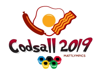
 dshineart
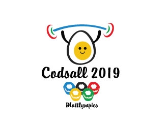
 opi11
opi11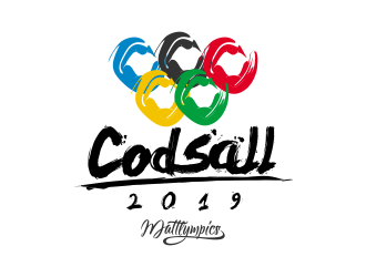
 smith1979
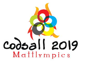
 bulatITA
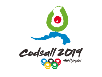
 done
done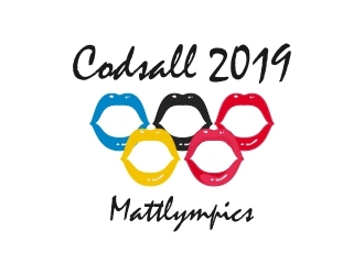
 berkahnenen
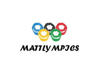
 ubai popi
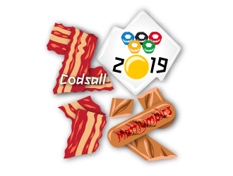
 justin_ezra
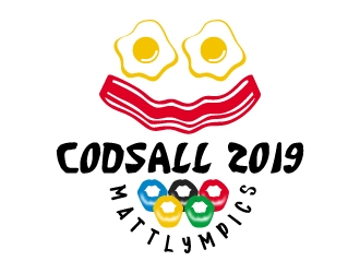
 jaize
jaize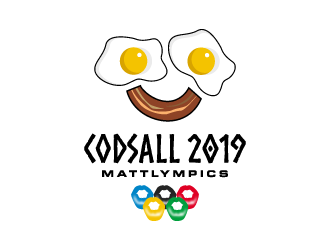
 torresace
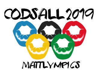
 ElonStark
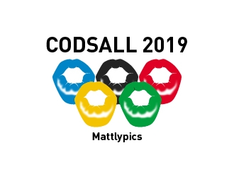
 GemahRipah
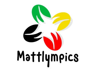
 uttam
uttam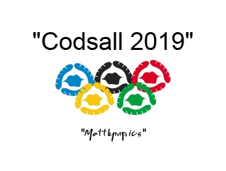
 Mirza
Mirza